Chapter 17 Analysis of Variance (ANOVA)
17.1 Overview
In the previous chapter we looked at \(\chi^2\) and GOF testing, which is useful for count (or proportion data), particularly when we want to test multiple comparisons simultaneously.
Here we’re going to look at a hypothesis test evaluating whether the means of multiple samples of continuous data are the reasonably the same.
ANOVA - which stands for ANalysis Of VAriance and is a common method to test if the means are the same for continuous data. Our null hypothesis here will typically be \(H_0:\mu_1 = \mu_2 = \mu_3 ...\) (or more depending on how many different groups or treatments we have.)
In this chapter we’re going to take a slightly different approach from our traditional hypothesis testing framework. Mostly, we’re going to let R do all of the work and so I won’t initially discuss the details of the math. We’ll still need to develop a null and alternative hypothesis, but from there we’ll let R calculate the test statistic, figure out the parameters of the F distribution (which is new to us), and finally compute the p-value of our test. I will try to provide enough of a summary about the how and why we look at variance, and an optional section describes the math in much more detail.
17.1.1 Why Analysis of Variance?
To start, why is it called analysis of variance and not analysis of means? I’ll try to answer this two ways.
First, hopefully at this point based on all of our standard error discussions, you realize that if we’re interested in testing if a sample’s true mean has some prior value, then computing and evaluating the variance (standard error) is as important as the specific difference between the sample and hypothesized means themselves.
For example, imagine the following:
- Test of \(H_0: \mu = 18\) with an \(\bar X = 16\) and \(SE = 0.5\) compared with…
- Test of \(H_0: \mu = 18\) with an \(\bar X = 16\) and \(SE = 2\)
Our sample mean is the same in both situations. In the first case, we’d find our test statistic as \(\frac{16-18}{0.5} = -4\) which we’d almost always reject at \(\alpha= 0.05\) compared to the second case where \(\frac{16-18}{2} = -1\) which we’d basically never reject.
The point being that since its the test statistic that we’re comparing against our null distribution, and since this includes the standard error (variance) in the denominator, the standard error is as important as the actual difference between \(\mu\) and \(\bar X\) in ultimately determining whether or not we reject \(H_0\).
Second, let me make one other point about comparing means versus looking at the variance. If we only have two samples, then it is fairly straight forward to calculate the difference between them. We simply subtract one from the other. But what if we have three (or more) samples - how would you compare all of the means simultaneously to decide if they’re equal? Pause here and think about that for a moment.
As one approach, you might attempt to calculate the distance each group’s mean value is from the overall mean. However, if we simply summed the distance between them we would find this to be zero (as we saw when discussing alternative forms of our \(\chi^2\) test statistic). So instead, we might calculate the sum of the squared distance of each group’s mean from the overall mean. In fact, that’s essentially what we’ll end up doing here, and since this is basically a variance calculation (as will be shown below), we call it “Analysis of Variance” (ANOVA).
So in this chapter, we’re going to focus a bit more on the variance, or something closely related to it. As a reminder, one equation we’ve used for the variance of a random variable \(X\) is calculated as: \[\sigma^2_x = \frac{1}{n} \sum (x_i-\bar x)^2\]
The first part \(\frac{1}{n}\) scales the result based on the number of observations, and the second part \(\sum (x_i-\bar x)^2\) is called the “sum of squares”. We’ll see this second term quite a bit in this chapter (but don’t panic, as R will do most of this for us.)
17.1.2 Learning Objectives
By the end of this chapter you should be able to:
- Understand the format of data in R to easily create boxplots and run ANOVA
- this will include a reminder of what a boxplot shows
- Extract subsets of data from a dataframe and evaluate the mean and standard deviation of individual groups
- this is also a reminder from our early work on EDA
- Explain why ANOVA is needed to evaluate multiple means instead of many pairwise tests
- Explain the assumptions needed for ANOVA to be used.
- Perform an ANOVA test in R using the
aov()andsummary()functions in R, along with the~character. - Understand how ANOVA works, in particular that it calculates at the “variation” between the means and compares this against the “variation” within each group. If the former is significantly larger, then we'll reject \(H_0\) that our means are the same.
- I put “variation” in quotes because we'll use a measure of variance but not exactly, technically the variance itself.
- Interpret the ANOVA output from R, and be able to report the number of groups and samples, explain the specific null distribution, and point out both the test statistic and corresponding p-value. Also, make an appropriate conclusion using the context of the original question, based on the p-value
- Perform a post-hoc test of means to evaluate where evidence of a difference exists and explain why post-hoc tests are not the same as a hypothesis tests
- Describe the three changes we make to our difference of means test when performing a post-hoc analysis
17.2 Using ANOVA to Test Difference of Means
17.2.1 An Example
Let’s start with an example. Listen to the following clip from NPR: https://www.npr.org/sections/health-shots/2015/06/22/415048075/to-ease-pain-reach-for-your-playlist-instead-of-popping-a-pill
Now let’s load some similar data. This should be available on Canvas under “files->data”. Make sure you save it wherever your working directory is and modify your code as appropriate.
##   type pain
## 1    A    5
## 2    A    6
## 3    A    7
## 4    A    2
## 5    A    6
## 6    A    3
Let’s inspect the data. This is an interesting format, and we’ll see why we use this form in a bit. As a reminder, the head() function simply returns the first 6 rows. The important part here is that each observation (patient) is in its own row.
What do we see? Our three different groups here (as indicated by the type variable) are: M for music, A for audiobook and C for control. The pain variable is a measure of the pain patients reported after receiving the treatment.
Our general research question here is: “Are the results the same under each treatment?” Or maybe a better wording of the question would be, “Is there a statistically significant difference between the average response of each group?”
So, our null hypothesis will be \(H_0: \mu_C = \mu_A = \mu_M\) and our alternative hypothesis is that at least one of the means is different.
17.2.2 Why ANOVA? Why not multiple tests?
Before we dive into the details of the test, why do we need to do this at all? Why not just run multiple t-tests comparing each group? Note that here to test each pairwise combination we would need 3 total tests: M vs. A, M vs. C, and C vs. A.
We’ve chosen the probability of a type I error for a single test to be \(\alpha = 0.05\). Given that, what is the probability that we see a type I errors if we run all three tests?
Think back to our discussion of probability from earlier chapters. If we define event \(E\) as the event that we make an error on any given comparison, then \(p(E) = 0.05\) and \(p(!E) = 0.95\). (This is of course just our type I error rate.)
From there, the probability that we don’t make an error in three separate (independent) tests is the probability that we don’t make an error in the first test AND we don’t make an error in the second test AND we don’t make an error in the third test. We’d calculate this as \(0.95^3 = 0.857\). This means there is an 85.7% we don’t make a type I error, or alternatively there is now a 14.3% chance we make a type I error, almost triple our original \(\alpha\) value. Ouch! We could argue about whether these events are independent or not, but even still, this is not OK. And this rate gets worse the more groups we have.
So, if we want to preserve our type I error rate, we need a better approach than simply running the multiple different pairwise tests.
17.2.3 Exploring our data
Before performing the ANOVA test itself, let’s explore the data a bit. How might we do that? Remember our EDA processes?
Some questions you might ask:
- How many rows and columns? (use the
dim()function in R)
- How are the different groups represented?
- What are the means and standard deviations of the different groups? (remember how to extract data?)
For example, if I wanted to know the number of values for group A, I would use (and read this as “the length of the ap$pain variable where the ap$type variable equals A”):
## [1] 10Now, you try. What are the means and standard deviations of the different groups? (Hint: extract the appropriate set of data and then use the mean() and sd() functions in R.)
cat("For the Audiobook group, we found a mean of", mean(ap$pain[ap$type=="A"]), "and standard deviation of", round(sd(ap$pain[ap$type=="A"]), 3), "\n")## For the Audiobook group, we found a mean of 5 and standard deviation of 1.82617.2.4 Guided Practice
Calculate the means and standard deviations of the other two groups (“M” and “C”).
17.2.5 Revisiting Boxplots
Before diving into the ANOVA itself, let’s visualize the data. A boxplot is the best way to do this. As a reminder, in the following function the ~ (tilde) means “as a function of”. So we’ll plot the pain values as a function of type (which are our groups.)
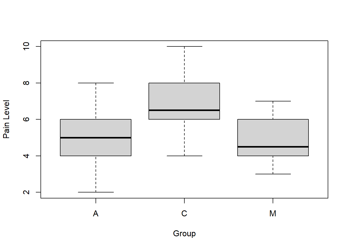
As a reminder, for a box plot in R:
- the thick line is the median of the data
- the “box” represents the interquartile range (IQR)
- the whiskers are the values of 1.5 times the IQR (this is adjustable)
- any additional points outside of that are shown as circles
So, given that, what do you see? What do you think about our research question and null hypothesis? Do you think that these three datasets have the same mean?
17.2.6 Guided Practice
For this practice exercise, use the built-in data set PlantGrowth. Type names(PlantGrowth) at the command prompt. What do you see? How big is the data set? How many observations are there? (hint use dim()).
This data contains results from an experiment to compare yields (as measured by dried weight of plants) obtained under a control (ctrl) and two different treatment conditions (trt1 and trt2).
- Determine how big the PlantGrowth dataset is, and what it contains.
- Calculate the mean and standard deviation of each group in the PlantGrowth dataset.
- Create a box plot of
weightas a function ofgroup.
17.2.7 Running ANOVA in R
(I’m doing this backwards from our previous approach. First I’ll show you the test in R, and then later we’ll talk about the calculations…)
As mentioned above, our null hypothesis is \(H_0: \mu_A = \mu_C = \mu_M\), i.e. that there is NO DIFFERENCE between the means of the three groups. Our alternative hypothesis is that at least one of the means is different.
The hardest part of ANOVA is that the math behind the test statistic is a bit complicated. Putting that aside for a bit (because R will do the calculations), we will follow our same overall framework and introduce a new null distribution along the way, the F distribution.
As a reminder, our hypothesis testing framework includes:
- Determine the null and alternative hypothesis
- Figure out our null distribution including appropriate parameters
- Choose the significance level and calculate the critical value
- Calculate our test statistic
- Compare the test statistic to the null distribution
- Calculate the p-value of our test statistic if \(H_0\) is true
- Draw our conclusion in context
Now let’s run the test, and then talk through the results. To do so we’ll use a couple of new R functions here:
aov()summary()- the
~operator, which means “as a function of” (actually we’ve seen this before.)
Below is the actual function call. aov() runs the analysis and summary() formats the output in an easy to read table.
##             Df Sum Sq Mean Sq F value Pr(>F)
## ap$type      2   29.6  14.800    5.02  0.014 *
## Residuals   27   79.6   2.948
## ---
## Signif. codes:  0 '***' 0.001 '**' 0.01 '*' 0.05 '.' 0.1 ' ' 1
Before we proceed too far here, let’s think of these results within our framework. What’s important to recognize is this table contains our null distribution, test statistic, and p-value.
For ANOVA we’ll using what’s known as an F distribution (probably one of the last one’s we’ll introduce this year) for our null distribution.
Let’s look at it’s shape for this particular test:
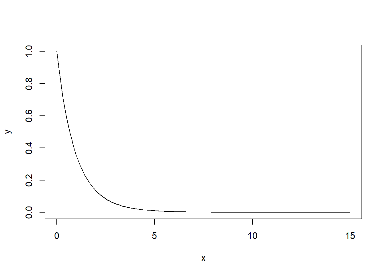
They don’t all have this shape, it depends on the parameters. An F distribution has two parameters, \(df1\) and \(df2\), (where “df” not surprisingly stands for degrees of freedom) in this case 2 and 27 respectively. I’ll explain where those values come from shortly.
Remember how we said the \(\chi^2\) distribution is the square of the \(N(0,1)\). That was great. The F distribution is the square of the t-distribution.
And similar to the GOF and \(\chi^2\) tests, under ANOVA we’ll only reject our \(H_0\) if our test statistic is too big, meaning we’ll only have one critical value.
In a later section I will explain the math behind all these numbers, (but its doubtful you’ll ever calculate them by hand).
So, what is our test statistic? It’s the F value from the output, here equal to \(5.02\). In ANOVA, the test statistic basically measures the amount of variance that exists between the means of three different groups (MSG) and compares that to (divides it by) the amount of variance that exists within each of the three groups (MSE). Remember, looking at the variance of the means of the three groups helps us evaluate if they are the same, which is our null hypothesis. We’ll go through more of the details behind the test statistic calculation below.
What’s most important here is (of course) the p-value which is shown under Pr(>F), in this case equal to \(0.014\). (Remember, a p-value from a hypothesis test always refers back to a null hypothesis, in this case equal means for each group or \(H_0: \mu_1 = \mu_2 = \mu_3\).)
Since the p-value is: “The probability of seeing a test statistic value as extreme as ours if the null hypothesis is true”, and since our p-value here is less than \(\alpha=0.05\), we will reject \(H_0\) and conclude there is a statistically significant difference between the average pain response the three treatments. (However, we can’t say which one yet. More on that in a bit.)
And, that’s it! At the most basic level you can now run an ANOVA test using the above function and interpret the results simply based on the table that is returned.
17.2.8 Guided Practice
Use the built-in PlantGrowth dataset, and run an ANOVA test of on the yield (weight) as a function of treatment.
- What are your null and alternative hypothesis here? Be explicit.
- Run an ANOVA test in R to evaluate your null hypothesis. What do you conclude and why?
17.2.9 Assumptions of ANOVA
It’s important to think about the assumptions of One-way ANOVA:
- Normality – That each sample is taken from a normally distributed population
- Sample independence – that each sample has been drawn independently of the other samples
- Variance Equality – That the variance of data in the different groups should be the same
- The dependent variable – “pain” or “hours” or “length”, should be continuous – that is, measured on a scale which can be subdivided using increments (i.e. grams, cm, degrees, etc.)
17.2.10 Quick Review and Summary
So far in this chapter we’ve looked at:
- understanding the format of data in R to easily create boxplots and run ANOVA, including a reminder of what a boxplot shows
- extracting subsets of data from a dataframe and evaluate the mean and standard deviation of individual groups
- explaining why ANOVA is needed to evaluate multiple means
- performing an ANOVA test in R and interpreting the results
17.3 The Whole Process
Let’s discuss the impact redlining has had in Seattle. See: https://depts.washington.edu/civilr/segregated.htm for reference.
“People who grew up in neighborhoods marked in Red in the 1980s… earn less today than those who grew up in areas marked as blue.”
An abbreviated map of seattle with redline districts and high schools is available here: https://www.google.com/maps/d/edit?mid=1kPnAYNS8T63pIsfALCo16FLUMFkbqvCn&usp=sharing. Please don’t modify the map!
Load the data from Canvas (files -> data) entitled “redline_schools.csv”. It contains data on graduation rates and percent POC for Seattle high schools, along with the 1930s redline designation for the specific school location.
- Inspect the data. What columns and rows exist? What does the data seem to represent? Are there any missing observations? What are the average graduation rates across all schools? What is the average percent POC across all schools? How much variation exists in the sizes of the schools?
- Create a box plot of percent POC as a function of redline designation. What do you observe?
- Create a box plot of graduation rates as a function of redline designation. What do you observe?
- Create a scatter plot of graduation rates (on the y-axis) against percent POC (on the x-axis). What do you observe?
- Perform an ANOVA test looking at whether there this is a significance difference in the graduation rates as a function of redlining designation. Be specific about your null hypothesis, p-value and conclusion.
- Inspect the original data. Which specific schools are probably leading to the conclusion that you reach? Optional: do some research on those schools. Does it seem appropriate to include them in the analysis? Why or why not?
- The redline designation given in the dataset is based on the specific location of the school, but not necessarily the whole area that feeds the school. You may want to refer back to the original map for details about this. Comment on whether this is appropriate and how the analysis might be improved.
- Pose another question you would like to ask about the impact of redlining, which may or may not be answerable with the given data. If not, be specific about what additional data you’d need to collect.
17.4 Optional: Understanding the Math Behind ANOVA
In this section we will work through all of the calculations of ANOVA and explain where the numbers in the ANOVA summary table come from. The value in working through this is that it should give you a better understanding of how the ANOVA test works.
For this section we will use a data set that describes the number of hours of HW worked per week by class.
Let’s load the data and create a boxplot of the results: (Note: The factor() function is used to designate a specific order for the different groups. The only purpose of doing this is so that the boxplot shows the groups in the desired order.)
## Load the data
homework <- read.csv("data/homework.csv")
## Order the groups so they boxplot x-axis shows as I want
homework$grade <- factor(homework$grade, levels=c("freshman", "sophomore", "junior", "senior"))
## Create the boxplot
boxplot(hours~grade, data=homework)
As said above, ANOVA calculates the “variance” that exists between the four means (in this case) and compares that to the “variance” that exists within each group.
I put “variance” in quotes because it’s not exactly the variance, but in fact the “sum of squares”, which is similar to variance but (as we’ll see) uses a different scaling. What ANOVA actually does is multiply each “variance” by the number of samples (or a function of that) to make sure a comparison can then be made against the appropriate F statistic.
Importantly, if the former (the between groups variance) is roughly the same as the latter (the within groups variance), then we fail to reject \(H_0\) and conclude that our means are likely the same. In this case, any differences we see are probably the result of random sampling. Alternatively, if the between groups variance is significantly larger than the within groups variance, then we reject \(H_0\) and conclude that (at least one of) our means are likely different.
Look at the following summary data including number of samples (\(n\)), sample mean (\(\bar X\)) and sample standard deviation (\(s\)) for each group:
| grade | freshman | sophomore | junior | senior |
|---|---|---|---|---|
| \(n\) | 12 | 12 | 12 | 12 |
| \(\bar X\) | 10.04 | 11.69 | 11.66 | 9.53 |
| \(s\) | 0.9 | 1.89 | 1.45 | 1.2 |
And here is the ANOVA output:
##                Df Sum Sq Mean Sq F value   Pr(>F)
## homework$grade  3  44.31  14.770   7.453 0.000386 ***
## Residuals      44  87.19   1.982
## ---
## Signif. codes:  0 '***' 0.001 '**' 0.01 '*' 0.05 '.' 0.1 ' ' 1
Let’s now go through where these numbers come from.
The first column in the summary output shows the degrees of freedom (Df). We have \(k=4\) different grades, so our “groups degrees of freedom”, shown as homework$grade is \(k-1 = 3\) degrees of freedom. Next, there are \(n=48\) total data points, so our Residuals degree of freedom is \(n-k = 44\).
Looking at the second column, we want to calculate estimates of both the within group and between group variability. To start, we’ll calculate the sum of squares. To get an estimate of the between group variability, and here we start by taking the four \(\bar X\) values (one per group) and calculating the variance among those.
## [1] 1.2342But, to make the comparison fair, we need to scale this. In this specific case, we’ll multiply this by 36.
Why 36? \(36 = 3*12\). There are \(k=4\) groups so we first multiply this by \(k-1=3\). Next, since there are \(n=12\) observations per group, we multiply it by 12 to further scale the result.
## [1] 44.4312which matches the first value in ANOVA output shown under the Sum Sq column.
To determine our estimate of the within group variability, we similarly start by calculating the variances from each of our four groups and then summing these together. Pulling the sample standard deviation values from the table we have:
## [1] 7.9246Again here, we need to scale this intermediate result, and in this particular case we’ll multiply by 11. Why 11? Again since there are \(n=12\) observations per group, so we multiple each by \(n-1=11\).
## [1] 87.1706which matches (within rounding) the second value in ANOVA output shown under the Sum Sq column.
For this class, you don’t need to worry about the details about exactly why we multiply by 36 and 11 respectively. Instead, what’s most important is to recognize that we’re scaling both measures of variability so that we can compare them.
In particular we’re evaluating and comparing the:
- Between group variation, by looking at the means of each group
- Within group variation, by calculating the variance within each group and then summing these.
To calculate the results in the next column, once we have our between groups and within groups sums of squares, we then divide each by the appropriate degrees of freedom (as shown in the first column) to determine our Mean Sq (mean square) values.
The Mean Square for grade is:
## [1] 14.77The Mean Square for Residuals is:
## [1] 1.981591Since we’re scaling these Mean Sq values by the degrees of freedom, you might think about these as an estimate of the average variability.
From there, to determine our test statistic, which is given in the next column, we divide the Mean Sq groups by the Mean Sq Residual value. And hence our test statistic (the F value) is:
## [1] 7.452069Of course, this number by itself isn’t that useful, as we need to know the null distribution to compare it against. In particular, we are using an F distribution with 3 and 44 degrees of freedom (as we saw above). Once we have this, we can calculate either the critical value to compare the test statistic to or we can find the the p-value itself.
To find the p-value by hand, we would use the pf() function (which is analogous to pnorm()) with the test statistic and appropriate degrees of freedom. Similar to our \(\chi^2\) testing, we only reject if the test statistic is too large, so we’ll always use lower.tail=F.
Here’s the function call in R:
## [1] 0.0003858626which matches the result in the last column of our ANOVA output, under Pr(>F).
In summary, what ANOVA does is to compare a measure of the variability that exists between the groups (using each group’s mean) to the variability that exists within the groups, and if this ratio is too large, we reject the idea that the means are the same.
17.5 Simulating ANOVA
In a further attempt to help you understand what ANOVA is doing, let’s do some simulation work. What if we took samples from three known distributions (i.e. where we control \(\mu_1\), \(\mu_2\), \(\mu_3\), and \(\sigma\)) and then saw what happened to our ANOVA results as the means diverged?
Note: We did a similar thing in our Kahoot, but didn’t look explicitly at the results.
See Sim_ANOVA.R script on Canvas. (also shown below…)
Some questions to consider:
- What happens to our p-value if you change the mean of one or more of the groups?
- How far can you change the means before you consistently reject \(H_0\)?
17.5.1 A Necessary Helper Function
The following function create.tst.data() creates a data frame from a set of three different vectors of data: d1, d2 and d3. It assigns them groups 1, 2, and 3 respectively. We’re doing this because R needs data formatted in a specific way to run ANOVA.
The three vectors of data (d1, d2 and d3) can be of any length and must be continuous data. The result will be the data frame that we will then test using ANOVA, under the null hypothesis of no difference between the means of the three groups.
create.tst.data <- function(d1, d2, d3)
{
  a <- cbind(rep(1, length(d1)), d1)
  b <- cbind(rep(2, length(d2)), d2)
  c <- cbind(rep(3, length(d3)), d3)
  my.dat <- rbind(a, b, c)
  colnames(my.dat) <- c("group", "data")
  as.data.frame(my.dat)
}
Make sure to include this code chunk in your R Markdown document and source it so the function is available to you.
17.5.2 Visualizing ANOVA Through Simulation
To start, let’s examine the case where the variability that exists between the three means is “small” compared to the variability within each group. In this case, we should fail to reject \(H_0\). As we’ll see in the box plot, the rectangles of each group will all encompass the means of the other groups.
To simulate this, I’ll first create the three different data sets (d1, d2 and d3) using rnorm() with slightly different mean parameters. Then I’ll use the above function to create my data frame.
# create d1, d2 and d3 with slightly different means
d1 <- round(rnorm(25, 20, 2), 3)
d2 <- round(rnorm(25, 19.9, 2), 3)
d3 <- round(rnorm(25, 20.1, 2), 3)

# use our above function to create a single data frame
my.dat1 <- create.tst.data(d1, d2, d3)

# create a boxplot
boxplot(data~group, data=my.dat1)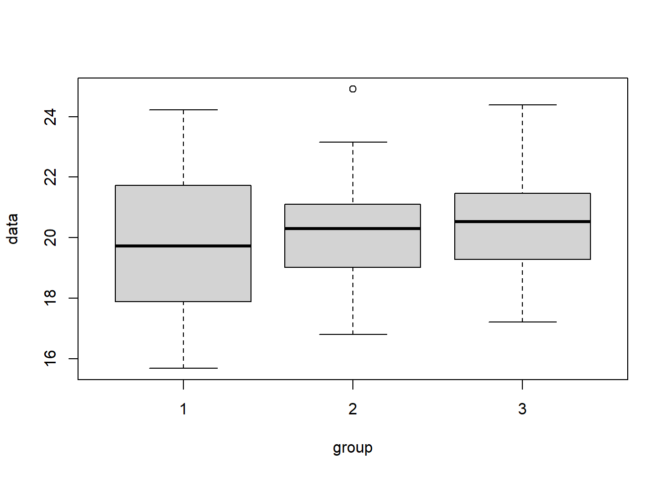
Now, let’s run our ANOVA test and print out the summary results:
##             Df Sum Sq Mean Sq F value Pr(>F)
## group        1   4.26   4.260   1.094  0.299
## Residuals   73 284.13   3.892
What do we observe? As expected, the average between group variability Mean Sq group is not that much bigger than the average within group variability Mean Sq Residuals, and so our test statistic is small and we fail to reject \(H_0\).
Now, let’s look at the case where the variability that exists between means is “large” compared to the variability within each group. Here, we should reject \(H_0\). As shown in the box plot below, the different rectangles of the box plots will be somewhat offset from one another.
d1 <- round(rnorm(25, 20, 2), 3)
d2 <- round(rnorm(25, 17.5, 2), 3)
d3 <- round(rnorm(25, 22.5, 2), 3)

my.dat2 <- create.tst.data(d1, d2, d3)

# create a boxplot
boxplot(data~group, data=my.dat2)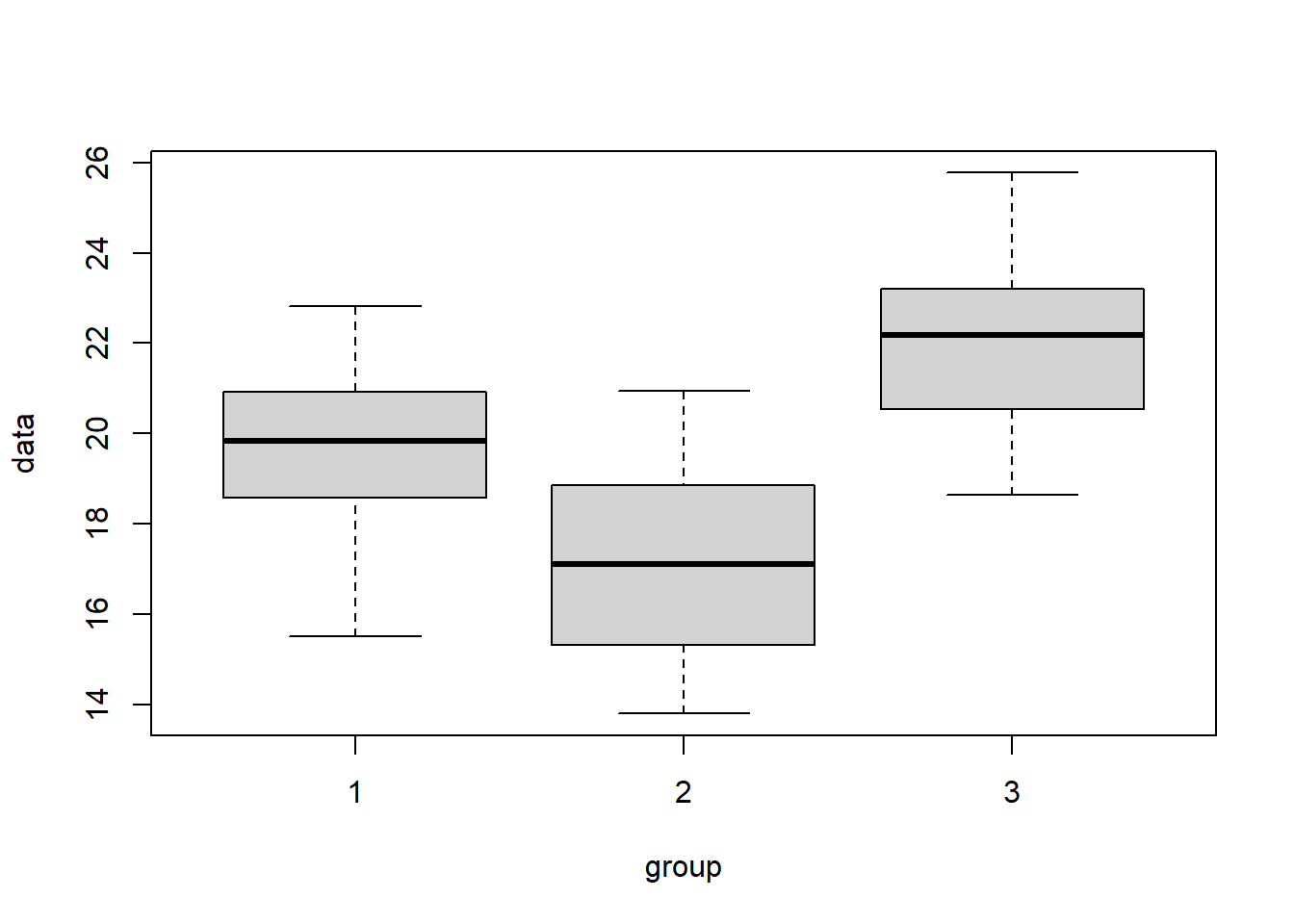
Again here, let’s run our ANOVA test and print out the summary results:
##             Df Sum Sq Mean Sq F value  Pr(>F)
## group        1   75.7   75.65   10.91 0.00148 **
## Residuals   73  506.2    6.93
## ---
## Signif. codes:  0 '***' 0.001 '**' 0.01 '*' 0.05 '.' 0.1 ' ' 1
Now what do we observe? Here, the average between group variability Mean Sq group is much bigger than the average within group variability Mean Sq Residuals, and so our test statistic is big and we reject \(H_0\).
17.5.3 Guided Practice
Now, I’d encourage you to experiment with the above code. Variations you might look at include:
- What happens as the means diverge? How far apart do they need to be before you consistently reject \(H_0\)?
- What happens if two means are the same and one is different? Do you typically reject or not? Why does your result make sense given \(H_0\)?
- What happens as you increase the sample sizes of each group, separately? What happens to the degrees of freedom and therefore average estimate of variability as the sample sizes increase?
- How does the sample standard deviations impact how far away the means can be (before rejecting \(H_0\))?
- What happens if one or more of the groups has a much larger standard deviation than the others?
17.6 Post-hoc Difference of Means Testing
The following data was introduced in the optional section on Understanding the Math Behind ANOVA and concerns the hours of homework worked per week for a sample of students in different grades. Here again is the boxplot and ANOVA output:
homework <- read.csv("data/homework.csv")
homework$grade <- factor(homework$grade, levels=c("freshman", "sophomore", "junior", "senior"))
boxplot(hours~grade, data=homework)
##                Df Sum Sq Mean Sq F value   Pr(>F)
## homework$grade  3  44.31  14.770   7.453 0.000386 ***
## Residuals      44  87.19   1.982
## ---
## Signif. codes:  0 '***' 0.001 '**' 0.01 '*' 0.05 '.' 0.1 ' ' 1
As we see, we reject our \(H_0\) that all means \(\mu_{fr} = \mu_{so} = \mu_{ju} = \mu_{sr}\) are equal and conclude that at least one of them is different. But then what?!
Ideally, we’d like to know which of these means are different, and do it in a more rigorous way than just looking at the boxplot.
In Latin, post hoc means “after this”.
To determine which groups are potentially different, we’ll proceed similar to how we would if we were just testing individual groups, but with a slight modification to our two sample t-test procedure AND a bit of caution as to what it all means.
As a reminder, a two sample t-test uses a t-distribution with an appropriate number of degrees of freedom as the null distribution. More details are available in Chapter 14.4.
Let’s look at the following table of summary results:
| grade | freshman | sophomore | junior | senior |
|---|---|---|---|---|
| \(n\) | 12 | 12 | 12 | 12 |
| \(\bar x\) | 10.04 | 11.69 | 11.66 | 9.53 |
| \(s\) | 0.9 | 1.89 | 1.45 | 1.2 |
Given this information, you could run a difference of means test between each pair of groups, but this wouldn’t be statistically valid. Why not?
To answer this, consider the following:
- How many pairwise tests would we need to run to compare all of these means? (You may need to write out all of the combinations.)
- If we had \(k\) groups, does anyone remember the general form of how many tests we’d need to run?
.
.
.
.
For the second question, if there are \(k\) groups, then there are \(\frac{k(k-1)}{2}\) possible comparison tests we might run. So, in our specific case with 4 groups, there are 6 possible comparison tests we might run. These incldue (because we don’t care about the order):
- Freshman v. Sophomore
- Freshman v. Junior
- Freshman v. Senior
- Sophomore v. Junior
- Sophomore v. Senior
- Junior v. Senior
(To remind you of the link back to Fall trimester, these are unordered groups.)
In fact, we will eventually run these six tests, HOWEVER as we said previously, this is going to distort our type I error rate. So, to fix this, we’ll apply a correction. We’ll also make a couple of other small changes to our procedure.
To introduce the approach, we’ll proceed ahead evaluating all possible pairs of means, with three important changes:
- Adjust our significance level in an attempt to ensure we don’t make a type I error,
- Use a different value of our standard error that accounts for ALL our data, as well as the corresponding degrees of freedom, and
- Be cautious about our interpretation of the results.
17.6.1 The Bonferroni Correction
As discussed above, if \(k\) is our number of different groups, then \(K = \frac{k(k-1)}{2}\) is the number of possible different pairwise tests we might run.
To guard against make a type I error, before running the post hoc difference of means test, we’ll use the so-called Bonferroni correction on \(\alpha\) and set \(\alpha^* = \alpha/K\). (Importantly, this doesn’t prevent us from making a type I error, it simply keeps our overall \(\alpha\) level where we want it.)
So, in our case, we have 6 possible pairwise tests and at \(\alpha = 0.05\), we’ll use a modified significance level for our post hoc tests of \(\alpha^* = 0.05/6 = 0.00833\) to evaluate if a meaningful difference seems to exist. This will cause us to adjust our critical values and the p-value below which we conclude a difference exists.
17.6.2 Using the Pooled Standard Error and Degrees of Freedom
The second change we are making is to use the so-called pooled estimate of the standard error.
If we were to simply run a t-test between two of the grade levels based on our summary results, we’d be leaving out half of the data. Because of small sample sizes, we know our estimate of \(\sigma\) isn’t great. We also know having more data leads to a better estimate of \(\sigma\). So, for post-hoc tests, we will use all of the data to determine our best estimate of \(\sigma\).
To overcome this, the pooled version of the standard deviation is calculated as the square root of the mean squared error (residuals). Again, here is our ANOVA call:
##             Df Sum Sq Mean Sq F value   Pr(>F)
## grade        3  44.31  14.770   7.453 0.000386 ***
## Residuals   44  87.19   1.982
## ---
## Signif. codes:  0 '***' 0.001 '**' 0.01 '*' 0.05 '.' 0.1 ' ' 1
Using results in the above table, we calculate the pooled standard error as the square root of the Mean Sq Residuals, or \(s_{pooled} = \sqrt{1.982} = 1.408\).
Finally, since we’re running a t-test, we also need to know the appropriate degrees of freedom. Here we will similarly use the “pooled” degrees of freedom, which is the Residuals Df = 44.
17.6.3 Running our Post-hoc Tests
Now, armed with our modified \(\alpha\) level and pooled \(\sigma\), we proceed using our previous difference of means test. I’ll do this first by hand, and then in a later section provide you with an R script.
For example comparing freshman to sophomores (and pulling data from the above table) we first find the point estimate of the difference between the groups as:
\[\bar x_{fr} - \bar x_{so} = 10.04 - 11.69 = -1.65\]
Next, we calculate our standard error, where we use the pooled standard deviation (\(s_{pooled}\)) in place of both \(s_1\) and \(s_2\) as:
\[SE = \sqrt{\frac{1.408^2}{12} + \frac{1.408^2}{12}} = 0.575\] Based on these two results, our test statistic becomes: \[\frac{-1.65}{0.575} = -2.870\] which we will compare to a t-distribution with 44 degrees of freedom.
This is two sided test. The implicit null hypothesis here is that the means are the same, and we will reject this \(H_0\) if the test statistic is too small or too large. Hence, to find the p-value we’d use:
## p-value: 0.00628647which looks small, but remember, we need to compare this against our modified \(\alpha^* = 0.00833\). Even so, we’d conclude the freshman and sophomores are statistically distinguishable in their amount of homework even at our modified \(\alpha^*\) level. Does this surprise you given the boxplot?
A complete analysis would then continue to test all other pairs of means in the same manner. You will do this below as Guided Practice and then homework.
17.6.4 Interpreting post hoc results
Above we said the third difference in our testing approach was additional caution about our conclusion.
For any groups that are found to be different using the Bonferroni correction, the best we can say is “there is strong evidence that groups X and Y are different”.
Of course based on the initial ANOVA, we can also say we rejected the null that all groups are the same. However, we need to be more cautious about conclusions related to specific comparisons of groups because that was done post hoc.
Note: it is also possible that we might not find any groups showing evidence of being different. This does NOT invalidate our ANOVA results and conclusion. It instead simply means that we were unable to identify which groups differ.
17.6.5 Guided Practice
Run a post-hoc test to evaluate if strong evidence of a difference exists between the average HW time of freshman and juniors.
17.6.6 R script to run post-hoc test of difference of means
Below is an R function to run a post hoc test. It takes as parameters the two means, sample sizes, pooled standard deviation, the residual degrees of freedom and the modified alpha level.
ph.diffmeans.test <- function(x.bar1, x.bar2, n1, n2, sp, df, alpha)
{
  cat("Post hoc test for difference of means:\n")
  cat(" point estimate:", round(x.bar1-x.bar2, 3),"\n")
  my.SE <- sqrt( sp^2/n1 + sp^2/n2)
  cat(" combined standard error:", round(my.SE, 3), "\n")
  my.z <- (x.bar1-x.bar2)/my.SE
  my.df <- df
  cat(" test statistic", round(my.z, 3), "with", my.df, "degrees of freedom.\n")
  cat(" critical values:\n")
  cat("   lower:", round(qt(alpha/2, my.df), 3), "\n")
  cat("   upper:", round(qt(1-alpha/2, my.df), 3), "\n")

  if (my.z > 0) {
    my.p <- 2*pt(my.z, my.df, lower.tail=FALSE)
  } else {
    my.p <- 2*pt(my.z, my.df)
  }
  cat(" p-value:", my.p, "\n")
  if(my.p < alpha) {
    cat(" is <", alpha, "so")
    cat(" strong evidence of difference\n")
  } else {
    cat(" is >=", alpha, "so")
    cat(" not statistically different\n")
  }
}
Again here is our summary data:
| grade | freshman | sophomore | junior | senior |
|---|---|---|---|---|
| \(n\) | 12 | 12 | 12 | 12 |
| \(\bar x\) | 10.04 | 11.69 | 11.66 | 9.53 |
| \(s\) | 0.9 | 1.89 | 1.45 | 1.2 |
So for example, to use this function on the example comparing freshman and sophomores (as we did above by hand) we’d use:
## Post hoc test for difference of means:
##  point estimate: -1.65
##  combined standard error: 0.575
##  test statistic -2.87 with 44 degrees of freedom.
##  critical values:
##    lower: -2.763
##    upper: 2.763
##  p-value: 0.006278197
##  is < 0.008333333 so strong evidence of difference
17.6.7 Guided Practice
Use the R script to run a post-hoc tests to evaluate if strong evidence of a difference exists between the average HW time of freshman and seniors.
17.6.8 What NOT to do.
It is NOT statistically valid to collect data, look at it, find the group with the biggest difference and then run a difference of means test at \(\alpha = 0.05\).
17.6.9 Review of Post-hoc Testing
Based on this section, you should be able to:
- Perform a post-hoc difference of means test to evaluate where a difference may exists
- Discuss how post-hoc testing is only appropriate after running an ANOVA
- Explain how/why (the three ways!) post-hoc testing differs from a hypothesis test:
- we use a different alpha level to base our conclusion
- we use a different standard error (the pooled value) and degrees of freedom
- not statistically valid as a hypothesis test, we don’t “reject” \(H_0\), we say there is “strong evidence of a difference”.
- we use a different alpha level to base our conclusion
17.7 The EDA and ANOVA Framework
The following lists the steps you might include in an analysis of data where ANOVA is appropriate.
Inspect the data: Determine the number of observations per group are there (be careful it’s not always the same!). Find the unique names of each group. Calculate each group’s mean and standard deviation.
Create a boxplot of the data, showing the response as a function of group. Write a few sentences about what you observe. Does it seem like the means are the same? Are there any obvious outliers? Is the spread (IQR) of each group about the same? This is important for our assumptions (see #3).
List and explain the assumptions of ANOVA. Be able to discuss if the assumptions seem met by a given data set.
Perform a statistical test in R to evaluate if there is a difference between the groups, including:
- State your null and alternative hypothesis? Be specific.
- Run an ANOVA test in R using the
aovandsummaryfunctions. Report out your test statistic, null hypothesis and p-value.
- Explain your conclusion, and not only whether you reject or fail to reject. Be specific about what it means within the context of the experiment being run.
- Perform a post-hoc analysis to determine which (if any) groups show “strong evidence of a difference”. (It’s ok to use the provided script for this.)
17.7.1 Guided Practice
The following data are taken from here: https://ourworldindata.org/grapher/co-emissions-per-capita-vs-gdp-per-capita-international-?country=LBR
- Load the data into R and inspect it. Create a box plot of per capita emissions as a function of continent. What do you notice? Are there any obvious outliers? Which points are those?
##                 Entity Code  Emission    GDP Population Continent
## 1                Qatar  QAT 46.186320 156299    2654000      Asia
## 2               Norway  NOR  8.379484  82814    5251000    Europe
## 3 United Arab Emirates  ARE 25.181911  75876    9361000      Asia
## 4               Kuwait  KWT 25.528392  71010    3957000      Asia
## 5            Singapore  SGP 11.174682  65729    5654000      Asia
## 6          Switzerland  CHE  4.666286  59662    8380000    Europe
What are the names of the columns? What does each column represent (to the best of your ability)? Print out the first few columns (hint: use the
head()function).Produce a boxplot of the per capita emissions as a function of continent. What do you notice? Which continents have the highest and lowest average per capita emissions? How much variation is there between the continents?
Run an ANOVA to evaluate if, on average, the continents have the same per capita emissions. Be specific about your null hypothesis, your p-value and your conclusion.
Run a set of post hoc tests (using the provided R script is fine) to determine which continents show strong evidence of differences from others.
(Challenge!) Create a new variable that is the per capita emissions per $ of GDP. Then evaluate whether this variable is on average different for different continents.
17.8 Review and Summary
17.8.1 Review of Learning Objectives
By the end of this chapter you should be able to:
- Understand the format of data in R to easily create boxplots and run ANOVA
- this will include a reminder of what a boxplot shows
- Extract subsets of data from a dataframe and evaluate the mean and standard deviation of individual groups
- this is also a reminder from our early work on EDA
- Explain why ANOVA is needed to evaluate multiple means instead of many pairwise tests
- Explain the assumptions needed for ANOVA to be used.
- Perform an ANOVA test in R using the
aov()andsummary()functions in R, along with the~character. - Understand how ANOVA works, in particular that it calculates at the “variation” between the means and compares this against the “variation” within each group. If the former is significantly larger, then we'll reject \(H_0\) that our means are the same.
- I put “variation” in quotes because we'll use a measure of variance but not exactly, technically the variance itself.
- Interpret the ANOVA output from R, and be able to report the number of groups and samples, explain the specific null distribution, and point out both the test statistic and corresponding p-value. Also, make an appropriate conclusion using the context of the original question, based on the p-value
- Perform a post-hoc test of means to evaluate where evidence of a difference exists and explain why post-hoc tests are not the same as a hypothesis tests
- Describe the three changes we make to our difference of means test when performing a post-hoc analysis
17.8.2 Summary of R functions
| function | description |
|---|---|
aov() |
computes the ANOVA |
summary() |
prints out a summary of the ANOVA results |
If my.data is a dataframe containing two columns, $group (which category or treatment) and $value (the continuous data measurement) where group is the category, then the following commands may be useful:
To extract the mean and standard deviation of group “A”:
mean(my.data$value[my.data$group=="A"], na.rm=T)  ## na.rm=T only needed if NA observations
sd(my.data$value[my.data$group=="A"], na.rm=T)
To find the number of observations in group “A”:
To create a boxplot of the values as a function of the groups:
To run an ANOVA testing if the means of the different groups are the same:
17.9 Exercises
Exercise 17.1 Load the data from Canvas (files -> data) entitled “homework.csv”. It contains data on hours of homework per week by grade for a sample of high school students.
- Inspect the data. What do you notice? How many data points are there? Which group works the longest on average? Which group works the shortest?
- Calculate the standard deviation of each group. One of the assumptions of ANOVA is that these are similar (or equal). Does this seem to hold?
- Create a box plot of the data, and in particular you should plot hours of homework as a function of grade. What are your observations?
- Run a hypothesis test at \(\alpha = 0.05\) to evaluate if there is a difference between hours of homework by grade. Be specific about your null hypothesis, your test statistic, your p-value and your conclusion.
- Create a plot of the specific F distribution based on your degrees of freedom (hint: use
df()) and add a vertical line to indicate where your test statistic is. Confirm that this is reasonable given your p-value.
- Calculate the difference in the means between each pair of groups. What does this analysis suggest?
Exercise 17.2 A boxplot shows the median and IQR. ANOVA is based on the mean and standard deviation. Comment about the conditions under which a boxplot is a good representation of the spread of the data.
Exercise 17.3 Simulate the F distribution for different numbers of groups (\(df1\)) ranging from 3 to 6, with a fixed number of observations (i.e. assume \(df2 = 48\)). What do you observe? (Hint: use the df() function to calculate the density of the F distribution.)
Exercise 17.4 The following image shows an ANOVA output from R comparing the average arrival delay for a number different airlines.
- What is the “inherent” null hypothesis in this test?
- How many different airlines were included in the study? How many total samples were taken?
- What is the value of the test statistic? What is the null distribution?
- Based on this output, what do you conclude?
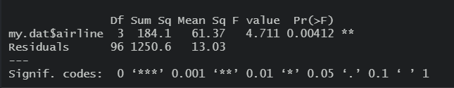
Figure 17.1: ANOVA output comparing average delay in arrival.
Exercise 17.5 Below again is the output for the audio_pain ANOVA. For this problem you will discover where the numbers in the ANOVA table all come from.
As a reminder it’s important to remember how variance is calculated. \[\sigma^2_x = \frac{1}{n} \sum (x_i-\bar x)^2\]
There are two components of this, (i) the fraction \(\frac{1}{n}\) and (ii) the sum of squares \(\sum (x_i-\bar x)^2\). In this problem, we’ll use the var() function in R to calculate the sum of squares, and then both scale up and manipulate the results.
First using the raw data, calculate the means and standard deviations of each group. Do the means seems similar? Does the assumption of equal standard deviations seem to apply? If needed, remind yourself of the different groups within the $type column using the
unique()command in R.Now, looking at the above ANOVA output, notice the column that is titled
Sum Sq, which stands for sum of squares. Let’s investigate where those values come from. First add those two values together. Next, calculate the variance of the whole $pain column (from the original data) and then multiply it by \(n-1\) (the total observations minus 1). What do you notice about this value compared to parta. Hint: they should be the same!Let’s now calculate the value of the Sum of Squares
Residuals. Calculate the variance of only the ‘A’ group and multiply it by the number of people in that group-1. As shown below, this should equal 30. Now, do the same thing for the other two types and add all three results together. What do you notice? Does this match anything on our ANOVA table?To find the Sum of Squares
type, first create a new vector that includes themeanof each treatment group, and then separately, calculate the overall mean of the pain data (hint: use all the data here.) We can find Sum of SquaresResidualstwo equivalent ways. One way is to use the variance of thepain.meansvector and scale it up. There are three (3) groups, so we first multiply by \(k-1\) and then since there are 10 children per group, multiply by 10. The other way is to calculate the sum of squares as the difference between thepains.meanand the overall mean, squared, scaled by the number of children per group. This is our estimate of how much variation exists between the three means.Next, let’s calculate the degrees of freedom. How many treatment groups \(k\) are there? The
typedegrees of freedom is \(k-1\). How many total observations \(n\) are there? TheResidualsdegrees of freedom is \(n-k\)Similar to how when we calculate variance we divide by \(n\), to get MSE (mean squared error) we divide the sum of squares by the appropriate degrees of freedom. Both the
typeandResidualmean square values are the respective sum of squares divided by their degrees of freedom. Prove this to yourself.The F value is the ratio of the
typemean square to theResidualmean square. Prove this to yourself.Now, given the F value, which is our test statistic, calculate the p-value using the
pf()function in R. Remember that we only reject if our test statistic is too big.
##             Df Sum Sq Mean Sq F value Pr(>F)
## type         2   29.6  14.800    5.02  0.014 *
## Residuals   27   79.6   2.948
## ---
## Signif. codes:  0 '***' 0.001 '**' 0.01 '*' 0.05 '.' 0.1 ' ' 1
Exercise 17.6 (Challenge!) Use the approach above to recreate the ANOVA output table for the built in R PlantGrowth dataset.
Exercise 17.7 Use post-hoc tests to evaluate if strong evidence of a difference exists between the average HW time of (i) sophomores and juniors and (ii) juniors and seniors. (Data is in “homework.csv” available on Canvas files->data.)
Do this both “by-hand” and using the provided R script.
Exercise 17.8 When running ANOVA on the “audio_pain.csv” dataset (avalable on Canvas files-> data), we rejected the null hypothesis of equal means with p=0.014. Use the ANOVA results and post-hoc testing methods (either by-hand or using the provided R script) to evaluate if and where any strong evidence of difference between three groups the exists. (Hint: you should run three different post-hoc tests.)
Exercise 17.9 Sort the following in order from smallest to largest:
Exercise 17.10 In a few sentences, explain why we use the pooled version of the standard error when running post-hoc tests.
Exercise 17.11 In a few sentences, explain why we need to use the corrected \(\alpha\) level when running post-hoc tests.
Exercise 17.12 Imagine a situation where you had 5 different groups to evaluate (A, B, C, D and E).
- How many total tests would you need to run to do all the pairwise comparisons?
- What would your overall type I error rate be if you ran all those tests? Be specific and quantitative.
Exercise 17.13 The Bonferroni correction adjusts the type I error rate based on the number of groups. We then use this corrected error rate within a t-test to attempt to see which groups might be different.
- Create a plot of the adjusted \(\alpha\) level as the number of groups, \(k\) increases from 2 to 10. Hint: first you will need to figure out the number of unique tests. What do you see?
- Then, assuming \(df=44\), plot the critical values for a one sided test as \(k\) increases from 2 to 10. Note that the critical value for \(k=2\) with \(\alpha=0.05\) would be
qt(0.95, 44). Explain what you see.
Exercise 17.14 The Gentoo, Chinstrap and Adelie penguins are closely related species of the Pygoscelis genus, generally living in the Falkland Islands and Antarctica.
To load the data for this exercise, you will need to run the code at the end of this exercise. This will create a penguins object you can evaluate. These data were collected from penguins observed on islands in the Palmer Archipelago near Palmer Station, Antarctica.
The data contains quantitative (continuous) and qualitative (discrete) information about a sample of each species. Can we use this information to distinguish between them?
- Inspect the data. What variables are present? How many observations are there? Which variables are quantitative and which are qualitative?
- Create different box plots of at least two of the quantitative variables. Based on the plots, does it appear that the average values across the three species are the same or different? Be specific.
- Run an ANOVA test to compare the mean result of your chosen quantitative variable as a function of species. What do you conclude and why?
Code to load the penguins object:
Exercise 17.15 Using the penguin data from the previous propblem and your chosen quantitative variable, run a post-hoc difference of means test to evaluate for which species there is strong evidence of a difference.