Chapter 2 Summary (Descriptive) Statistics
2.1 Overview
In this chapter we will start by discussing types of data, then move on to how we might summarize the data. We’ll look at two important types of summarize, one on where the middle of the data is, and the second on what a good measure of the spread of the data is.
It might seem trivial to think about where the middle of the data, lies, but do we mean halfway between the largest and smallest values OR the average (most likely) value OR the value that half of our observations lie above and half lie below. Similarly when we discuss the spread of the data, do we want to know the full range OR the range where most (95%) of the data lie? Or maybe we simply want a measure of how wide the range is?
As we’ll see, the answers to these questions will depend a lot on the context of the data and how we intend to use the result.
2.2 Data Types
2.2.1 Learning Objectives
By the end of this section you should be able to:
- Identify the types of data we commonly encounter and be able to classify observed data by type
- Define the following terms and give examples of data that comprise each: numerical, categorical, continuous, discrete, ordinal, nominal, boolean, and binary
2.2.2 Review of Types of Data
Generally, when we think about types of data we really mean “what form does the variable take?” Is it numerical, like the ppm of CO\(_2\) in the atmosphere, or a categorical descriptor like race, gender or party affiliation? If its numerical, is it continuous, meaning it can take any value such as temperature or unemployment rate, or discrete, meaning it can take, for example, only whole non-negative numbers, such as many counts of individuals do. Is money discrete or continuous?
While some variables are numerical, we really treat them as categorical, such as zip code. It wouldn’t make sense to manipulate those algebraically.
Categorical variables can also be either ordinal if there’s a natural ordering to them such as year in school (freshman, sophomore, junior, senior), or nominal if no obvious ordering exists, such as eye color or city.
Finally, we will also see cases where data are boolean namely T or F, and binary, such as Heads or Tails.
And note that the type of data we have is related to the type of data structure we’ll use to store the data (like string or character or integer or real), but its not exactly the same. For the most part there are obvious 1:1 correlations, but maybe not always.
2.2.3 Summary of Data Types
- numerical
- continuous
- discrete
- categorical
- ordinal
- nominal
- binary
- boolean
2.2.4 Guided Practice
Select the best variable data type for the following data:
- number of Orca in Puget Sound
- age of individual Orcas
- the associated Pod (J, K or L) of an individual Orca
- daily water temperature of Puget Sound
- season of the year
- whether an individual Orca is pregnant or has given birth
- sex of an individual Orca
- the value of Orca to the Puget Sound Economy
2.2.5 Summary
In this section we began by discussing data types, which we will come back to throughout the year. Of importance, the type of visual and/or statistical analysis we’ll do often depends on the data type.
2.2.6 Review of Learning Objectives
By the end of this section you should be able to:
- Identify the types of data we commonly encounter and be able to classify observed data by type
- Define the following terms and give examples of data that comprise each: numerical, categorical, continuous, discrete, ordinal, nominal, boolean, and binary
2.3 Measures of Central Tendency
Now, given our understanding of types of data, we will move on to useful summary or descriptive statistics.
In this section we’ll be reviewing common “statistics” we apply to data, and in particular we will start with those which help measure the middle or average of the data. Many of these will be familiar to you.
A summary statistic is, quite simply, a single valued number that summarizes or describes some aspect of the data. That could be a measure of the central tendency, e.g. the mean, or as we’ll see in the next section, the spread/variability of the data, e.g. the variance, or something else, like the min or max.
Here and in the next section we’ll discuss the calculations behind these common summary statistics, discuss when its appropriate to use each, and learn how to use R to calculate them.
So, what is a good estimate for the “middle” of our data? What are the differences between the mean, median and mode? Why would we use one vs. the other?
2.3.1 Learning Objectives
By the end of this section, you should be able to:
- Describe what the mean, median and mode each represent and know generally how to calculate each
- Recognize the statistical/mathematical formulation of the mean
- Calculate the mean, median and mode in R
- Select the appropriate measure of central tendency to use in different situations
- Explain why the median is more robust than the mean to individual data points
- Optional: Explain and demonstrate the use of the geometric mean
2.3.2 Mean, Median and Mode
| Name | What it represents | How it’s calculated | R function |
|---|---|---|---|
| Mean | the average value of the data | Sum all points together and divide by number of points | mean() |
| Median | the value for which half the data lie above, and half lie below | Order the points and pick the middle one | median() |
| Mode | the most frequent value | Sort and count the data and pick the value that occurs most often | (no standard function) |
As we’ll see, which exact summary statistic we’ll use will typically depend on what specific question we’re asking of the data.
- For example, maybe we want to have an estimate of the most likely result, or
- Maybe we want to know about the center of the distribution
2.3.3 Calculating the Arithmetic Mean: using R
The arithmetic mean, or simply the “mean” is what’s commonly considered the average. Take the values, add them up, and then divide by the number of samples.
Imagine the following set of data representing test scores of 15 different students: {93, 89, 99, 95, 78, 81, 83, 94, 75, 98, 87, 94, 96, 94, 89}.
You could put these numbers into your calculator, one at a time, add them and then divide by the total number. Or we can do this in R.
The first thing I’m going to do is create a variable called ‘scores’ and then assign the list or vector of values. The c() function in R means combine. So here we combine the scores into a vector and then assign it a name using the <- characters which I’ll call “gets”.
Now scores is a variable within your current R session that you can manipulate.
R has a huge number of useful “built-in” commands. For example, we can find the length of a vector using length():
## [1] 15Here we have passed the vector scores to the function length().
We can similarly find the sum of a vector using sum():
## [1] 1345And we can do all sorts of mathematical calculations, such as:
## [1] 89.66667Hence our average test score was 89.6666667.
A simpler way to do this is to use the built in mean() function as:
## [1] 89.66667Note: For more information on vectors and data frames and building test conditions, see Appendix A.
2.3.4 Calculating the Arithmetic Mean: Notation
How do we represent the mean mathematically?
Let’s suppose we had a list of data in a vector, as above, and we’ll use the notation \(x_1, x_2, \ldots\). So above \(x_1 = 93\), \(x_2=89\), etc. We’ll also let \(n\) be the total number of observations, which is also the length of the vector, so in this case \(n=15\)
Formally, we’ll write this as:
\[\bar{x} = \frac{1}{n}\sum_{i=1}^n x_i \]
What does this formula mean? And, maybe first, what are all of these symbols?
- \(\bar{x}\) is read as ‘x bar’ and is the calculated sample mean
- \(i\) is an index into the observations
- \(\Sigma\) represents ‘sum’
- \(x_i\) is the \(i^{th}\) observation of variable \(x\)
- \(n\) is the number of observations
2.3.5 Sample vs. Population Mean
Note: We sometimes will also refer to the mean as \(\mu\), and that gets a little bit into the differences between a sample and a population.
For example, suppose we wanted to know the average height of all 12th graders in WA state. There is a “true” value, \(\mu\), but it’s obviously hard to find. We could pretty easily measure the heights of everyone in this class, or maybe even all seniors at EPS, and we’d call either of these \(\bar x\), but obviously that’s only a sample, an estimate of the true value. Part of what we’ll do later in this class is figure out how to use the sample to represent the whole population, how good of an estimate it is, etc. but that’s getting a little ahead of ourselves.
2.3.6 Median
The median is the middle of the data. Half lies above and half lies below. Think of the median as the line in the middle of the road.
If \(n\) is odd, then its the middle number of the data set, when ordered numerically. If \(n\) is even, then its the halfway point between the two middle values.
The median is a bit harder to both explain the notation and calculate by hand. In R, there is a sort() function which helps:
## [1] 75 78 81 83 87 89 89 93 94 94 94 95 96 98 99And then, we can access the 8th element (since there are 15 total values)
## [1] 93The square brackets allow me to access a certain element of a vector.
A simpler way to do this is to use the built in median() function as:
## [1] 93Here’s an example of using the median: See: https://www.seattletimes.com/seattle-news/data/think-seattles-rich-this-eastside-city-tops-census-list-of-richest-u-s-cities/ Why does using the median make sense here?
2.3.7 Mode
Simply, the most frequent value in a data set. An easy way to do this in R is to use the table() function:
## scores
## 75 78 81 83 87 89 93 94 95 96 98 99
##  1  1  1  1  1  2  1  3  1  1  1  1
Where we can see that 94 has the most frequent result, it occurred 3 times.
One potential issue with calculating the mode is that there may be more than 1!
2.3.8 Guided Practice
The following data represent daily high temperatures in Seattle for July of 2019 (in F):
temps <- c(71, 71, 69, 71, 69, 72, 71, 70, 70, 71, 82, 76, 74, 73, 74, 82, 82, 77, 80, 83, 83, 81, 72, 72, 71, 72, 72, 71, 72, 72, 73)
length(temps)
## [1] 31- What are the mean, median and mode? (Do I need to walk them through this more slowly?)
- Also experiment with the
mean()andmedian()functions in R. Can you guess what they do? Do you get the same answers when you do it “by hand”?
2.3.9 Questions?
How did that go for you? What worked well and where did you struggle?
R is very particular about syntax (i.e. exactly how you type things) You can’t make spelling errors. You have to use the right type of parenthesis or bracket.
Look at the error message. Use the built in help. What I show below opens up the help for the mean function in the lower right window of RStudio.
2.3.10 Mean, Median or Mode?
Why would you use one vs. the other? How do you choose?
Let’s do an example, about income levels. What if income for a sample was (in thousands) 30, 35, 40, 50, 100, 1200.
- What is the mean? What is the median?
- Which is more useful?
And the answer of course is always, to what end? What are you trying to accomplish? analyze? understand?
Which would you use in the following situations:
- projecting annual return of the stock market
- understanding the distribution of house prices
- analyzing previous sales of electric cars (units)
- quantifying historical rainfall (& snowfall) levels
- investigating # of annual death for mass shootings in the US and elsewhere
- calculating the average # of people seeking refuge in the US or being deported back out of the US
and hopefully for each of these you see that there’s not necessarily an obvious choice.
- Can someone give an example of why would you want to use the mode?
2.3.11 Optional: Geometric Mean
There’s one other measure of central tendency that might be of value to you. Let’s suppose we’re looking at stock market returns and want to calculate our average return over a number of years. How might we quantify that?
Here’s an example. Suppose we saw the following returns over the last 8 years:
where a +1% return is indicated as 1.01 and a -2% return is indicated by 0.98. If we started with $1000, how much would I have after 8 years?
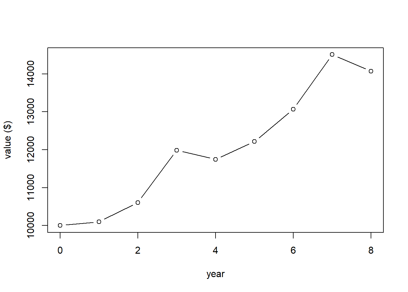
What this plot shows is the value of our account at the end of different years.
If I wanted to calculate the value of our account at the end of 8 years I could do it as:
## [1] 14071.07Now, getting back to the average return, I could certainly take the mean() of these different annual returns, but that has a problem. Anyone know what?
## [1] 1.045What I really want to know is “what is the constant return that if I received every year, my end result would be the same as above, namely $14071.07?”
Does the mean value give this? We can find
## [1] 14221.01which is in fact a bit more than our actual return.
The geometric mean in this case is found as:
## [1] 1.043616Or more simply as:
## [1] 1.043616and here we see:
## [1] 14071.03which matches (within $0.04) our observed return. So said differently, if we had received a constant 4.3616% return every year (exponential growth), our overall return would be the same as our observed return.
And here’s our plot again, showing the average return in green, and note that our initial value in year 0 and final value in year 8 both match.
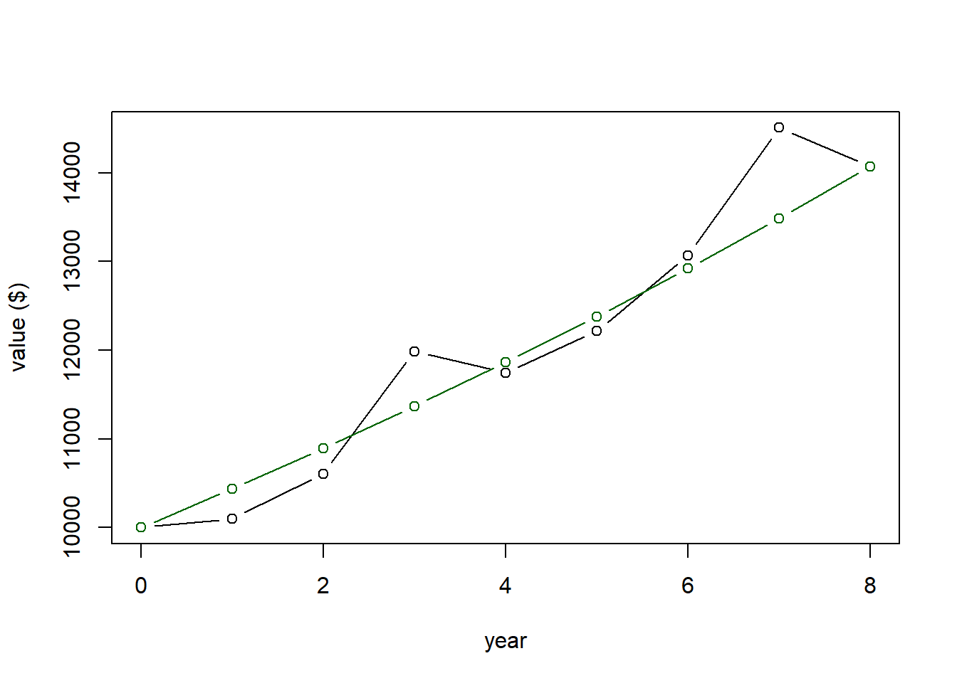
More generally we can write the geometric mean calculation as \[ \bar r = 1- \sqrt[n]{\prod_{i=1}^n (1+r)} \]
2.3.12 Guided Practice
Rates of increases for COVID infection per week over the course of two months in a certain location are given in the following block. A value of 1 means no change, values greater than 1 are increased rates and values less than 1 are decreased rates. An increase of 21% is represented by a value of 1.21. A decrease of 2% is represented by a value of 0.98. What is the average rate of infection over this timeframe?
2.3.13 What does Robust mean?
- What happens if we change one point in a dataset? Let’s go back to the scores data and recalculate the mean and median?
2.3.14 Summary
In this section we looked at different ways to measure the ‘middle’ or average of the data including the mean, median and mode. We discussed the technical details of the calculations and how to do these calculations in R. We also considered situations in which someone might choose one statistic vs. another. Hopefully you recognize the answer is “it depends!” and in particular on how the result will be used, and on what the question is that you are trying to answer. We also saw how the median is more robust to extreme values, and how for symmetric distributions how the mean and median are often the same.
2.3.15 Review of Learning Objectives
By the end of this section, you should be able to:
- Describe what the mean, median and mode each represent and know generally how to calculate each
- Recognize the statistical/mathematical formulation of the mean
- Calculate the mean, median and mode in R
- Select the appropriate measure of central tendency to use in different situations
- Explain why the median is more robust than the mean to individual data points
- Optional: Explain and demonstrate the use of the geometric mean
2.4 Measures of Variability
2.4.1 Overview
What we’ve done so far is to look at ways to quantify the middle of the data (center, average, most likely value, etc.), but obviously there’s more to our data than just that.
Here is a histogram of the scores data we previously looked at:
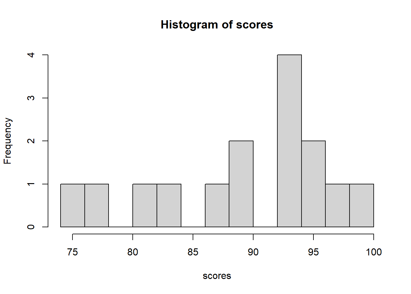
First, is everyone comfortable with a histogram? It shows the counts of various results. We said the mean of this data was 89.67. Does that tell the whole story? If not, what is missing?
So when we look at a histogram, what are the features we notice? Answers could include:
- peak or mode
- range, min, and/or max
- whether the distribution of the data is flat or maybe grouped?
In this section, we’re going to focus on the spread or variability of the data, including examining how the data are distributed, and how we might quantify and or summarize this. We’ll show how to calculate this spread a couple of different ways and discuss the advantages and disadvantages of each.
2.4.2 Learning Objectives
At the end of this section, you should be able to:
- Create a histogram of a given data set and explain what the histogram shows. Also discuss how bin width impacts the shape of the histogram and describe the difference between density and frequency.
- Calculate min, max and range of a data set in R
- Discuss what percentiles are and calculate them in R using the
quantile()function - Describe how variance uses all of the data to calculate its measure of spread
- Recognize the statistical/mathematical formulation of the variance
- Explain the relationship between variance and standard deviation, and the units of each
- Sketch where the standard deviation appears in a histogram
- Calculate variance and standard deviation of a data set in R
- Determine how many standard deviations away from the mean an observed value is
- Figure out, based on our “rules of thumb”, what percentage of the distribution lies above or below a given value
- Explain what Interquartile Range (IQR) is and how to calculate it in R. Distinguish between the boundaries and the width of an interval like IQR
- Create a box plot in R. Describe what a box plot displays
- Defend the use of different measures of variability in different situations
2.4.3 Min, Max, Range, and more in R
How would you find the range of the scores data? And is range a good estimate of the spread? Why or why not?
To start, how would you find the minimum value? Hint: We’ve already seen the sort function and we know how to extract a certain element using the [] brackets.
There are multiple ways we might do this. For example, should we store the sort() results as a new vector or should we simply access the first element of the sort result? Compare:
## [1] 75with
## [1] 75So the answer is, it doesn’t matter (unless you’re trying to find the fastest approach). This is not a programming class (although we will use a lot of R). Make your code readable to you.
The maximum can similarly be found. But how do we access the last value? Here it is the 15th value of the sorted list. Or, more generally, we saw above that n = length(scores). So, the last value of an array can be found using:
## [1] 99The interval of {75, 99} is a pretty useful summary of the data.
We might also be interested in the range, which is the width of the (min, max) interval. Remember that R is a calculator. So we can type
## [1] 24which is the range.
And yes, there are built in functions min() and max() that you’ll play with in the guided practice below.
2.4.4 Percentiles
Another thing that tells us about the how the data are distributed is where different percentages lie. Remember, the median is the point where 50% of the data is above the median and 50% of the data is below. But what if we wanted a different percentage? Like 5% or 95%?
If we knew where these points were, it could tell us something about any grouping or clustering that existed.
To figure this out, we could sort the data, and count. More easily, in R we use the quantile() function.
## 5%
## 75
which means that 5% of the data lies below 75.
Similarly,
## 95%
##  99
which means that 95% of the data lies below 99.
Note that I’m using 0.05 to represent the 5th percentile and 0.95 to represents the 95th percentile. Do these results make sense given our histogram?
hist(scores, breaks=10)
abline(v=quantile(scores, 0.05, type=1), col="blue")
abline(v=quantile(scores, 0.95, type=1), col="blue")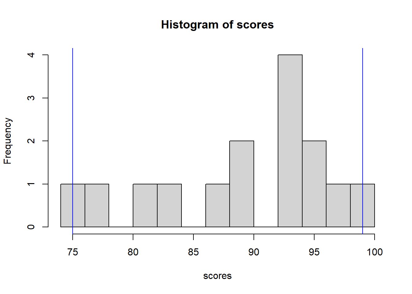
What I’ve done here is add the 5% and 95% values as blue vertical lines on the plot. 90% of the data fall within this range (because 95%-5% = 90%).
As an aside and on a technical note, there are different ways to interpolate where these percentiles lie. We won’t delve into those details, but feel free to search the quantile help for more details.
2.4.5 Guided Practice
- Calculate the min, max and range, for the
tempsdata. - Did I mention that
min(), andmax()are also built in functions? Do it both ways to show it works. - Calculate the 2.5% and 97.5% percentiles for the
tempsdata. Hint: for thequantile()function, use decimals, not percentages. How much of the data falls within this range? - Create a histogram of the
tempsdata in R.
Q: Which is more useful, the full range of the data or the middle 90th interval? A: It depends on the distribution!
2.4.6 Sample Variance
As we saw previously, one of the easiest ways to measure spread is using the range = max-min, but it left us a little dissatisfied because it didn’t tell us much about the distribution of the data inside or within that range.
Instead, we might want a statistic that measures how grouped or clustered the data are around the mean. As you may have noticed, the range is only based on two of the data values. We’d rather have something that summarize the spread across all of the data.
What we’re going to do is calculate \[ s^2 = \frac{1}{n-1}\sum_{i=1}^n (x_i-\bar x)^2 \]
which you’ll notice is similar to our equation for the mean. As a reminder
- \(s^2\) is our sample variance
- \(n\) is the number of data points
- \(i\) is an index that goes from 1 to \(n\)
- \(x_i\) is the data point \(i\)
- \(\bar x\) is the mean of the \(x\) data
- \(\sum\) represents the sum
What’s different here is that for each data point, we’re calculating the distance between that data point to the mean (\(x_i-\bar x\)), squaring that distance, and then adding all those squared distances together. Finally we’re dividing the sum by \(n-1\).
By doing this, we’re getting an estimate of how big the spread of the data is.
In this equation, \(s^2\) is known as the sample variance.
To determine this in R we could use:
## first calculate the mean
x.bar <- mean(scores)

## then calculate a vector that has all of the squared distances
sqdist <- (scores-x.bar)^2

## lastly, sum up all of the squared distances and divide by length-1
sum(sqdist)/(length(scores)-1)
## [1] 55.09524This is the long hand way. Of course there is also a short hand way
## [1] 55.09524I did it both ways so you could see they are the same.
2.4.7 Interpreting Variance
OK, but what does that number really mean? Well, in fact its a little complicated. Look back at the equation and we see that its the sum of squared difference between each observation and the mean. Focus here on the idea of squared. And so the units of variance aren’t in the same units as our test scores, like the mean is, but instead variance has units of “test scores squared”. That’s probably a little confusing and doesn’t seem immediately helpful.
So, how might we convert the variance to meaningful units? Any guesses?
2.4.8 Sample Standard Deviation
The answer is to take the square root of the variance, and when we do that we have get the standard deviation. It has the same units as the original data. As such it’s a pretty useful indicator of the spread of the data.
So the equation is:
\[ s = \sqrt{s^2} = \sqrt{\frac{1}{n-1}\sum (x_i-\bar x)^2} \]
and of importance here we take the square root as a last step, after we’ve done all the sums and division.
To calculate this in R, we use (I’ll just show the short hand here):
## [1] 7.422617which again has units of the original data. It’s a measure of how far the data are away from the mean.
2.4.9 Visualizing Standard Deviation
Here’s another version of our histogram of our scores data:
hist(scores, breaks=10)
abline(v=mean(scores), col="blue")

abline(v=mean(scores) - sd(scores), col="red", lty=2)
abline(v=mean(scores) + sd(scores), col="red", lty=2)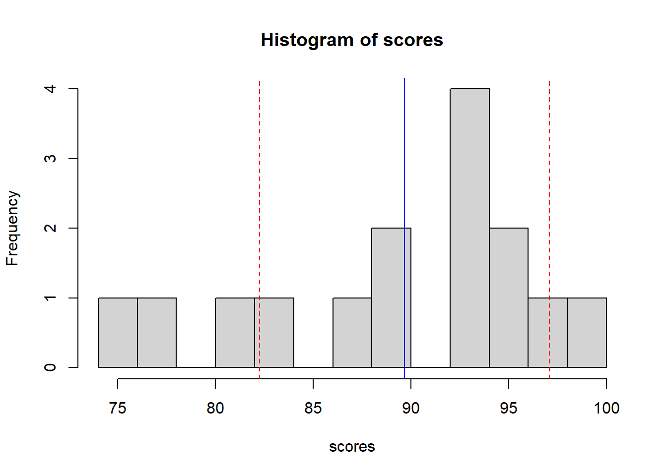
where the solid blue line shows the mean and the dashed red lines show the mean +/- 1 standard deviation. We will do a lot this year with the idea of “mean plus or minus a certain number of standard deviations”. For this scores data, this interval is {82.24405, 82.24405}.
As a general rule of thumb, about 66% of data will fall within one standard deviation of the mean, about 95% of the data will fall within two standard deviations of the mean, and about 99% of the data will fall within 3 standard deviations of the mean.
It’s because of these rules of thumb that standard deviation is useful. And remember, it represents a horizontal distance on the histogram. It’s a measure of spread.
2.4.10 Some Rules of Thumb
Later in the course we’ll learn how to calculate these more precisely for different distributions and under different assumptions, but for now, as long as our data are fairly well behaved, we can assume:
| interval | percent of data |
|---|---|
| \(\mu \pm 1*\sigma\) | 68% |
| \(\mu \pm 2*\sigma\) | 95% |
| \(\mu \pm 3*\sigma\) | 99% |
The multipliers here (1, 2, 3) are z-scores (which we’ll discuss more later).
It can be more useful to visualize this graphically than to look at the table. Below is an idealized distribution of simulated data with mean \(\bar x = 15\) and standard deviation \(s = 4\). The orange lines show the bounds of the 68% interval {11,19}, the red lines show the bounds of the 95% interval {7,23} and the purple lines show the bounds of the 99% interval {3,27}.
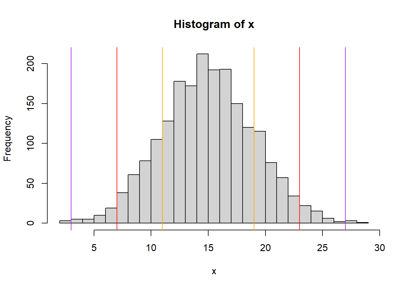
Another important takeaway from this is the idea of a back and forth relationship between the range of \(x\) values and the percentage of the distribution contained within that range. We’ll see this throughout the year when we discuss ideas such as:
- what is a 95% confidence interval on a range for our data?
- what is the probability of seeing a certain value?
2.4.11 Guided Practice
For a distribution with mean \(\bar x = 20\) and standard deviation \(s=2\), using our rules of thumb:
- What are the bounds of the interval where the middle 99% of the distribution lies?
- What percent of the distribution lies above 20?
- What percent of the distribution lies below 16 or above 24?
- What percent of the distribution lies between 18 and 20?
2.4.12 How Many Standard Deviations Away
Let’s suppose we have some generic data, \(x\) which has the following distribution:
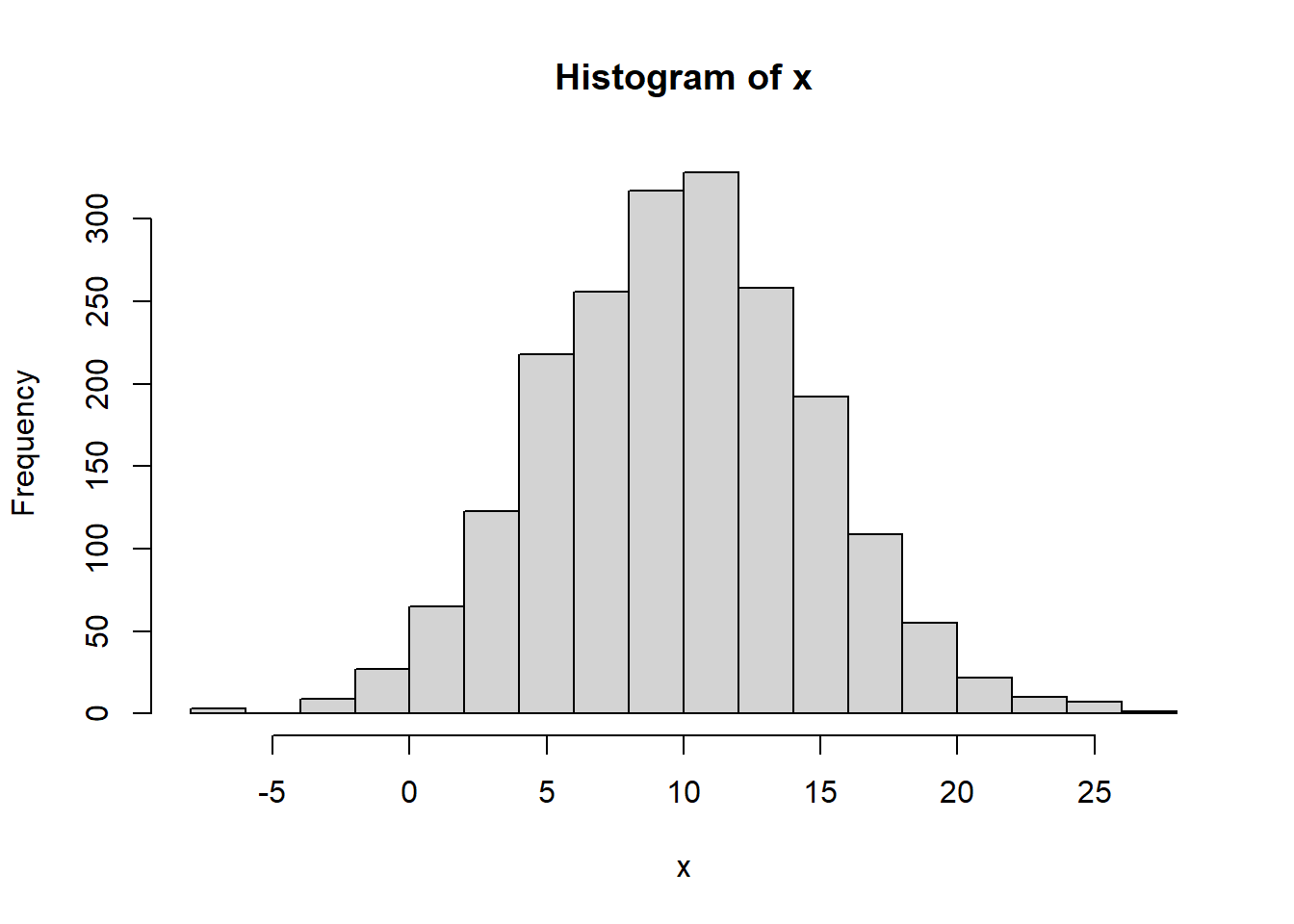
First, let’s calculate the mean \(\bar x\) of x and the standard devation \(\sigma\) of x.
## [1] 9.870335## [1] 4.88563Now, for this data set, how many standard deviations away from the mean is an observed value of 18? And note here we’re not asking how far away from the mean in $ or units, but instead “how many standard deviations away?”
To figure out how many standard deviations a certain value is from the mean, we’ll use \[z=\frac{x-\mu}{\sigma}\]
and we’ll call this our z-score. In this case we find:
## [1] 1.6639952.4.13 Guided Practice
For a well behaved distribution with mean \(\mu=8\) and standard deviation \(s=2.5\),
- How many standard deviations away from the mean is a value of \(x= 6\) ? (i.e. what is the z-score)
- How many standard deviations away from the mean is a value of \(x= 8\) ? (i.e. what is the z-score)
- What is the interval that contains approximately 95% of the distribution?
- What is the value that 2.5% of the distribution lies above?
- What is the value that 16% of the distribution lies below?
2.4.14 Interquartile Range (IQR)
The final measure of variability we’ll discuss this chapter is the Interquartile Range, (IQR) which is the interval that describes where the middle 50% of the data lie. We previously used the quantile() function to find the data associated with a certain percentiles of the distribution.
What’s new here is we will calculate the range between the 25% and 75% quantile. And since they’re the 1/4 and 3/4 points, we call them quartiles. Confusing, I know.
In R, we find this as
## 25%
## 83## 75%
## 95Or we can use the built in R function, which just gives you the width of the interval but not the bounds.
## [1] 12where 12 is 95 minus 83.
Note that IQR is to median as variance is to mean, and in particular the IQR is based more on the sorted order of the data and not really all of the individual data values.
IQR should be in your toolbox, just like median. There are certain types of data and analysis for which the IQR is standard, such as ANOVA (which we’ll explore later in the year).
2.4.15 Box plots
Along with IQR, there’s a common plot that’s focused mostly on visualizing this measure of variability. It’s called a box plot and here’s a box plot of the scores data
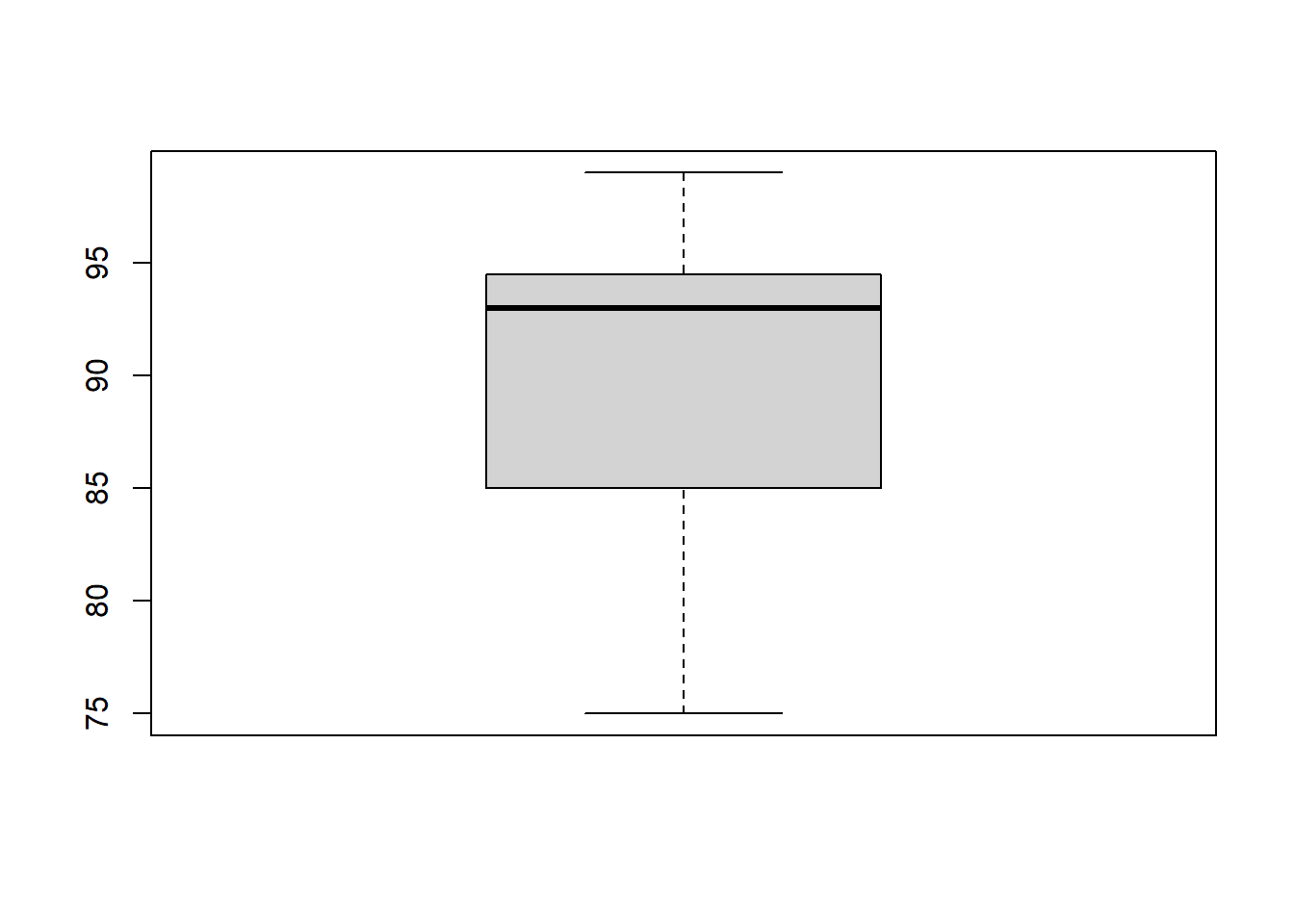
A box plot a lot of summary information in a single plot, but doesn’t give you details of the individual data points, like a histogram does. In particular, we see:
- the median (dark middle line),
- the IQR (the edges of the solid rectangle),
- up to 1.5 times the IQR in each direction if any data are within that (the whiskers), and * any data outside of that (shown as circles).
Why might this be useful? (Discuss)
We’ll come back to this more once we’re comparing two groups, as it can often be useful to see box plots side by side.
2.4.16 Guided Practice
- Calculate the variance and standard deviation for the
tempsdata. Do it both ways for variance to get practice with R and show the built in function works. - Calculate the 25% and 7.5% percentiles for the
tempsdata. Then calculate the IQR. Do the interval and calculated width match?
- Create a box plot for the
tempsdata.
2.4.17 Which measure of variability?
So which should you use? As with our discussion of the average, the answer is “it depends”.
What does robust mean in this video? And what does skew mean?
2.4.18 Review
So in this section we discussed a variety of approaches to looking at the amount of variability that exists within a data set, including range, standard deviation, variance and percentiles/quartiles. We also tied this back to the idea the best approach, depends on the distribution, but generally we’d like to know clustered the data are around the mean.
2.4.19 Review of Learning Objectives
At the end of this section, you should be able to:
- Create a histogram of a given data set and explain what the histogram shows. Also discuss how bin width impacts the shape of the histogram and describe the difference between density and frequency.
- Calculate min, max and range of a data set in R
- Discuss what percentiles are and calculate them in R using the
quantile()function - Describe how variance uses all of the data to calculate its measure of spread
- Recognize the statistical/mathematical formulation of the variance
- Explain the relationship between variance and standard deviation, and the units of each
- Sketch where the standard deviation appears in a histogram
- Calculate variance and standard deviation of a data set in R
- Determine how many standard deviations away from the mean an observed value is
- Figure out, based on our “rules of thumb”, what percentage of the distribution lies above or below a given value
- Explain what Interquartile Range (IQR) is and how to calculate it in R. Distinguish between the boundaries and the width of an interval like IQR
- Create a box plot in R. Describe what a box plot displays
- Defend the use of different measures of variability in different situations
2.5 Summary of R functions we’ve learned so far
| function | description |
|---|---|
<- |
used to assign data to a variable |
c() |
combines elements into a vector |
sum() |
calculates the sum of a vector |
length() |
returns the number of elements in a vector |
mean() |
calculates the arithmetic mean of a vector |
median() |
calculates the median of a vector |
table() |
creates a frequency table for a vector |
sort() |
sorts a vector in ascending order (by default) |
prod() |
calculates the product of all values in a vector |
hist() |
plots a histogram of a set of data |
abline() |
adds a vertical or horizontal line to a plot |
min() |
returns the minimum value of a vector |
max() |
returns the maximum value of a vector |
sd() |
calculates the standard deviation of a vector |
var() |
calculates the variance of a vector |
sqrt() |
calculates the square root |
quantile() |
determines the given percentile of a data set |
IQR() |
calculate the Interquartile Range of a data set |
boxplot() |
plots a box plot |
plus:
- A vector is an array or list of data.
- A vector is composed of different elements.
- To access a vector, simply type its name.
- To access or change individual elements within a vector use square brackets [].
2.6 Exercises
Note: These are not required and will occasionally be used during class as warm-up exercises or no-stakes quizzes.
Exercise 2.1 Select the best variable data type for the following data. And for each, indicate if it is quantitative or qualitative. Note any assumptions you make.
- States with gun control laws
- Funding to senators from the NRA
- Guns owned per household by state
- Number of homeless in Seattle
- Availability of low income job training programs
- Dollars spent on low income job training per year
Exercise 2.2 The following two data sets scores1 and scores2 are test scores from different sections of an Algebra 2 class.
- What are the mean, median and mode for each section?
- How many students were in each section? Use the built in
length()function.
- Sort both of the sections’ scores.
- Based on your answers from parts a..c, which section did better? Be thoughtful about what you consider “better”.
scores1 <- c(92, 88, 100, 96, 80, 82, 85, 93, 81, 95, 84, 92, 93, 90, 92)
scores2 <- c(92, 90, 99, 95, 78, 81, 83, 94, 75, 98, 94, 96, 94, 89)
Exercise 2.3 For the scores1 data above, now recalculate the mean using the length() and sum() functions. Does your answer match your previous result?
Exercise 2.4 It turns out that the professor had made a mistake in grading one of the exams in the first section. The fifth student, instead of getting an 80, should have received an 83.
We can modify the scores1 vector using square brackets to change just this test score as shown in the R chunk below. Execute that command and then,
- Calculate the new mean and median for the first section.
- Compare these new results to your previous values. Did these values change? Explain why or why not.
Exercise 2.5 The following data set wa.mortality shows WA state mortality by county per 100,000 people from the coronavirus in June of 2020.
- Create a histogram of the data. What do you observe about the distribution of the data?
- What are the mean, median and mode? Which of those measures would you use to describe the average mortality by county and why?
wa.mortality <- c(27, 49, 20, 10, 38, 29, 7, 6, 12, 18, 4, 9, 2, 7, 13, 0.5, 5, 0, 0, 0, 5, 14, 4, 2, 0, 0, 0, 0, 9, 0, 2, 5, 0, 0, 0, 0, 0, 0)
Exercise 2.6 Revisit the scores1 and scores2 data from above.
- What are the min, max and range of each?
- What are the 5% and 95% percentiles of each?
- What are the variance and standard deviation of each?
- What are the units of the variance and standard deviation?
- For the
scores1data, what is the z-score associated with a test score of 99? What is the z-score associated with a test score of 89?
Exercise 2.7 A survey of enrollment at 35 community colleges across the United States yielded the following figures:
6414, 1550, 2109, 9350, 21828, 4300, 5944, 5722, 2825, 2044, 5481, 5200, 5853, 2750, 10012, 6357, 27000, 9414, 7681, 3200, 17500, 9200, 7380, 18314, 6557, 13713, 17768, 7493, 2771, 2861, 1263, 7285, 28165, 5080, 11622.
- Create an R object to store this data and give it an appropriate name. (Hint: copy the above list of numbers and then put it inside a
c()function and then assign to a variable of your choosing using<-.) - Construct a histogram of the data, and adjust the
breaks=parameter to give adequate clarity of the distribution. - Calculate the sample mean and median.
- Calculate the sample standard deviation and the IQR.
- If you were to build a new community college, what is a reasonable estimate of the range of students you would want to accommodate?
(OS Pr #119)
Exercise 2.8 The following data is a sample of the King County price data (in $) for homes sold between May 2014 and May 2015 (taken from Kaggle).
- Create a histogram of the data, and attempt format the x-axis if possible.
- Explain in a sentence or two, what the x- and y- axis of the histogram represent.
- For your histogram, what is the width of each bin, including the appropriate units?
- Describe in a few sentences, what you observe about the shape of the distribution and any other noticeable features.
- How many data points are in this data set?
- What are the highest and lowest values in the data?
- What is the interval that contains the middle 50% of the distribution? Your answer should have two values, (i.e. the lower and upper boundaries of the interval).
- Calculate the mean and median of the data, including the units.
- Which of these statistics represents the price that half of the houses in King County are above (and therefore half are below)?
- Referring back to the interval you created in question 3, do both the mean and the median fall within this interval? Why or why not? Be specific.
- What does your answer to part (a) suggest about which measure of the average price is best? Justify your answer.
- Assuming the above data are representative of price houses in King County, if someone told you it was “impossible” to find a house in King County for less than $1M, would you agree or disagree? Be as quantitative as possible in your answer.
prices <- c(249000, 525000, 402000, 1750000, 341780, 359800, 330000, 312891, 75000, 4700000, 679950, 1580000, 541800, 81000, 1540000, 467000, 224000, 507250, 429000, 610685, 1010000, 475000, 286950, 360000, 286308, 400000, 402101, 400000, 325000, 2240000, 505000, 625000, 3570000, 305000, 329000)
Exercise 2.9 A certain safety check registers 1 if things are OK and 0 if there is a fault. The last 15 results are given as: 1, 1, 1, 1, 1, 1, 1, 1, 1, 1, 1, 0, 1, 1, 1.
- What are the mean, median, mode, variance and standard deviation of this data? Explain your results.
- What is the best measure of the central tendency of this data?
Exercise 2.10 Facebook data indicate that 50% of Facebook users have 100 or more friends and that the average friend count of users is 190. What do these findings suggest about the shape of the distribution of number of friends of Facebook users? (OI Ex 2.14)
Exercise 2.11 A certain data set has an approximate Normal distribution with sample mean \(\bar x=10\) and variance \(s^2=25\).
- What is the standard deviation?
- How many standard deviations away from the mean is an observation of 5? (i.e. what is the z-score?)
- Using our rules of thumb, approximately how much of the probability distribution lies between 5 and 15?
- How many standard deviations away from the mean is an observation of -5?
- How many standard deviations away from the mean is an observation of 12.5?
- How many standard deviations away from the mean is an observation of 10?
- Using our rules of thumb, approximately how much of the probability distribution is above 5?
Exercise 2.12 Based on this: https://blog.prepscholar.com/sat-standard-deviation, the mean and standard deviation of total SAT scores is \(\bar x = 1059\) and \(s = 210\).
- How many standard deviations away from the mean is a score of 1550?
- What is the range that 95% of students will lie between?
- Given the answer to part (b.) what score will only 2.5% of students will score above?