Chapter 9 Continuous Probability Distributions
9.1 Overview
In this chapter, we will discuss a few important continuous probability distributions. Again, probability distributions can be visualized like histograms and they (i) show all possible outcomes and (ii) must sum to exactly 1. They can also have a mathematical representation.
As we saw last chapter, discrete probability distributions are based on random variables that have discrete outcomes and here we’ll discuss probability distributions for continuous random variables.
The specific probability distributions we’ll study in this chapter include the continuous uniform distribution and the Normal distribution.
As before, for each distribution, we will discuss where it is applicable, the parameters used to characterize it, as well as its mean and variance. We will also discuss how R can be used to simulate data from and evaluate probabilities of each of these distributions.
One important difference for continuous distributions is that we’ll find the \(P(X=x)\) (the probability that an observed value takes a specific value) is a less useful concept for continuous distributions and will instead focus on \(P(x_1\le X\le x_2)\) (the probability that an observed value falls within a certain range). To do this we’ll further explore the concept of cumulative distributions, useful for calculating the probabilities associated with a set (or range) of outcomes.
9.2 The Continuous Uniform Distribution
The simplest continuous distribution is the uniform continuous distribution, defined by its min and max values. We saw something similar with the discrete uniform distribution, but this is different since here, as a continuous distribution, the outcome for our random variable can be any value between the min and the max.
9.2.1 Learning Objectives
By the end of this section you should be able to:
- Explain what continuous distributions are and how they are different from and/or similar to discrete distributions.
- Define and sketch a continuous uniform distribution and list its parameters.
- Calculate the mean and variance of the continuous uniform distribution.
- Explain why \(P(X=x)\) is not meaningful for a continuous distribution.
- Demonstrate how to both simulate and calculate probabilities from a continuous uniform distribution in R.
9.2.2 Visualizing the Continuous Uniform
It is useful (although possibly confusing) to examine the following probability distribution plot:
a <- 1
barplot(a, ylim=c(0,1),  ylab="Probability", xlim=c(0,1), space=0)
axis(1, at=c(0, 0.25, 0.5, 0.75, 1))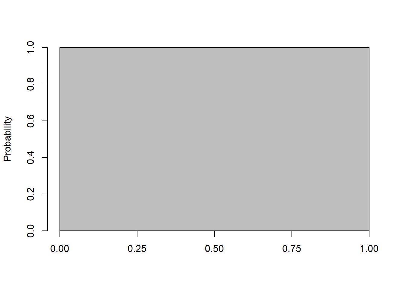
Based on this plot, what do you KNW (know, notice, wonder)?
- How do we read the probability value here?
- What is the probability of drawing a value of 0.67?
.
.
.
.
.
Part of the challenge with continuous (uniform) distributions is the plots can be a bit uninformative. You might read this as \(P(X=0.67) = 1\), but obviously that doesn’t make sense. Because??? What is \(P(X=0.89)\)? How can that be?
The first key part to recognize about this plot is that its a distribution. Meaning (as we’ve said many times) that it (i) describes all the outcomes and (ii) that it “sums” to one. For the latter, note that its simply a 1x1 square, so the area is exactly 1. And, maybe this is obvious but when we were discussion discrete distributions, we basically just added the height of each bucket (the latter being the probability) and showed it was 1. Here, since its simply a 1x1 square the area is exactly 1.
And the second key part is to not rely on the \(P(X=x)\) for continuous distributions. Just because we can calculate it doesn’t necessarily mean its useful to us.
9.2.3 When/why would we use the continuous uniform?
- A random number generator used by many programming languages is an example of the continuous uniform distribution, with min=0 and max=1.
- This is also known as an uninformative null distribution, particularly because it doesn’t tell us very much.
- It is used as a building block for later distributions.
- Monte Carlo simulations where we don’t know much beyond the upper and lower bound.
- And, as we’ll see, it makes simulating from probability distributions easy! More on that later…
9.2.4 Calculating Probabilities
So back to the above distribution (i.e. a continuous distribution with min=0 and max=1), what we’ll instead do is ask questions like \(P(X\le x_1)\). For example:
- What is the probability of seeing a value below 0.5?
- What is the probability of seeing a value above 0.75?
- What is the probability of seeing a value between 0.3 and 0.7?
- Can someone give me a general equation for P(\(X<=x\)) if min=0 and max=1?
Hint: Draw the picture!
For example, here is the picture of \(P(X\ge 0.75)\) where I’ve shaded the probability of interest in light blue:
barplot(1, ylim=c(0,1),  ylab="Probability", xlim=c(0,1), space=0)
axis(1, at=c(0, 0.25, 0.5, 0.75, 1))
polygon(c(0.75, 1, 1, 0.75, 0.75), c(0, 0, 1, 1, 0), col="light blue")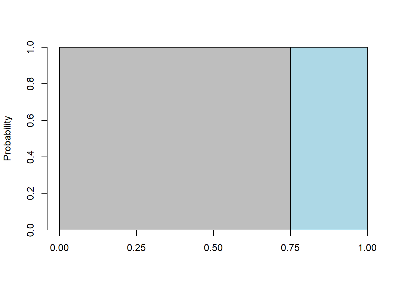
Again, for continuous uniform distributions, we can use the area of the rectangles to find the probabilities of interest.
9.2.5 Guided Practice
For a continuous uniform distribution between 0 and 1
- What is the probability of seeing a number between 0.3 and 0.4?
- What is the probability of seeing a number below 0.1 or above 0.9?
For a continuous uniform distribution between 10 and 20
- What is the height (density) of the distribution?
- What is the probability of seeing a number above 11.5?
- What is the probability of seeing a number between 12 and 18?
- What is the probability of seeing a number below 10.5 or above 19.5?
9.2.6 Summation vs. Integration
Some of you are taking and/or have taken calculus, and some have not. You don’t need calculus for this class, but as we talk about continuous distributions, for those that have, it may be useful for me to draw the connection.
The key takeaway is that when we try to understand and evaluate continuous distributions, since area and probability are related, you should know we’re really looking at the “area under the curve” between different points. As we showed above, our typically question for continuous distributions is:
- what is the probability between two values? or
- what is the probability above or below a certain value?
Technically, answering those questions requires integration, (i.e. what’s the area under the curve above/below/between our points of interest), however, we’ll have ways to short cut that. And, when we think about (continuous) distributions, remember the total area under the curve is 100%.
- If we were to integrate between -infinity and +infinity, what would we get?
And so, if \(f(x)\) is our continuous probability density, then \[P(X\le x) = \int_{-\infty}^x f(x) dx\] This is less interesting for the continuous uniform than for the Normal (which is upcoming).
9.2.7 Parameters, Mean and Variance of a Continuous Uniform
As we did with previous distributions, let’s look at the mean and variance. If \(a\) is the minimum and \(b\) is the maximum, then our mean is
\[\mu = \frac{a+b}{2}\]
and our variance is \[\sigma^2 = \frac{1}{12}(b-a)^2\]
(Note: Every “well behaved” distribution has a mean and variance.)
So, for example, if we have a distribution with min \(a=0\) and max \(b=1\), we’d calculate the mean and variance as \(\mu = \frac{0+1}{2} =0.5\) and \(\sigma^2 = \frac{1}{12}(1-0)^2 = \frac{1}{12}\).
Some of you may recognize similarities here with the discrete uniform.
9.2.8 Simulating and Calculating in R
And as we did with previous distributions, here are the corresponding R functions for simulating and calculating probabilities:
runif(): Simulate a random number from the given distributiondunif(): calculate the density (height) at a given value of \(x\) for the distributionpunif(): calculate the probability of \(P(X\le x)\) for the distribution
We’ve previously used runif() (in our election simulation) and it’s a good way to generate random data. As we’ll see, the dunif() function isn’t as useful as we’d like.
Examples of using these functions are shown here. To calculate the density, i.e. the height of the distribution at \(x=1.5\) if \(a=1\) and \(b=5\) we could use:
## [1] 0.25but note here that the value of \(x\) doesn’t matter. Every value of \(x\) between \(a\) and \(b\) gives the same result.
To calculate the probability of \(P(x<1.5)\) for this same distribution, we use punif(), (and note the similarities to pbinom())
## [1] 0.125Finally, to generate a set of 10 random numbers from this distribution we’d use:
##  [1] 2.130656 4.242041 1.907738 3.945894 2.693064 2.014401 3.436314 2.785969
##  [9] 3.055278 1.197010
and note that they are continuous, given the decimal results.
In fact, for the continuous uniform, I rarely use the first two functions, and instead just draw the picture and do the calculations by hand.
9.2.9 Guided Practice
For a continuous uniform distribution between 10 and 20 (and draw the picture!):
- What are the values of \(a\) and \(b\)?
- What are the theoretical mean and variance based on the above equations?
- What values are the lower and upper boundaries that contain the middle 95% of the distribution? And note here I’m asking the problem a slightly different way.
For a continuous uniform distribution between \(a=1\) and \(b=2.5\):
- What are the theoretical mean and variance based on the above equations?
- Simulate 1000 random variables. For your simulated data, what are the mean and variance.
- Compare your answers above. How close or far apart are these?
9.2.10 Review of Learning Objectives
By the end of this chapter you should be able to:
- Explain what continuous distributions are and how they are different from and/or similar to discrete distributions.
- Define and sketch a continuous uniform distribution and list its parameters.
- Calculate the mean and variance of the continuous uniform distribution.
- Explain why \(P(x=x)\) is not meaningful for a continuous distribution.
- Demonstrate how to both simulate and calculate probabilities from a continuous uniform distribution in R.
9.3 The Normal Distribution (and Density)
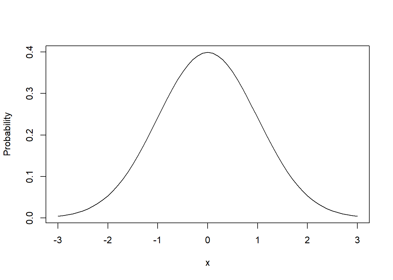
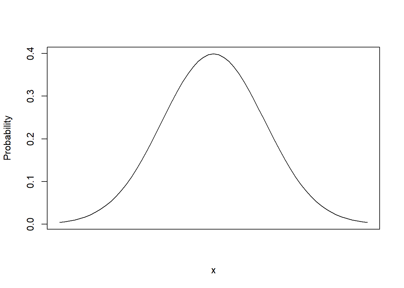
Ok, now on to the most important of all the distributions, the Normal distribution, also known as the bell curve. The following plot is an example of what’s known as the “Standard” Normal:
x <- seq(from=-3, to=3, by=0.1)
plot(x, dnorm(x), type="l", ylab="Probability")

polygon(
  c(-3, seq(from=-3, to=3, by=0.1), 3, -3),
  c(0, dnorm(seq(from=-3, to=3, by=0.1)), 0, 0),
  col="lightblue")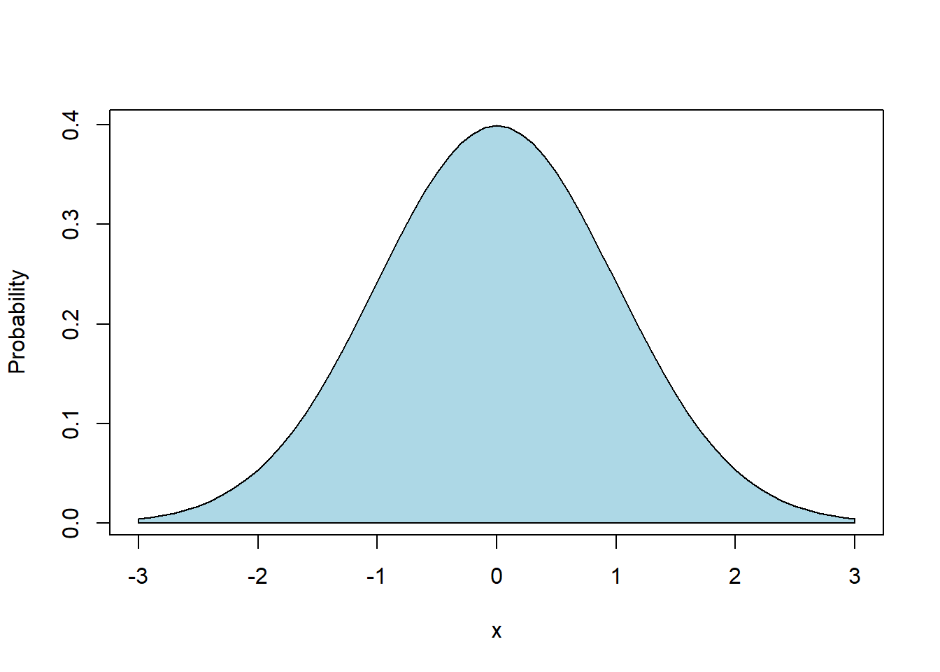
(Note that the polygon() function in R is used simply to shade the curve.)
Examples of data that are Normally distributed include:
- heights of adults in the US,
- SAT scores
- temperature anomalies: https://www.giss.nasa.gov/research/briefs/hansen_17/ (see Fig 2)!
- and many, many more
Looking at the plot:
- How would you describe this?
- Where are the mean and standard deviation?
.
.
.
.
.
Answers to the first question should include: (symmetric, unimodal, most of the probability near the center, some probability near the edges, other?)
For this distribution, again what’s known as the standard normal, we have \(\mu=0\) and \(\sigma=1\).
There are many examples of data in the real world that are approximately normal shaped. We can derive the normal distribution from certain assumptions about randomness. And so we use it frequently, because of this, and because it has some nice statistical (mathematical) properties.
But wait, Dr. Loosmore, how does this describe the heights of adults in the U.S.? The middle is near 0 and the bulk of the spread is between -3 and 3! We’ll get to that shortly.
9.3.1 Learning Objectives
By the end of this chapter you should be able to
- Define and sketch the Normal Distribution and list its parameters. State its mean and variance. Explain how the parameters (\(\mu\), \(\sigma^2\)) control its location, width and shape
- Explain generally where probability lies within the Normal distribution related to the \(\sigma\) and \(\mu\) parameters.
- Demonstrate how to both simulate data from (
rnorm()) and calculate probabilities of a Normal distribution (dnorm()) in R using built in functions - Recognize the statistical/mathematical formulation of the Normal distribution
- Explain the issue with using the probability density, i.e. \(P(X=x)\) for continuous distributions
- Fit a Normal distribution to data, including calculating the mean and variance for a given data set, overlaying the Normal density on a histogram based on those parameters, and estimating (by visual inspection) whether observed the data have an approximate Normal shape
- Discuss how and why the distribution of simulated data may or may not look “normal”
9.3.2 The Parameters of the Normal Distribution
What I’ve show above is what’s called the “standard Normal”, as it has parameters of mean \(\mu=0\) and and standard deviation \(\sigma=1\). What do those parameters do?
Those two parameters (\(\mu, \sigma\)) control (i) where the center of the distribution is located and (ii) how wide or narrow it is, respectively. The mean parameter \(\mu\) can shift the distribution right or left by moving the middle, and the standard deviation parameter \(\sigma\) adjusts its width. So with just those 2 parameters we can “parameterize” any Normal distribution.
9.3.3 Why Study the Normal?
The Normal distribution is also known as the Gaussian or Bell Curve.
Many types of data have a Normal distribution: heights of people, length of fish, test scores, some temperature data, errors in measurement, … I could go on and on here.
You may have also noticed that the binomial distribution starts to look bell shaped for larger \(n\).
Most importantly though, when we get into inference, we’ll use the Normal distribution, or something like it, quite a bit.
There is something called the “Central Limit Theorem” (CLT) that says that sums or averages of things tend to be normally distributed, regardless of the underlying distribution. Remember our games for examples? Where we’d roll the dice and win or lose $? The winnings over time are Normally distributed and we’ll do some simulation to illustrate that on another day.
So the point of this is that the Normal distribution is pretty fundamental within statistics. For the rest of the time today we’re going to play around a little with it, in Desmos!
9.3.4 Playing with the shape of the Normal Distribution in Desmos
To Desmos! Go to: https://student.desmos.com/
- Class Code (C period): S9CFZQ
- Class Code (F period): 35TZ77
9.3.5 The Formal Definition and Notation
You saw this in Desmos already, and here it is again. Mathematically we write the Normal distribution (the density function) as:
\[P(X=x) = f(x|\mu, \sigma^2) = \frac{1}{\sqrt{2\pi\sigma^2}}e^{-\frac{(x-\mu)^2}{2\sigma^2}}\]
which is the probability of a random variable \(X\) taking the value \(x\), given it comes from a Normal distribution with mean, \(\mu\) and variance, \(\sigma^2\).
More often, we will write \[X \sim N(\mu, \sigma^2)\] which similarly means the random variable \(X\) is “distributed normally” with a mean \(\mu\) and variance \(\sigma^2\).
(and sometimes you’ll see this just a \(\sigma\). So be careful!)
9.3.6 Intro to Simulating and Calculating in R
Similar to what we found with the Binomial Distribution, we have functions in R for calculating probabilities and simulating random variables:
rnorm(n, mean=0, sd=1): generates \(n\) random variablesdnorm(x, mean=0, sd=1): calculates the density function at \(x\)
(We’ll get to pnorm() in a bit.)
By looking at the help, we see that the parameters are the mean and standard deviation and the defaults are for the standard normal.
Remember that dnorm isn’t that useful for continuous distributions unless you’re drawing plots. Why? Because it’s telling us the height of the probability density, but that is not equal to the area in the “slice”.
9.3.7 Using dnorm() to Plot a Probability Distribution
Let’s suppose we had some random data and we wanted to evaluate whether it had an approximate Normal distribution. One way we might do that is plot a histogram of the observed data, and then overlay the fitted Normal curve to compare.
If I want to create a plot of a probability distribution curve in R, how would I do that?
Well, as with any plot, I need a vector of \(x\) values and a vector of \(y\) values.
Let’s do this for a standard Normal distribution. What does \(x\) span? Then, given \(x\), what are the corresponding \(y\) values?
As mentioned previously, the dnorm() function is the probability density, which is the height of the probability distribution for a given value of \(x\). And so if \(x\) is a vector and we pass it to dnorm(), we will get a vector back in return.
# generate a sequence of x values
x <- seq(from=-4, to= 4, by=0.1)
# calculate the corresponding y values for a standard normal
y <- dnorm(x, mean=0, sd=1)
# plot the results as a line instead of points
plot(x, y, type="l", xlab="x", ylab="probability")
Again, since for continuous distributions, probabilities are the areas under the curve, the real use of dnorm() is for creating plots, NOT for calculating probabilities.
If I wanted to create a plot with a different mean and standard deviation, we would just change both those parameters and the range of \(x\) values accordingly.
Note: above I used x <- seq(from=-4, to= 4, by=0.1) to generate the sequence of x values for my plot. Pay particular attention to the by=0.1 parameter here. If your values are spread too far apart, the resulting plot will not be smooth.
9.3.8 Guided Practice
- Use
rnorm()to simulate \(n=20\) values from a Normal distribution with \(\mu= 48\) and \(\sigma = 5\). Calculate the mean and standard deviation of your observed results. How do the observed results compare to the parameters?
- Now do it again with \(n=1000\)
- Create a normal distribution curve for mean \(\mu=3\) and \(\sigma=1\). Be careful about the range of \(x\) values you choose! A good rule of thumb is to span the range from \(\mu-3*\sigma\) to \(\mu+3*\sigma\). So in this case, you’ll want \(x\) to span the range 0 to 6.
9.3.9 Fitting Normal data
Earlier I suggested that adult heights generally have a Normal Distribution. Below is a histogram of male height data taken from the dslabs library. First, let’s plot a histogram of the observed data.
## load the `dslabs` library
library(dslabs)

## extract the heights data into a local object
data(heights)

## select only the male heights
males <- heights$height[heights$sex=="Male"]    ## extract the heights of just the Male subjects

## plot the histogram
hist(males, xlab="height (inches)", main="Adult Male heights", breaks=30, freq=FALSE)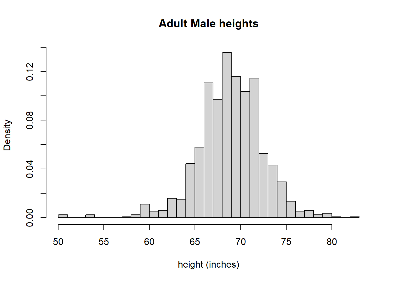
The data does look pretty normal, right? Maybe its a bit hard for you to tell, but to me this graph shows the nice bell curve shape to it, although it’s not perfect. Note that I’ve switched the y-axis to be proportion or “density” here, not frequency or count, so it looks more like a probability distribution. The density is simply the observed count in any bucket divided by the total number of observations across all buckets.
What if we wanted to “fit” this data to a Normal distribution. First, what does that mean and second, how would we do it?
“Fitting data to a normal distribution” means that we parameterize a normal distribution so that it has the same mean and standard deviation. More specifically, since the normal distribution only has those two parameters, \(\mu\) and \(\sigma\), we will estimate those values from the data.
So, let’s calculate the mean and standard deviation for this data, which will be the values we’ll use to parameterize our Normal. First we’ll calculate the mean:
## [1] 69.31475And then the standard deviation:
## [1] 3.611024And, what units are these in? Both are the same as the original data, so inches.
Let’s go back to the graph. Do these estimates seem reasonable? How would you know? The mean should occur where the peak (mode) of the data are and remember the standard deviation describes the spread. Seems reasonable so far, right?
Now we see the value of the dnorm() function in R. It calculates the height of the density function. (Again, this is NOT the probability at \(x\) like it was for discrete distributions.)
Below is the height data with an overlay of a “fitted” Normal distribution, using the parameters (\(\mu\), \(\sigma\)) calculated above, and the dnorm() function.
# create a histogram of the heights data with appropriate axis labels
hist(males, xlab="height (inches)", main="Adult Male heights", freq=FALSE, breaks=30)

# create a vector of possible x values that have the same range as the histogram x values
x <- seq(from=50, to=85, by=0.5)

# calculate the probability density at each x value, using the observed mean and standard deviation
y <- dnorm(x, mean=mean(males), sd=sd(males))

# overlay the line showing the probability density onto the histogram
lines(x, y, col="red")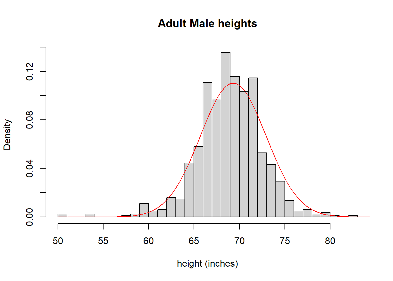
What do you think? Is it a good fit? I’d suggest that it is.
OK, so at this point, you should understand:
- how the parameters of the Normal distribution control its location and shape, and
- how the Normal distribution can be fit to observed data and what that means.
9.3.10 Guided Practice
- The following data have an approximate Normal shape. Calculate the mean and variance, plot a histogram and overlay the parameterized Normal curve.
y <- c(17.20, 13.07, 16.18, 13.19, 15.47, 16.42, 15.25, 12.59, 14.81, 18.12, 15.61, 16.34, 15.22, 15.73, 16.01, 17.11, 18.77, 18.37, 14.27, 15.47, 14.50, 17.26, 15.49, 12.23)
- Repeat the above example using the female height data.
- Create a histogram of the female heights
- Calculate the mean and standard deviation of the female height data
- Overlay the fitted curve on top of the histogram
- Comment on what you observe
9.3.11 What Does (Simulated) Normal Data Actually Look Like?
We previously looked at data that had a nice normal shape. Does Normal data always look so nice? Let’s find out.
Your task:
- Simulate 25 samples from a Normal distribution of your choice
- Plot the histogram
- Repeat this multiple times (at least 10) and try to find the best and worst examples you can! Also notice the similarities and differences between successive simulations
Here is sample code you could use that simulates 25 random values from a normal distribution with \(\mu=18\) and \(\sigma=3.5\):
# simulate 25 data points from a normal distribution with $\mu=18$ and $\sigma=3.5$ and store in a vector called `x1`
x1 <- rnorm(25, 18, 3.5)

# plot the historgram of the simulated data
hist(x1, breaks=12)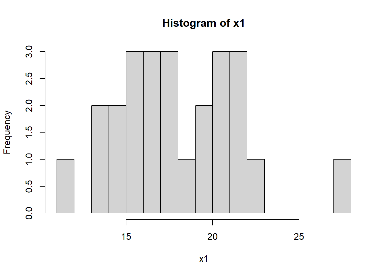
You might do this as in an R script. (And you might even collapse the code to a single line.)
- What do you observe?
- What type of similarity and/or variability do you notice between successive simulations?
.
.
.
.
Now, increase the sample size, \(n\) from 25 to 500 to 10000 and repeat each sample size 10 times. What happens?
.
.
.
.
Overall, what are your takeaways from this exercise?
- As \(n\) (the number of samples) gets larger, the simulated or observed normal data will tend to “look” more normal
- Conversely, for small \(n\) data won’t necessarily “look” normal even if it is
So for small data sets, how do we know if it just looks bad or if it isn’t really normal?
This is going to leave us a little frustrated until we get to the Central Limit Theorem (CLT) which will allow us to not worry too much about the shape of the data.
9.3.12 Review of Learning Objectives
By the end of this section you should be able to
- Define and sketch the Normal Distribution and list its parameters. State its mean and variance. Explain how the parameters (\(\mu\), \(\sigma^2\)) control its location, width and shape
- Explain generally where probability lies within the Normal distribution related to the \(\sigma\) and \(\mu\) parameters.
- Demonstrate how to both simulate data from (
rnorm()) and calculate probabilities of a Normal distribution (dnorm()) in R using built in functions - Recognize the statistical/mathematical formulation of the Normal distribution
- Explain the issue with using the probability density, i.e. \(P(X=x)\) for continuous distributions
- Fit a Normal distribution to data, including calculating the mean and variance for a given data set, overlaying the Normal density on a histogram based on those parameters, and estimating (by visual inspection) whether observed the data have an approximate Normal shape
- Discuss how and why the distribution of simulated data may or may not look “normal”
9.4 The Cumulative Normal Distribution
Above we discussed that while we could use the dnorm() function (or the mathematical form of the density) to find \(P(X=x)\), that typically isn’t that helpful except for drawing the shape of the distribution. For continuous random variables, \(P(X=x)\) does NOT tell us what we want to know.
Instead, what we usually want to find is \(P(X\le x)\) or \(P(x_1 \le X \le x_2)\). In this section we’ll learn how to visualize and calculate these as cumulative probabilities.
Here (again) is a standard normal distribution, but this time not (yet) shaded:
If \(X\sim N(0,1)\), we might ask: “What is the \(P(X \le -0.5)\)?” And we might want to visualize that on the above graph.
In this section we’ll answer both of those questions, and in particular focus on visualizing these probabilities in an attempt to develop a more intuitive sense of where they lie and therefore what these probabilities represent.
9.4.1 Learning Objectives
By the end of this section you should be able to
- Sketch (shade) by hand or in R, the area associated with cumulative probabilities, such as \(P(X\le x)\) or \(P(x_1 \le X \le x_2)\), for the Normal distribution
- Calculate ranges of probabilities of distributions, e.g. \(P(x_1 < X < x_2)\) using the
pnormfunction in R for a specified Normal distribution. - Describe the shape of the cumulative normal distribution.
- Understand that we use integration (or numeric approximations) to calculate cumulative probabilities for continuous distributions.
9.4.2 Where does Probability lie within the Normal?
Looking at the sketch of the Normal distribution, we can generally understand where the probability lies, but what if we wanted to be more quantitative about it?
Remember the idea that 68% of the distribution is within 1 standard deviation of the mean, 95% is within 2 standard deviations and 99.7% is within 3 standard deviations? Those were our “rules of thumb”.
The following graphic shows that relationship, where the interval (area) between the red lines capture the middle 68%, between the blue lines capture the middle 95% and between the green lines capture the middle 99% of the distribution:
x <- seq(from=-4, to=4, by=0.1)
plot(x, dnorm(x), type="l", ylab="Probability")
abline(v=1, col="red")
abline(v=2, col="blue")
abline(v=3, col="forest green")
abline(v=-1, col="red")
abline(v=-2, col="blue")
abline(v=-3, col="forest green")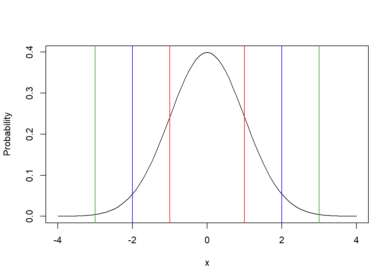
This graph displays the standard Normal. Another way to interpret these lines is the number of standard deviations away from the mean.
Said differently, 68% of the distribution lies between the red lines (\(\pm 1\) standard deviation), 95% lies between the blue lines (\(\pm 2\) standard deviations), and 99% lies between the green lines (\(\pm 3\) standard deviations).
But what if we wanted to be more precise? Or if we wanted the probability associated with a different \(x\) value?
9.4.3 Calculating and Sketching Cumulative Probabilities
Above we asked, what is the \(P(X< -0.5)\)?
Here is the graph highlighting the area (probability) of interest:
x <- seq(from=-3, to=3, by=0.1)
plot(x, dnorm(x), type="l", ylab="Probability")
polygon(c(-3, -0.5, seq(from=-0.5, to=-3, by=-0.1), -3), c(0, 0, dnorm(seq(from=-0.5, to=-3, by=-0.1)), 0), col="lightblue")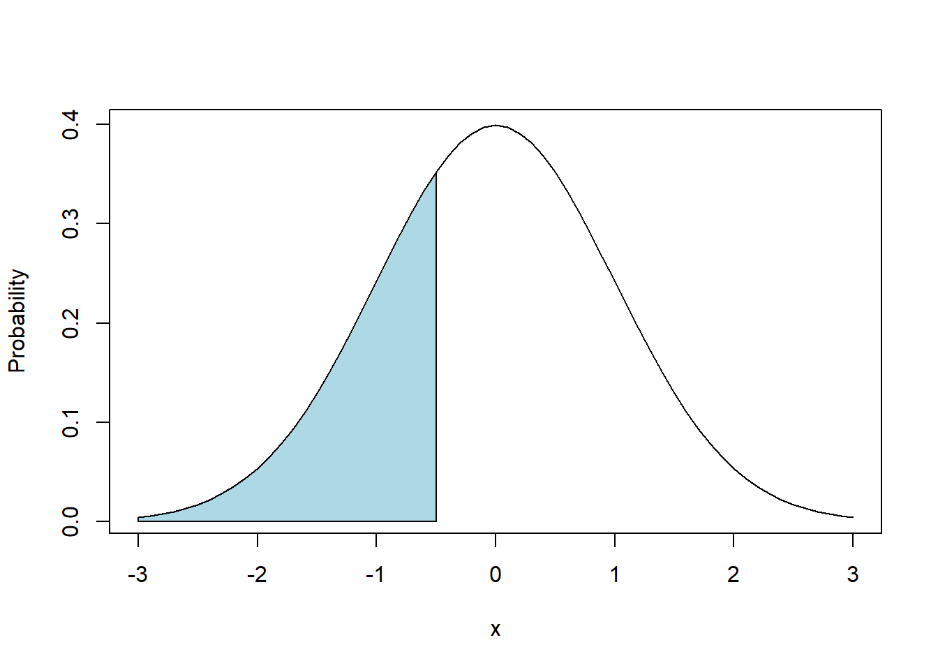
To sketch this, we will draw a vertical line at \(x=-0.5\) and then shade depending on the sign of the inequality. In this case we want the area (probability) below (to the left of) \(x=-0.5\).
As we’ve said before, the probability equates to the “area under the curve”. So in this case, we want the area under the curve to the left of \(x=-0.5\), or between \(-\infty\) and -0.5.
For those of you who have studied advanced calculus, we could use integration here. Luckily, R makes it easier than that.
To calculate this in R, we’ll use the pnorm() function as:
## [1] 0.3085375where the first parameter is the value of interest, and then we also provide the mean and standard deviation.
Qualitatively, this answer (0.309) makes some sense in that since our value of \(x\) is less than the mean, we expect the probability to be less than 0.5, as it is.
What if we asked: “what is \(P(X\ge 0.5)\)?”
There are two ways we might approach this. One is to use the complement rule, remembering that the full area under the curve sums to 1. The second is to ask for the “upper tail” specifically.
In the first case, we calculate the probability as above, and then subtract the result from 1 as:
## [1] 0.6914625In the second case, we can let R calculate this explicitly by adding a new parameter to the pnorm() function. The parameter lower.tail= allows you to specify whether you want the lower or upper tail probability. Simply, this is whether you want the probability to the left (use lower.tail=T) or right (use lower.tail=F) of the given value. Note that lower.tail=T is the default which is why we didn’t specify it originally.
## [1] 0.6914625As you can see, these two approaches are equivalent.
Of course this would also work with different values of the mean \(\mu\) and the standard deviation \(\sigma\) and you would simply change those within the pnorm() function call.
9.4.4 Guided Practice
We previously looked at heights of males in the US and found the mean \(\mu=68.32\) and standard deviation \(\sigma=4.08\). Using these values and the pnorm() function in R, calculate (and draw the picture!):
- What is the probability of seeing a height less than 64.2? Write your answer in as “\(P(X\le x)=\)”…
- What is the probability of seeing a height greater than 72.3?
- What is the probability of seeing a height less than 41?
9.4.5 Sketching and Calculating Compound Probabilities
In addition to looking at one sided probabilities, we might also ask, “what is \(P(-1.5 \le X \le 1.5)\)?” Or “what is \(P(X<-.5\ OR\ X>2.5)\)?”, which are known as compound probabilities.
In the first case we’re looking for the area between the two limits and the in second case we’re looking for the area outside the two limits.
x <- seq(from=-3, to=3, by=0.1)
plot(x, dnorm(x), type="l", ylab="Probability")

polygon(c(-3, -1.5, seq(from=-1.5, to=-3, by=-0.1), -3), c(0, 0, dnorm(seq(from=-1.5, to=-3, by=-0.1)), 0), col="lightblue")
polygon(c(1.5, seq(from=1.5, to=3, by=0.1), 3, 1.5), c(0, dnorm(seq(from=1.5, to=3, by=0.1)), 0, 0), col="lightblue")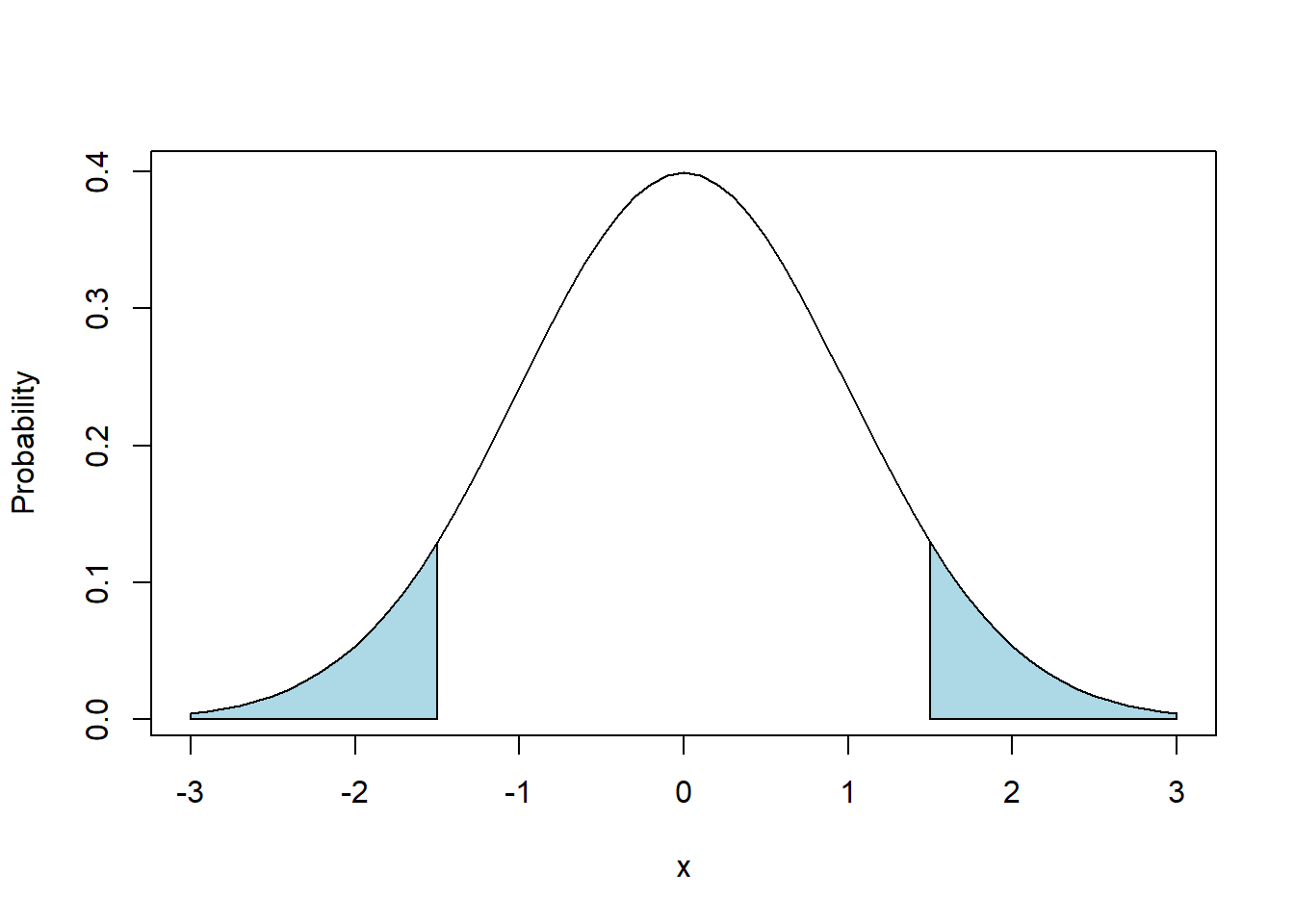
To calculate the probability shown in blue, there are a few ways we might approach this, where generally we will use the idea that the shaded areas plus the non-shaded areas all add to 1.
The straightforward way to approach this specific problem is to calculate the two probabilities separately and add them. We can do this as area in lower tail + area in upper tail, or equivalently:
## [1] 0.1336144In special cases, particularly when we know the two shaded areas are equal, we can also find this as:
## [1] 0.1336144Note this latter approach only works if the two \(x\) values are equal in their distance from the mean, and if we are using a symmetric distribution (of which the Normal is one).
For our second question, we asked “what is \(P(X<-.5\ OR\ X>2.5)\)?” and this region is sketched below. Note in this case our probabilities of interest are not symmetric.
x <- seq(from=-3, to=3, by=0.1)
plot(x, dnorm(x), type="l", ylab="Probability")

polygon(c(-.5, seq(from=-.5, to=2.5, by=0.1), 2.5, -.5), c(0, dnorm(seq(from=-.5, to=2.5, by=0.1)), 0, 0), col="lightblue")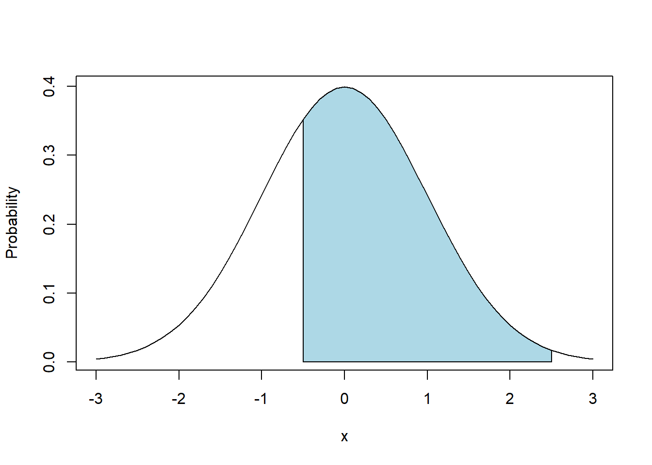
Here, we need to think a little more about the geometry of our shape to do our calculation.
One approach is to use the complement of what we did above. We can calculate the unshaded areas separately, add these together and then subtract the sum from 1. Be careful about your parenthesis!
## [1] 0.6852528Alternatively, we could calculate the area to the left of 2.5, and then subtract off the area to the left of -0.5 as:
## [1] 0.6852528We see that these approaches are equivalent.
9.4.6 Notes on using pnorm()
We’ll use this (or something similar) quite a bit this year. As we said early on, probabilities must range between 0 and 1. So, if you’re using pnorm() to calculate a probability, and your result is greater than 1, something is wrong.
Usually this results from not using the lower.tail= parameter correctly.
9.4.7 Guided Practice
Take the “Shading Normal Distribution Worksheet.docx” (available on Canvas) and attempt to both (i) sketch the probabilities by hand and (ii) use R to find the exact probabilities.
9.4.8 Using pnorm() to Plot a Cumulative Distribution
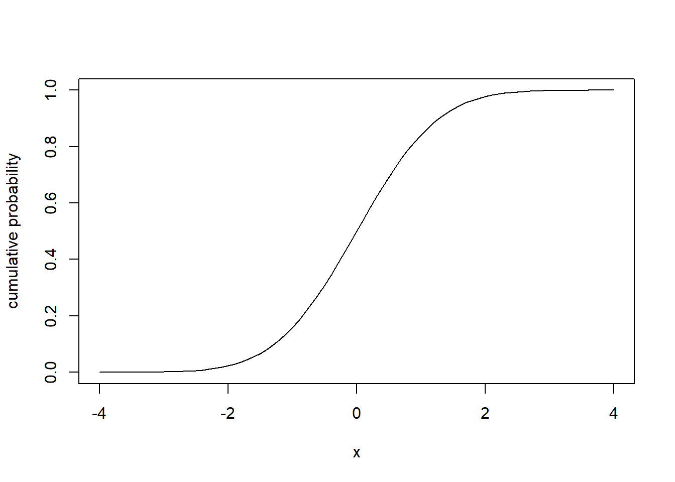
We previously used pnorm() to calculate the probabilities of seeing “less than” or “more than” a certain value.
Let’s try to visualize what happens to the pnorm() function as \(x\) increases, for the standard Normal distribution:
Can you describe what you see and what this represents?
- Why does it have this shape?
- Why does it start at 0 and go to 1?
- Looking at this plot, can you better explain what
pnorm()does?
.
.
.
.
To interpret this graph, let’s start with values of \(x\) on the left side of the graph. Looking at \(x=-4\), the graph shows \(P(X\le-4)\), and we know for a standard normal distribution, almost none of the probability is less than -4. So the y-value here is right at zero. Next, as \(x\) increases, we know based on our rules of thumb that, for example, \(P(x\le-1)\) should be close to 16%. So the y value associated with \(x=-1\) is about 0.16. Continuing, we know that exactly 50% of lies below \(x=0\), so the associated y value there is 0.5. Then, as \(x\) grows above 0, eventually we capture all of the probability, and so \(y\) asymptotes at 1.
This plot is known as the cumulative normal distribution, and we’ll denote this function using \(\Phi(x)\), i.e. the cumulative probability at \(x\).
9.4.9 Visualizing the pnorm() function
Now that we’ve introduced the cumulative normal distribution, let’s make sure the link to pnorm is clear. If I asked the question “what is \(P(X\le 0.675)\)?”

What this graph illustrates is that first we go up to the curve for our given value of \(x\), and then we go over to the y-axis to find the associated probability.
And in fact we see the answer is:
## [1] 0.7501621Hence the pnorm() function in R simply the returns the result (\(y\)) of this graph for a given value of \(x\).
9.4.10 Guided Practice
- Explain why the the range (possible y values) of a cumulative distribution plot are restricted between 0 and 1.
- For a standard normal distribution, what is \(P(X\le -1.96)\)? What is \(P(X\le 1.96)\)?
- Create a cumulative probability plot for \(X \sim N(15.3, 2.1)\) Be careful about your range of \(x\) values!
9.4.11 Review of Learning Objectives
By the end of this section you should be able to
- Sketch (shade) by hand or in R, the area associated with cumulative probabilities, such as \(P(X\le x)\) or \(P(x_1 \le X \le x_2)\), for the Normal distribution
- Calculate ranges of probabilities of distributions, e.g. \(P(x_1 < X < x_2)\) using the
pnormfunction in R for a specified Normal distribution. - Describe the shape of the cumulative normal distribution.
- Understand that we use integration (or numeric approximations) to calculate cumulative probabilities for continuous distributions.
9.5 The Normal Quantile Function, qnorm()
9.5.1 Learning Objectives
By the end of this section you should be able to
- Determine the \(x\) value associated with a certain cumulative probability, and recognize this as the inverse of what we previously did.
- Use the
qnorm()function in R to calculate this \(x\) value. - Explain the relationship between cumulative probabilities and quantiles for the normal distribution, and similarly between the
pnorm()andqnorm()functions in R
9.5.2 Introducing the qnorm() function
We previously asked (and found) the probability associated with a certain value (e.g. \(P(X\le x)\)) using the pnorm() function. Here, we’re going to ask the “inverse” question.
So, what if I asked, “for what value of \(x\) does 75% of the distribution lie below?” This is a question we haven’t asked before. Notice here we’re given the probability and are tasked to find \(x\).
I could attempt to solve this with trial and error by picking different \(x\) values and calculating the probability until I get close to \(P(X\le x) = 0.75\), however, there is a much easier and more precise way.
Looking at our previous above cumulative distribution graph, to answer this question we want to go in the reverse direction, namely from the y-axis to the curve and then back to the x-axis.
To solve this directly, we will use the qnorm() function, which takes a probability and returns the \(x\) value. So for our question above we have:
## [1] 0.6744898And so we find 75% of the standard Normal distribution lies below \(x=0.675\).
Btw, just to check we can put this result back into pnorm(), again because they are inverse functions:
## [1] 0.7501621Showing again that 75% of the probability lies below 0.675.
The qnorm() and pnorm() functions have an inverse relationship. In particular, pnorm() goes from the x value to the probability and qnorm() goes from the probability to the x value.
As with all of our normal distribution functions in R, you can set the mean and standard deviation as parameters. So, to find the \(x\) value that 95% of a \(N(18,5)\) distribution is below we’d use:
## [1] 26.224279.5.3 What about the upper tail?
Similar to how with pnorm() we can ask for the probability above a given value using the lower.tail=F parameter, with qnorm() we can ask for the value for which a specified probability lies above. Inspect the following, and explain why they produce the same result:
## [1] -0.6744898## [1] -0.67448989.5.4 Guided Practice
For \(X \sim N(12.6, 1.3)\):
- What value does 50% of the distribution of X lie below?
- What value does 5% of the distribution of X lie below?
- What value does 95% of the distribution of X lie below?
- What probability is contained within the interval defined by the previous two calculations?
- What value does 25% of the distribution of X lie above? (and think about two different ways to do this!)
- What is \(P(X<11.3)\)?
- What is \(P(X>13.9)\)? (think about two different ways to do this!)
- What is \(P(11.3<X<13.9)\)?
9.5.5 Comparing the quantile() and qnorm() Functions
In chapters 2 and 3 we used the quantile() function in R when we were looking at observed data. Does anyone remember what it did?
We gave the quantile() function a percentage between 0 and 100 (well really between 0 and 1.0) and R returned the value of the distribution that the given percentage was below. So if we asked for quantile(x, 0.25) where \(x\) was a vector of data, it returned the specific value of x where 25% of the set of values were below.
There is similar to what we’re doing with qnorm(), but instead applying it to a theoretical distribution, in this case the normal distribution. Again the quantile() function works when applied to observed data.
The difference is whether you’re using an empirical distribution (meaning you’re looking at observed data), or you’re looking at a theoretical distribution (not data, just parameter values).
9.5.6 Revisiting our Rules of Thumb
We previously said that approximately 68% of the distribution lied in the interval between \(\mu\pm 1*\sigma\), 95% between \(\mu\pm 2*\sigma\) and 99.7% between \(\mu\pm 3*\sigma\). Let’s be a little more precise.
For our 68% interval we’d expect 16% to be below the lower bound. For a standard normal, what is the \(x\) value associated with a probability of 16%?
## [1] -0.9944579and hence we see it’s very close to -1, and since this is the standard normal, this represents 1 standard deviation below the mean.
For our 95% interval we’d expect 2.5% to be below the lower bound. For a standard normal, what is the \(x\) value associated with a probability of 2.5%?
## [1] -1.959964and hence we see it’s very close to -2, which represents 2 standard deviations below the mean.
Finally, for our 99.7% interval, we’d expect 0.15% of the distribution below the lower bound. For a standard normal, what is the \(x\) value associated with a probability of 0.15%?
## [1] -2.967738which is it’s very close to -3, which represents 3 standard deviations below the mean.
The following table shows our approximate (rule of thumb) vs. the exact standard deviations for each of these intervals:
| percent | approx interval | precise interval |
|---|---|---|
| 68% | \(\mu\pm 1*\sigma\) | \(\mu\pm 0.9945*\sigma\) |
| 95% | \(\mu\pm 2*\sigma\) | \(\mu\pm 1.960*\sigma\) |
| 99.7% | \(\mu\pm 3*\sigma\) | \(\mu\pm 2.968*\sigma\) |
For most applications, using our rules of thumb are close enough.
9.5.7 Review of Learning Objectives
By the end of this section you should be able to
- Determine the \(x\) value associated with a certain cumulative probability, and recognize this as the inverse of what we previously did.
- Use the
qnorm()function in R to calculate this \(x\) value. - Explain the relationship between cumulative probabilities and quantiles for the normal distribution, and similarly between the
pnorm()andqnorm()functions in R
9.6 Z scores
9.6.1 Learning Objectives
By the end of this section, you should be able to:
- Define what a z-score is and know the equation for computing a z-score.
- Explain how z-scores allow us to make comparisons between differently parameterized distributions
- Describe how z scores relate observed values to the Standard Normal distribution
- Calculate a z score given x, \(\mu\) and \(\sigma\), and similarly find \(x\) if given z, \(\mu\) and \(\sigma\).
9.6.2 Review of Z scores
We previously discussed a way to calculate “how many standard deviations away from the mean a certain value is?” and we called this a “z-score”. Specifically, we defined this as:
\[Z= \frac{x-\mu}{\sigma}\]
Based on this formulation, the z-score tells us how many standard deviations, \(\sigma\), away from the mean, \(\mu\), an observation, \(x\) is, and it’s sign represents whether its above or below.
So for example, if \(X\sim N(\mu = 25, \sigma= 4.5)\), to calculate the Z score for \(x = 20\) we’d use
\(\frac{20-25}{4.5}\) which we find in R as:
## [1] -1.111111Hence a value of 20 is 1.11 standard deviations away from the mean (25), and this result is negative because the value of \(x\) is below \(\mu\).
9.6.3 Guided Practice
If \(X\sim N(\mu = 25, \sigma= 4.5)\), calculate the Z score for and interpret the magnitude and sign of the result:
- \(x = 20.5\)
- \(x = 25\)
- \(x = 12\)
9.6.4 Interpretting Z scores
One use of a z score is to allow us to go back and forth between an observed normal and the standard normal distribution. A z score takes an observation from a non-standard Normal, shifts it so that the center is now at zero (by subtracting the mean) and then scaling it so the width is standard (i.e. \(\sigma^2=1\)) by dividing by the standard deviation.
Here’s an example:
The SAT has a mean of 1100 and standard deviation of 200. What is the Z score of someone who scored 1350?
To find this, we can calculate the Z score as \(\frac{1350-1100}{200} = 1.25\) In this case, the person’s score was 1.25 standard deviations above the mean.
But what does this value represent?
Let’s draw the picture to make sure we understand what’s going on.
x <- seq(from=500, to=1700, by=10)
plot(x, dnorm(x, mean=1100, sd=200), type="l", xlab="score", ylab="probability")
abline(v=1350, col="blue")
What is the probability of a random student’s score being above 1350, i.e. a random value falling above the blue line?
We can find this as
## [1] 0.1056498And so we find there’s a 10.6% chance of scoring higher than 1350.
So what? We did this all without our z score.
If we look at the standard normal distribution we find a similar result using our z-score as:
## [1] 0.1056498These are the same, and this is shown in the following image:
par(mfrow=c(1,2))

x <- seq(from=500, to=1700, by=10)
plot(x, dnorm(x, mean=1100, sd=200), type="l", xlab="score", ylab="probability")
abline(v=1350, col="red")


x <- seq(from=-3, to=3, by=.05)
plot(x, dnorm(x), type="l", xlab="score", ylab="probability")
abline(v=(1350-1100)/200, col="red")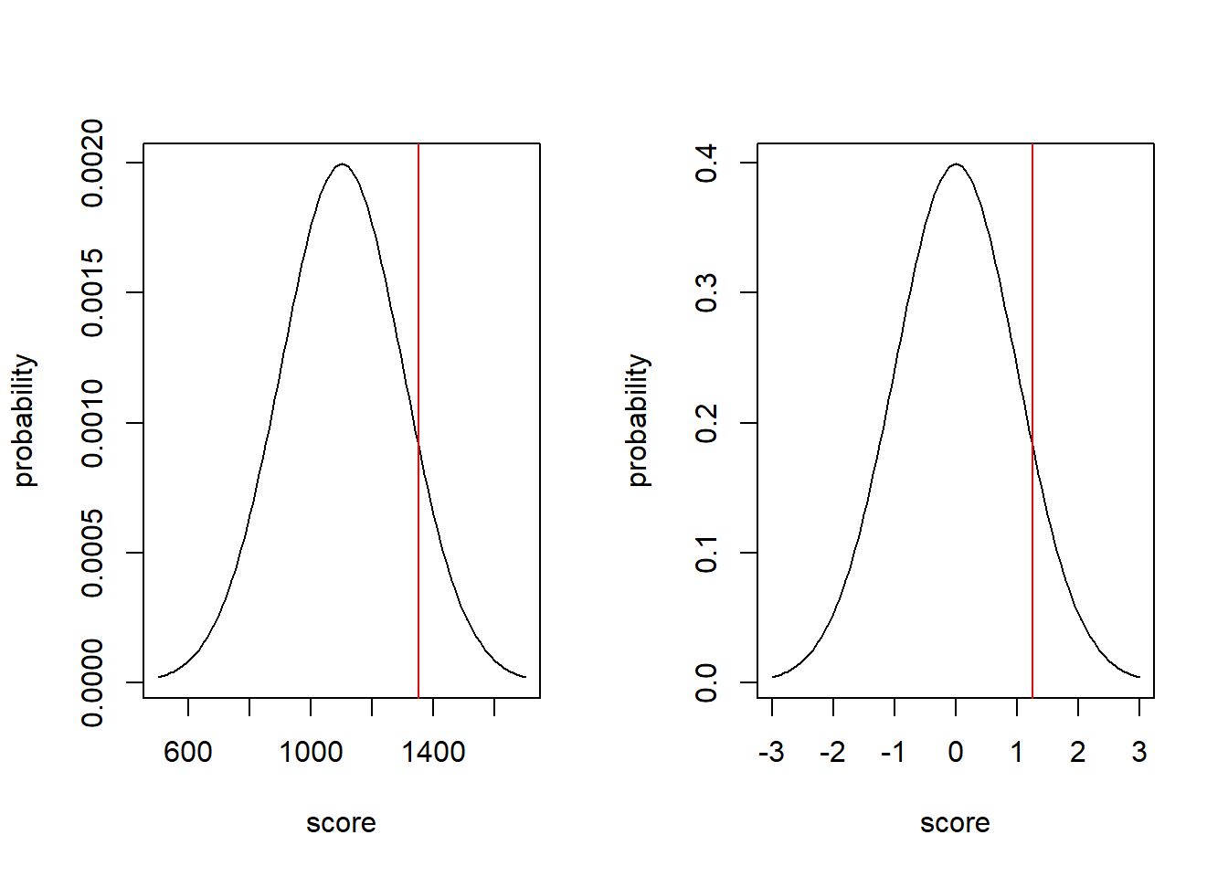
In both distributions, there is 10.6% of the probability above the red line.
What I hope this shows is:
The probability of the z-score on the standard normal distribution is the same as the probability of the observed value on the its normal distribution.
Even better, we can use z-scores to compare results from different distributions as you’ll do in the following example.
9.6.5 Guided Practice
In triathlons, it is common for racers to be placed in age and gender groups. Friends Leo and Mary both completed the Hermosa Beach Triathlon, where Leo competed in the Men, Ages 30-34 group while Mary competed in the Women, Ages 25-29 group. Leo completed the race in 1:22:28 (4948 seconds), while Mary completed the race in 1:31:53 (5513 seconds). Obviously Leo finished faster, but they are curious about how they did within their respective groups. Can you help them? Here is some information on the their performance of their groups:
- The finishing times of the Men, Ages 30-34 group has a mean of 4313 with a standard deviation of 583 seconds.
- The finishing times of the Women, Ages 25-29 group has a mean of 5261 with a standard deviation of 807 seconds.
- The distributions of finishing times for both groups are approximately Normal.
Remember: a better performance corresponds to a faster finish:
- Write down the short-hand for these two Normal distributions
- What are the Z-scores for Leo’s and Mary’s finishing times? What do these Z-scores tell you?
- Did Leo or Mary rank better in their respective groups? Explain your reasoning.
- What percent of the triathletes did Leo finish faster than in his group?
- What percent of the triathletes did Mary finish faster than in her group?
- What finishing time would Leo need to have the same rank in his group as Mary had in hers?
9.6.6 Using Z score to find \(X\)
Now what if I asked it the other way? Given \(X\sim N(\mu = 25, \sigma= 4.5)\), how would we find the \(x\) value associated with \(Z=0.5\). This is the same as asking: “what value of \(x\) is 0.5 standard deviations away from the mean?”
This just requires the previous equation and some algebraic manipulation.
We can write \(0.5=\frac{x-25}{4.5}\) and solve this for our unknown \(x\) to find \(x=27.25\), and we can check our work as:
## [1] 0.5which confirms the z score.
9.6.7 Guided Practice
- Assuming \(X\sim N(\mu = 25, \sigma= 4.5)\), find the \(x\) values associated with the following z-scores:
- \(Z = 0\)
- \(Z = 1.64\)
- \(Z = -1.96\)
And, for the last two, why are those important values?
9.6.8 Optional: The Relationship between Z scores, \(\Phi\) and \(x\) values
As we’ve seen, there is a 1:1 relationship between the \(x\) value for a given normal distribution and the associated cumulative probability, \(\Phi\). We saw that in the above graph, and we know that from using pnorm() and qnorm().
Specifically, given an \(x\) value, \(\Phi(x)\) is the cumulative probability at \(x\), and we can find \(\Phi(x)\) using pnorm(x). Also learned that given a probability, \(\Phi\), we find the \(x\) value using qnorm(\(\Phi\)).
Further, since \(x\) values are associated with a given cumulative probability, and z-scores are really just \(x\) values (but on the standard normal scale), then z-scores are also associated with a specific cumulative probability.
9.6.9 Test statistics are basically z-scores.
One final note here. In the coming chapters on statistical inference, we will often compute test statistics that are scaled by a form of standard deviation, and then compare those statistics against a known distribution. This process will be similar to what we are doing here when computing z-scores.
9.6.10 Using z scores to convert to Standard Normal
If \(Y\) is a random variable with \(Y\sim N(\mu, \sigma)\) then \(\frac{Y-\mu}{\sigma}\sim N(0,1)\).
What this transformation does is take every value from \(Y\) and map it to it’s equivalent point in the standard Normal.
We saw this above and it is repeated here:
par(mfrow=c(1,2))

x <- seq(from=500, to=1700, by=10)
plot(x, dnorm(x, mean=1100, sd=200), type="l", xlab="Y", ylab="probability")
abline(v=1350, col="red")


x <- seq(from=-3, to=3, by=.05)
plot(x, dnorm(x), type="l", xlab="(Y-mu)/sigma", ylab="probability")
abline(v=(1350-1100)/200, col="red")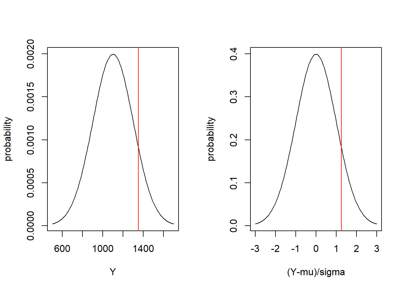
Here we see on the left the distribution of \(Y\sim N(1100, 200)\) and on the right the distribution of \(\frac{Y-1100}{200}\sim N(0,1)\). A value of \(Y=1350\) (shown on the left graph in red) is equivalent to a value of \(\frac{Y-1100}{200} = 1.25\) on the right graph.
When I say “equivalent”, I mean that they are located on the same position in their respective distributions. They both have the same probability below (or above) them, as shown by:
## [1] 0.8943502## [1] 0.8943502So this means that if we want to know where a given value \(y_i\) lies with respect to a given Normal distribution, we can either compare it directly to \(N(\mu, \sigma)\) or we can compare \(\frac{y_i-\mu}{\sigma}\) to \(N(0,1)\). This transformation will become useful when performing hypothesis testing.
9.6.11 Review of Learning Objectives
By the end of this section, you should be able to:
- Define what a z-score is and know the equation for computing a z-score.
- Explain how z-scores allow us to make comparisons between differently parameterized distributions
- Describe how z scores relate observed values to the Standard Normal distribution
- Calculate a z score given x, \(\mu\) and \(\sigma\), and similarly find \(x\) if given z, \(\mu\) and \(\sigma\).
9.7 Chapter Review and Summary
Overall, for continuous distributions, what do you now know how to do?
- Continuous Distributions, how are they different from Discrete Distributions
- Continuous Uniform and Normal Distributions…
- calculating the probability density, cumulative density, quantile and simulating random values in R
- plotting the probability density and cumulative density
- Fitting data to distributions, we’ve done that for the Normal and so couldn’t we do that for any distribution now?
- Note that this is a slight change to our approach: we’re given data and we estimate the parameters compared with being given the parameters and estimating the data! (More generally, this is where we’re heading with inference)
Note: We’re basically done with our exploration of different distributions, although we’re not really. We’ll shortly see the \(\chi^2\) distribution, the F distribution, and the student’s T distribution just to name a few. But.They’re.All.The.Same.
9.8 Summary of R functions in this Chapter
| function | description |
|---|---|
rnorm() |
function used to generate random data from a normal distribution |
dnorm() |
function used to calculate the probability density (height) of a normal distribution |
pnorm() |
function used to find the cumulative probability associated with a given \(x\) value for a normal distribution |
qnorm() |
function used to determine the \(x\) value associated with a given probability for a normal distribution |
lines() |
function to add a line plot to and existing plot |
polygon() |
function used to draw (shaded) shapes on existing plots |
library() |
function used to load an external R library that may contain useful functions and/or data |
9.9 Exercises
Exercise 9.1 For a continuous uniform distribution with min = 1 and max = 5,
- What is the \(P(X>4.2)\)?
- What is the \(P(1<X<3)\)?
- What is the height of the density function, i.e. \(P(X=2)\)?
- What are the mean and variance of the distribution?
- Create a plot of the cumulative distribution. Explain why it has the shape it does.
Exercise 9.2 Simulate 1000 random variables from a continuous uniform distribution with min \(a=0\) and max \(b=1\). Create a histogram of the result. What do you observe?
Exercise 9.3 For a Normal distribution with mean \(\mu=12\) and standard deviation \(\sigma=3\), use R commands to determine the following, and for each, drawsketch where on a Normal distribution the probability lies, (you can use the example below.)
- What is the \(P(X<12)\)?
- What is the \(P(X<10.5)\)?
- What is the \(P(10.5 < X < 13.5)\)?
Exercise 9.4 You are told the heights of male high school students in Washington state is Normally distributed with mean \(\mu=62.5\) inches and standard deviation of \(\sigma=4.8\) inches.
- What is the probability that a randomly chosen student will have a height of exactly 55 inches?
- What is the probability that a randomly chosen student will have a height between 54.5 and 55.5 inches?
- What is the probability they have a height between 48 inches and 55 inches?
- What is the probability they have a height below 58 OR above 67 inches?
- Using our rules of thumb, what is the interval that contains the middle 95% of the heights? Your answer should have two numbers: the lower and upper bounds of the interval.
Exercise 9.5 The following data, blue, are believed to be Normally distributed:
- Create an R object (vector) to store the results.
- Calculate the mean and standard deviation of the vector.
- Plot a histogram of the data.
- Overlay a Normal density function on the histogram.
- Comment on how good of a fit you think a Normal distribution is.
blue <- c(31.281, 33.571, 41.401, 58.695, 51.440, 42.425, 42.122, 49.753, 35.356, 41.885, 43.353, 48.928, 37.646, 50.222, 59.239, 53.949, 47.855, 46.143, 47.511, 51.929, 44.075, 38.587, 47.826, 41.215, 49.217, 45.693, 39.078, 38.743, 50.796, 44.854, 57.276, 61.732, 43.724, 29.195, 57.059, 42.628, 47.349, 38.538, 42.407, 41.002)
Exercise 9.6 How does a Normal distribution with mean \(\mu=5\) and variance \(\sigma^2= 3\) compare to one with mean \(\mu= 10\) and variance \(\sigma^2= 3\)?
- Create a plot which shows both distributions on the same plot. Create the first distribution and when plotting, use the
xlim=c()parameter to make space for the second distribution. - Then use the
lines()function to add the second distribution on top of the first.
When answering consider the center of the distribution and the width of the distribution.
Exercise 9.7 How does a Normal distribution with mean \(\mu=5\) and variance \(\sigma^2= 3\) compare to one with mean \(\mu=5\) and variance \(\sigma^2= 2\)?
- Create a plot which shows both distributions on the same plot. Create the first distribution and when plotting, use the
xlim=c()parameter to make space for the second distribution. - Then use the
lines()function to add the second distribution on top of the first.
When answering consider the center of the distribution and the width of the distribution.
Exercise 9.8 Assume \(X\) is a random variable describing the annual Dec snowfall at Crystal Mountain in inches. Let \(X\sim N(\mu = 25, \sigma= 4.5)\):
- plot the density function for theoretical snowfall in December.
- what is the probability that snowfall in any given December would be below 12 inches?
- what is the probability that it would be above 24 inches?
- what is the probability of observing between 12 and 24 inches?
- create an R vector and simulate 2500 random samples of \(X\).
- What are the mean and standard deviation of your simulated data? How do they compare to the population parameters?
- What percent of the simulated values lie between 12 and 24 inches?
- what are the theoretical bounds of the interval containing the center 90% of the data? What are the empirical bounds based on your simulated data?
Exercise 9.9 For \(X \sim N(0, 1)\)
- What is \(P(X < 0.5)\)?
- For what value of \(x\) does 70% of the probability distribution lie below?
- Compare your answers to parts (a) and (b).
- What is \(P(X > 1.96)\)?
- For what value of \(x\) does 97.5% of the probability distribution lie above?
- Compare your answers to parts (d) and (e).
Exercise 9.10 For \(X\sim N(18.6, 2.4)\)
- What is \(P(X < 17.9)\)?
- What is \(P(X > 17.5)\)?
- What is \(P(18 < X < 19)\)?
- For what value of X does 2.5% of the distribution lie below?
- What is \(P(X < 13.9)\)?
- How are your answers to (d) and (e) related? What does this suggest about the relationship between the
pnorm()andqnorm()functions? - For what value of X does 97.5% of the distribution lie below?
- How much probability is contained within the interval defined by your answers to (d) and (g)?
Exercise 9.11 For a Normal distribution with mean \(\mu=150\) and variance \(\sigma^2=12\), use R to determine:
- \(P(140<X< 160)\)?
- The value of the distribution that 80% of the distribution is below.
- The value that 80% of the distribution is above
- Compare your answers from parts (b) and (c) and in particular how far away from the mean they each are. Explain what you find and why.
Exercise 9.12 Monthly returns on the S&P 500 (which is an index of stocks) can be modelled with a Normal Distribution. Let X be our random variable of monthly returns and then \(X\sim N(0.009, 0.0434)\). Yes, these are small numbers, the mean is 0.9% and the standard deviation is 4.34%. Use R to calculate:
- \(P(X > 0)\)?
- \(P(-.1 < X < .1)\)?
- \(P(X<-0.05\ OR\ X > 0.05)\)?
- The value of the distribution that 95% of the distribution is below.
- The value that 95% of the distribution is above
- How much of the distribution lies between your answers to (d) and (e)?
- Create a plot of the probability density with properly labeled axis and title
Exercise 9.13 Summer temperature deviations are believed to be Normally distributed. Assume that our average summer temperature is 85 degrees, and “extreme days” where the temperature is over 100 degrees only happen 2.0% of the time.
- What is the standard deviation of summer temperature?
- What is the distribution of summer temperatures? Write it as \(N(\mu, \sigma)\).
- If the mean of the distribution were to increase by 3.5 degrees, how often would “extreme days” happen?
Exercise 9.14 For a \(X\sim N(18.5, 3.35)\):
- What is the z score of an x value of 18.48?
- What is the z score of an x value of 15.5?
- What is the z score of an x value of 22?
- What x value has a z score of 0?
- What x value has a z score of -1.25?
Exercise 9.15 Test scores for two different sections of Statistics each had their own normal distribution. Scores in B period were distributed \(N(88, 1.5)\) and scores in H period were distributed \(N(87, 2)\). Hannah is in B period and scored a 90. Rylie is in H period and scored a 89.5.
- Calculate the z scores for each student’s test in comparison to their classes distribution.
- Who did better when compared to their individual class?
Exercise 9.16 Assume test scores for this class are Normally distributed and you know the mean, \(\mu=85\) and you know that only 2% of people get over 98. What is the standard deviation of the distribution?