Chapter 3 Exploratory Data Analysis
3.1 Overview
In this chapter, we will be building on what we learned previously to discuss Exploratory Data Analysis or EDA, the overall process of how we approach a data set to discover the story it’s telling. We’ll do this by interacting with the data using an iterative process going between asking questions, querying the data and doing initial statistical analysis.
The following image shows an example of the overall research process. Within EDA, we typically limit our focus to the upper loop, with a potential goal of learning enough to develop a testable hypothesis.
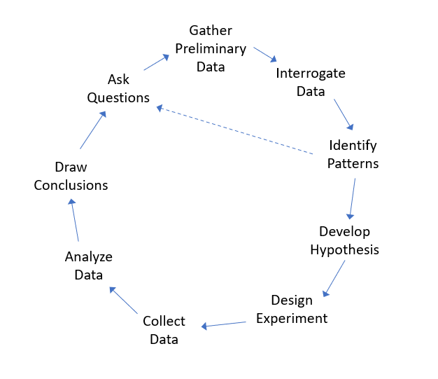
Figure 3.1: A interative framework for research
This chapter will include both a discussion of the overall framework for EDA and the technical details of how we can interrogate data in R. This includes:
- specifics of selecting subsets of data from data frames,
- more details on how to visualize data, and
- how to examine relationships in mulitvariate data.
We will work through a number of examples to illustrate these techniques.
In summary, EDA is typically the first part of any statistical analysis, and is used to gain preliminary understanding of “what our data are willing – or even anxious– to tell us” (Tukey, p21)
John W. Tukey
3.1.1 Learning Objectives
By the end of this chapter you should be able to:
- Explain the purpose and iterative nature of Exploratory Data Analysis (EDA)
- Query a data set, ask and then answer interesting questions
- Describe what vectors and data frames in R are and use simple test conditions to extract data from a data frame
- Recognize that columns are vectors and can be manipulated in R as such. Extract columns from data frames using either the
$or[]operators - Perform calculations using vector math
- Load external data from your computer into a data frame in R (including setting the correct working directory), and understand the format of CSV files
- Create and interpret scatter plots, line graphs, histograms, and boxplots, and select the appropriate plot for the analysis at hand
- Customize plots in R, including adding appropriate title, axis labels, plot character and plot color
- Determine the percent or proportion of a dataset that lies between two specified values
- Understand how to write simple test conditions using <, <=, ==, >=, >
- Extract a subset of a vector or data frame using
[]and a Boolean test condition - Use data from one vector along with a test condition to select data from a second vector
- Describe the relationship that exists between two variables as displayed in a scatter plot
- Calculate and interpret the correlation between two variables
Note: For more information on vectors and data frames and building test conditions, see Appendix B.
3.2 What is EDA (Exploratory Data Analysis)?
Statistical analysis relies on and often requires a bit more judgment than traditional mathematics, so a common first step is to play around with our data to get a feel for what’s going on. This typically includes calculating descriptive statistics and visualization. Often the goal here is to help determine next steps in our analysis and whether to proceed to more formal hypothesis testing.
In statistics, exploratory data analysis (EDA) is
A method to understand patterns and trends that exist within data, often through an interactive process of calculating summary statistics and plotting and visualizing different characteristics of the data, typically as a precursor to any type of formal hypothesis testing.
Initial questions we might ask during EDA include:
- What shape does the distribution of the data have?
- What is the average value of each variable and how much variation exists around that measure?
- Are there trends or relationships between different variables within the data, or with time?
The first two of these we learned last chapter, so here we’ll focus a bit more on the third.
Further, once we’ve explored the data a bit we might also ask:
- Why does this trend or shape occur? (Remember, if our data isn’t random then there must be a process behind it.)
- How might we use this data to change our behavior?
- What might we do to “improve” the situation?
- And more, many of which are context dependent.
3.2.1 An EDA Framework
Generally, the EDA approach follows something like:
- Start with asking some questions about the world.
- Collect or find some preliminary data related to your question. Load it into R. (Some scrubbing/cleaning might be necessary - which is more in the realm of data science.) We’ll typically use a data frame here to store the data, but it might be a different data structure as well.
- Understand what the data set is and what it represents. How big is it (number of rows, columns)? What do the various columns (our variables) each represent and what are their units? What do the various rows represent (i.e. time, location, people or other observations)?
- Create some plots. Do some calculations. Look for trends or interesting patterns. Are there seemingly important relationships between variables? If there is a trend, how consistent is it? Are there seemingly significant outliers or points that don’t follow the trend? This is our step of playing with or “Interrogating” the data.
- Now, what patterns emerge? And what additional questions could you ask about the data? Repeat the process as necessary, potentially with the goal of developing a testable hypothesis.
Through the year we’ll learn more formal ways to test our hypothesis, but for now we’ll just ask and answer simple questions.
Our process won’t always follow these exact steps in this order, and this list is intended to be a guiding framework.
3.3 Interrogating Data Frames in R
What is a data frame? In R, a data frame is similar to a vector in that it stores data, but instead of being one-dimensional, it’s two-dimensional. We’ll talk about its rows (across) and its columns (up and down).
In this example ,we’ll use the built-in cars data set. To use a built in data set, we typically need to load it. The data() function makes the data frame available in our current session.
To learn more about what this data set contains, use the help function:
If we look at the help we see that “The data give the speed of cars and the distances taken to stop. Note that the data were recorded in the 1920s.”
What are the various column names and what do they represent? We can use the names() function to get the column names which we see are speed and dist
## [1] "speed" "dist"In this case the names are pretty self explanatory.
We can use the dim() function to get the dimensions of the data frame, and here we see that there are 50 rows and 2 columns.
## [1] 50 2In this case, the rows represent different cars (and actually the help isn’t that useful on this.)
Of note, both the results of the dim() and names() functions are vectors and so we could find the number of rows using dim(cars)[1], in other words accessing the first element. Or we could find the name of the second column as names(cars)[2]
We might use the head() function to get a sample of what this data frame looks like, and by default it returns the first 6 rows:
##   speed dist
## 1     4    2
## 2     4   10
## 3     7    4
## 4     7   22
## 5     8   16
## 6     9   10
3.3.1 Accessing Columns, Rows, and Elements
If we were doing an EDA process, next we might calculate descriptive statistics of both the speed and dist columns. Or maybe we would want to look at specific rows or elements. But how do we access that specific data?
Each column is a vector, and we’ve learned a lot about how to deal with vectors. To extract a given column using its name, use the $ character followed by hte column of interest, such as:
##  [1]  4  4  7  7  8  9 10 10 10 11 11 12 12 12 12 13 13 13 13 14 14 14 14 15 15
## [26] 15 16 16 17 17 17 18 18 18 18 19 19 19 20 20 20 20 20 22 23 24 24 24 24 25
Notes that cars$speed is a vector. You can store it in a separate vector. Or, if we wanted to calculate its mean, we could do that as:
## [1] 15.4The second approach is to access a data frame using indexing. I can select a single data point using the cars[row, col] format. So the speed (the first column) of the 3rd car is:
## [1] 7Similarly, the dist of the 8th car is:
## [1] 26If you leave either the column index or the row index blank (empty), the entire row or column is returned. So, as an alternative to using cars$speed, we could equivalently call:
##  [1]  4  4  7  7  8  9 10 10 10 11 11 12 12 12 12 13 13 13 13 14 14 14 14 15 15
## [26] 15 16 16 17 17 17 18 18 18 18 19 19 19 20 20 20 20 20 22 23 24 24 24 24 25
where here the row index is blank.
3.3.2 Guided Practice
Using the cars data set,
- find the min and max values of the
distcolumn - find the distance of the 5th car
- extract the element in the 13th row and 1st column
- find the speed and distance of the 12th car, using a single R command (hint: you want the 12th row)
- calculate the range and standard deviation of the distance column
3.3.3 Ask Questions!
Ok, so given what we’ve found in our data, what might we want to know?
- Can we use speed to predict the stopping distance?
- What aspects result in longer or shorter stopping distances for a given speed?
- Was the same driver used in each case?
The point here is to generate questions, and some of those may not be answerable directly by the data we have.
3.4 Multivariate Interrogation
From above, we understand that data frames are typically comprised of multiple columns of data, and that we can extract individual columns as vectors using the $ operator.
We may want to simply evaluate a single column, but more often, we want to examine (visualize, evaluate, quantify) the relationship and interaction between multiple variables (columns).
Here we’ll look at the built in airquality data set, which contains daily air quality measurements and in particular ground level ozone, in New York, May to September 1973. To load the data use:
3.4.1 Guided Practice
- What are the column names of the
airqualitydata set?
- What are the units of each variable (hint: see the help!)
- On how many days were measurements taken?
3.4.2 Examining Air Quality
Why are we interested in ozone?
“Ozone in the stratosphere is good because it shields the earth from the sun’s ultraviolet rays. Ozone at ground level, where we breathe, is bad because it can harm human health.” (https://www.epa.gov/ground-level-ozone-pollution)
The EPA has set the recommended limit on ground based ozone at 70 ppb (parts per billion).
As a first step toward EDA, here is a histogram of the Ozone column from the airquality data with a horizontal line drawn to show the EPA recommended limit:
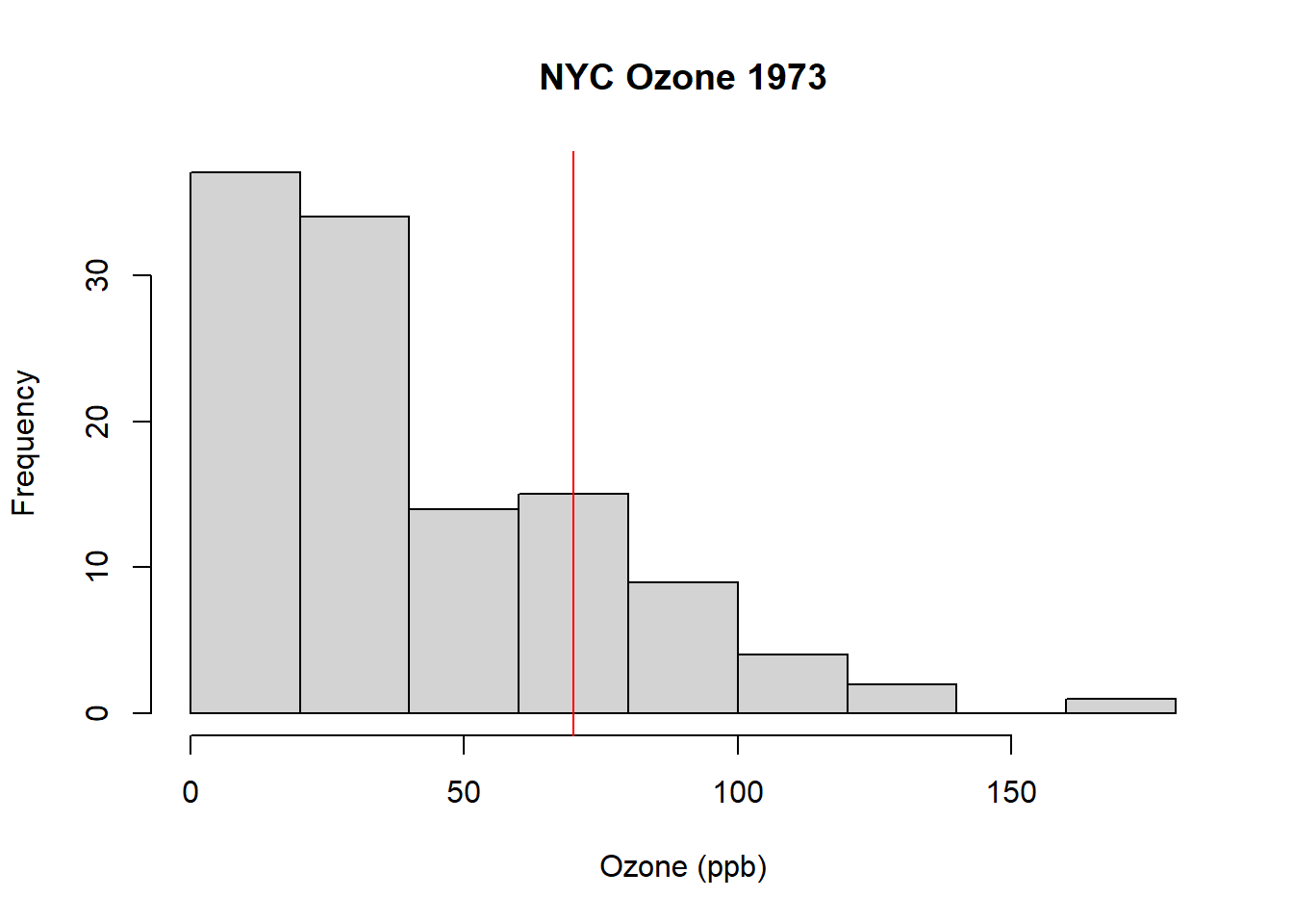
What do you observe?
.
.
.
.
From this, we can see that there are number of days where the Ozone level was too high. But how many days? And what percent of the measured days exceed the limit? These are the types of questions we might want to ask during EDA.
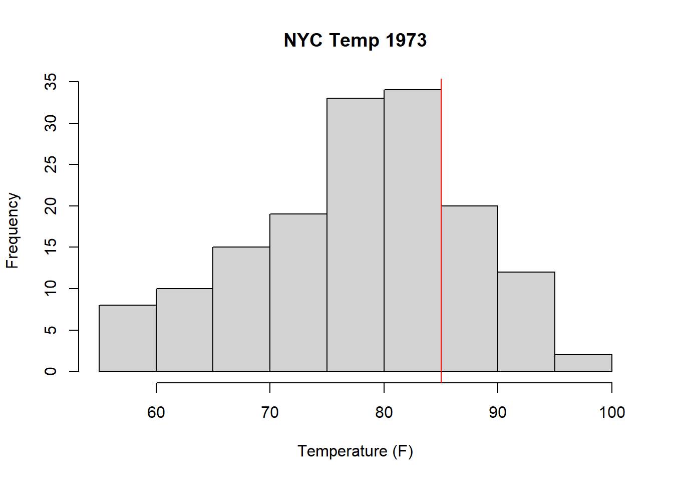
Additionally, from this (https://news.harvard.edu/gazette/story/2016/04/the-complex-relationship-between-heat-and-ozone/) we see there is a (complex) relationship between temperature and surface Ozone. We’ll dive into this relationship in a bit, but for now, let’s at least plot a histogram of the temperature and draw a line at 85 F.
A full investigation here would also examine the relationships between solar radiation and ozone, in that higher solar radiation should support formation of ozone, and between wind and ozone, in that wind should help dissipate ground level ozone and thus reduce ozone levels. And of course, solar radiation, temperature and wind are themselves all probably correlated.
At this point, we can start asking questions, which is a critical part of our EDA process. Knowing our data also includes information on solar radiation, wind and month, questions at this point might include:
- How many days was the ozone concentration above the EPA limit? And on what percent of measured days did that occur?
- What day(s) had the highest ozone concentrations?
- Do higher temperature days correspond to higher ozone days?
- How does solar radiation impact the amount of ozone?
- Does higher wind speed reduce ozone concentrations?
- Can we untangle the relative effects of each of these covariates on measured ozone?
Notice the last three questions here are looking at a causal relationships. Later in the course we’ll learn methods to start to answer these type of questions, and so for now, we’ll focus on the first three questions above.
For the first question above, inspect the following code:
## [1] 25the clause airquality$Ozone>70 tests each of the 153 values of ozone and returns either TRUE or FALSE depending on whether the ozone value is greater than 70, as
##   [1] FALSE FALSE FALSE FALSE    NA FALSE FALSE FALSE FALSE    NA FALSE FALSE
##  [13] FALSE FALSE FALSE FALSE FALSE FALSE FALSE FALSE FALSE FALSE FALSE FALSE
##  [25]    NA    NA    NA FALSE FALSE  TRUE FALSE    NA    NA    NA    NA    NA
##  [37]    NA FALSE    NA  TRUE FALSE    NA    NA FALSE    NA    NA FALSE FALSE
##  [49] FALSE FALSE FALSE    NA    NA    NA    NA    NA    NA    NA    NA    NA
##  [61]    NA  TRUE FALSE FALSE    NA FALSE FALSE  TRUE  TRUE  TRUE  TRUE    NA
##  [73] FALSE FALSE    NA FALSE FALSE FALSE FALSE  TRUE FALSE FALSE    NA    NA
##  [85]  TRUE  TRUE FALSE FALSE  TRUE FALSE FALSE FALSE FALSE FALSE FALSE  TRUE
##  [97] FALSE FALSE  TRUE  TRUE  TRUE    NA    NA FALSE FALSE FALSE    NA FALSE
## [109] FALSE FALSE FALSE FALSE FALSE FALSE    NA FALSE  TRUE  TRUE    NA  TRUE
## [121]  TRUE  TRUE  TRUE  TRUE  TRUE  TRUE  TRUE FALSE FALSE FALSE FALSE FALSE
## [133] FALSE FALSE FALSE FALSE FALSE FALSE FALSE FALSE FALSE FALSE FALSE FALSE
## [145] FALSE FALSE FALSE FALSE FALSE    NA FALSE FALSE FALSE
NA means that there is no data associated with that record.
The which() function extracts only those elements that are TRUE as
##  [1]  30  40  62  68  69  70  71  80  85  86  89  96  99 100 101 117 118 120 121
## [20] 122 123 124 125 126 127
and specifically it returns the row numbers corresponding to each observation where ozone is greater than 70.
Finally, if we want the number of observations where ozone is greater than 70, we can calculate that vector’s length as:
## [1] 25Notice through this example that we are able to nest commands in R.
Now, to determine the percentage of days that exceeded the ozone limit, inspect the following code:
## [1] 0.1633987And so 16.3% of the days saw dangerous ozone levels.
The numerator is the same as the previous question and the denominator is simply the length of the airquality$Ozone vector, in this case 153.
For the second question (what days had the highest ozone), let’s start by sorting the ozone data
##   [1]   1   4   6   7   7   7   8   9   9   9  10  11  11  11  12  12  13  13
##  [19]  13  13  14  14  14  14  16  16  16  16  18  18  18  18  19  20  20  20
##  [37]  20  21  21  21  21  22  23  23  23  23  23  23  24  24  27  28  28  28
##  [55]  29  30  30  31  32  32  32  34  35  35  36  36  37  37  39  39  40  41
##  [73]  44  44  44  45  45  46  47  48  49  50  52  59  59  61  63  64  64  65
##  [91]  66  71  73  73  76  77  78  78  79  80  82  84  85  85  89  91  96  97
## [109]  97 108 110 115 118 122 135 168
from which we observe the highest days were above 110 ppb. We can find which rows those correspond to by again using the which function.
## [1] 30 62 99 101 117 121These are the row numbers that correspond to the 6 measurements that are 110 ppb or greater. We can then use those row numbers to retrieve the data of interest as
##     Ozone Solar.R Wind Temp Month Day
## 30    115     223  5.7   79     5  30
## 62    135     269  4.1   84     7   1
## 99    122     255  4.0   89     8   7
## 117   168     238  3.4   81     8  25
## 121   118     225  2.3   94     8  29
Note that I’m using the square brackets and selecting a group of rows, and then asking for all columns in those rows.
For our third question (do higher temperature days correspond to higher ozone days?) there are a few ways we might visualize this including box plots and scatter plots.
Here is a box plot where we’re using month as a proxy for temperature, with the threshold now drawn as a horizontal line:
boxplot(airquality$Ozone~airquality$Month, xlab="Month", ylab="Ozone (ppb)")
abline(h=70, col="red")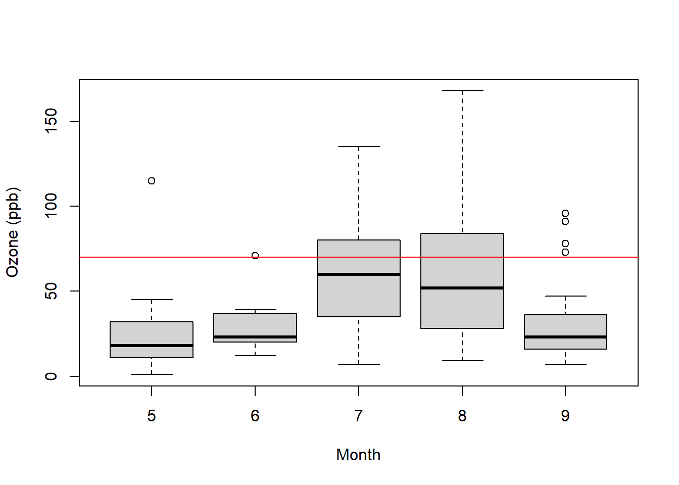
What do you observe?
And here is a scatter plot of the same data:

Note the introduction of the new function plot() which can take both an x and y variable as parameters.
Now what do you observe? (There are a lot of interesting aspects of both of these plots!) What does each point represent? What trends do you see? Are they constant trends?
Based on these two plots, how would you describe the relationship between ozone and temperature?
.
.
.
.
Overall, what we’ve done in this section is demonstrate how we interrogate a data frame, through an iterative process of asking questions and doing initial analysis with both graphs and calculations.
3.4.3 Summary of Initial EDA approaches
To determine how many measurements exceed a certain value:
length(which(airquality$Ozone>70))To determine the percentage of measurements that exceed a certain value, use above, then divide by the total number of measurements
To evaluate the relationship between variables, we might use box plots, grouped by a categorical variable, or scatter plots to show two continuous variables.
3.5 Using R for Vector Math
Sometimes, you might want to use vector math to perform calculations between columns.
We already know we can do quick math on entire vectors, which is what columns typically are. So, for example, suppose we wanted to know the temperature from the airquality data in degrees C?
##   [1] 19.44444 22.22222 23.33333 16.66667 13.33333 18.88889 18.33333 15.00000
##   [9] 16.11111 20.55556 23.33333 20.55556 18.88889 20.00000 14.44444 17.77778
##  [17] 18.88889 13.88889 20.00000 16.66667 15.00000 22.77778 16.11111 16.11111
##  [25] 13.88889 14.44444 13.88889 19.44444 27.22222 26.11111 24.44444 25.55556
##  [33] 23.33333 19.44444 28.88889 29.44444 26.11111 27.77778 30.55556 32.22222
##  [41] 30.55556 33.88889 33.33333 27.77778 26.66667 26.11111 25.00000 22.22222
##  [49] 18.33333 22.77778 24.44444 25.00000 24.44444 24.44444 24.44444 23.88889
##  [57] 25.55556 22.77778 26.66667 25.00000 28.33333 28.88889 29.44444 27.22222
##  [65] 28.88889 28.33333 28.33333 31.11111 33.33333 33.33333 31.66667 27.77778
##  [73] 22.77778 27.22222 32.77778 26.66667 27.22222 27.77778 28.88889 30.55556
##  [81] 29.44444 23.33333 27.22222 27.77778 30.00000 29.44444 27.77778 30.00000
##  [89] 31.11111 30.00000 28.33333 27.22222 27.22222 27.22222 27.77778 30.00000
##  [97] 29.44444 30.55556 31.66667 32.22222 32.22222 33.33333 30.00000 30.00000
## [105] 27.77778 26.66667 26.11111 25.00000 26.11111 24.44444 25.55556 25.55556
## [113] 25.00000 22.22222 23.88889 26.11111 27.22222 30.00000 31.11111 36.11111
## [121] 34.44444 35.55556 34.44444 32.77778 33.33333 33.88889 33.88889 30.55556
## [129] 28.88889 26.66667 25.55556 23.88889 22.77778 27.22222 24.44444 25.00000
## [137] 21.66667 21.66667 25.55556 19.44444 24.44444 20.00000 27.77778 17.77778
## [145] 21.66667 27.22222 20.55556 17.22222 21.11111 25.00000 23.88889 24.44444
## [153] 20.00000
We can similarly combine values from multiple vectors. Suppose we wanted to estimate the wind chill factor for each date. We can find this approximately as temperature (F) - wind speed (mph) * 0.7.
In R, we can find this easily as:
##   [1] 61.82 66.40 65.18 53.95 45.99 55.57 58.98 49.34 46.93 62.98 69.17 62.21
##  [13] 59.56 60.37 48.76 55.95 57.60 44.12 59.95 55.21 52.21 61.38 54.21 52.60
##  [25] 45.38 47.57 51.40 58.60 70.57 75.01 70.82 71.98 67.21 55.73 77.56 78.98
##  [37] 68.99 75.21 82.17 80.34 78.95 85.37 85.56 76.40 70.34 70.95 66.57 57.51
##  [49] 58.56 64.95 68.79 72.59 74.81 72.78 71.59 69.40 72.40 65.79 71.95 66.57
##  [61] 77.40 81.13 78.56 74.56 76.37 79.78 75.37 84.43 87.59 88.01 83.82 75.98
##  [73] 62.99 70.57 80.57 69.99 76.17 74.79 79.59 83.43 76.95 69.17 74.21 73.95
##  [85] 79.98 79.40 75.98 77.60 82.82 80.82 77.82 74.56 76.17 71.34 76.82 81.17
##  [97] 79.82 83.78 86.20 82.79 84.40 85.98 77.95 77.95 73.95 73.21 70.95 69.79
## [109] 74.59 70.82 70.37 70.79 66.15 61.99 66.18 72.21 78.62 80.40 84.01 90.21
## [121] 92.39 91.59 89.59 86.17 88.43 91.04 89.78 81.82 73.15 72.37 70.79 67.37
## [133] 66.21 70.57 65.15 72.59 63.37 62.95 73.17 57.34 68.79 60.79 76.40 55.18
## [145] 64.56 73.79 61.79 51.38 65.17 67.76 64.99 70.40 59.95
3.6 More on Visualizing Data
As seen above, a critical tool of our initial EDA process is our ability to plot our data, using either histograms, box plots and/or scatter plots. In this section we’ll discuss more details about how to create various plots.
3.6.1 Scatter Plots
The following data shows a scatter plot of braking distance and speed for a number of different cars, again using the plot() command. A scatter plot is used to show the relationship between two variables.
plot(cars$speed, cars$dist, xlab="speed (mph)", ylab="distance (ft)", main="Braking distance as a function of speed")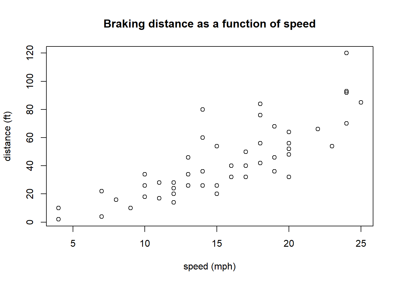
The goal of plotting is to look at relationships that might exist. Questions you should ask in plots include: What do you see? (What is the predictor, what is the response? Is the relationship linear? Or does it seem random? How much variation exists in the relationship? etc. etc.)
3.6.2 Parameters of the R plot() command
The plot() function in R is very versatile.
Within plot() the first two parameters are the x and y data vectors, and these need to be the same length. Additional parameters we’ll often use include:
| parameter | what it does |
|---|---|
xlab=, ylab= |
the x- and y- axis labels |
main= |
the title of the graph |
xlim=, ylim= |
the x- and y- axis ranges |
type= |
the type of plot: “p” for points, “l” for line, “b” for both |
pch= |
the character used to plot |
col= |
the color used to plot |
Here is a more customized scatter plot of the cars data:
plot(cars, xlab="Speed (mph)", ylab="Distance (ft)", main="Speed vs. Stopping Distance", xlim=c(0, 30), pch=20, col="blue")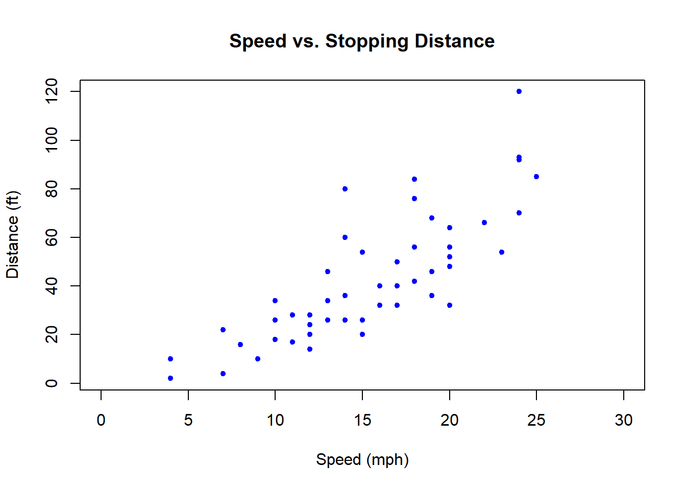
What is different than our previous plot?
3.6.3 More on Histograms
Histograms group data into bins and then display the counts per bin. If we wanted to display the counts of individual values, we could experiment with breaks=() parameter, or we might plot the data is to use our table() results:

(Note, we could also do this with dots as we did in the election data.)
Let me now create a slightly different plot using the hist() function, and I’ll put them side by side:
par(mfrow=c(1,2))
plot(table(cars$speed), xlab="Speed (mph)", ylab="Frequency")
hist(cars$speed, main="", xlab="Speed (mph)", breaks=10)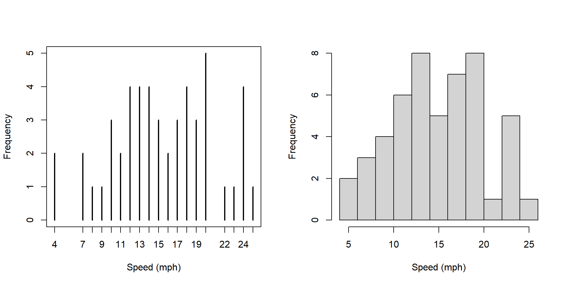
What is similar and what is different about these two plots?
Answers should include: * less detail in the histogram * higher numbers on the y axis
Now, what’s different about these two plots?
par(mfrow=c(1,2))
hist(cars$speed, main="", xlab="Speed (mph)", breaks=10)
hist(cars$speed, main="", xlab="Speed (mph)", breaks=10, freq=FALSE)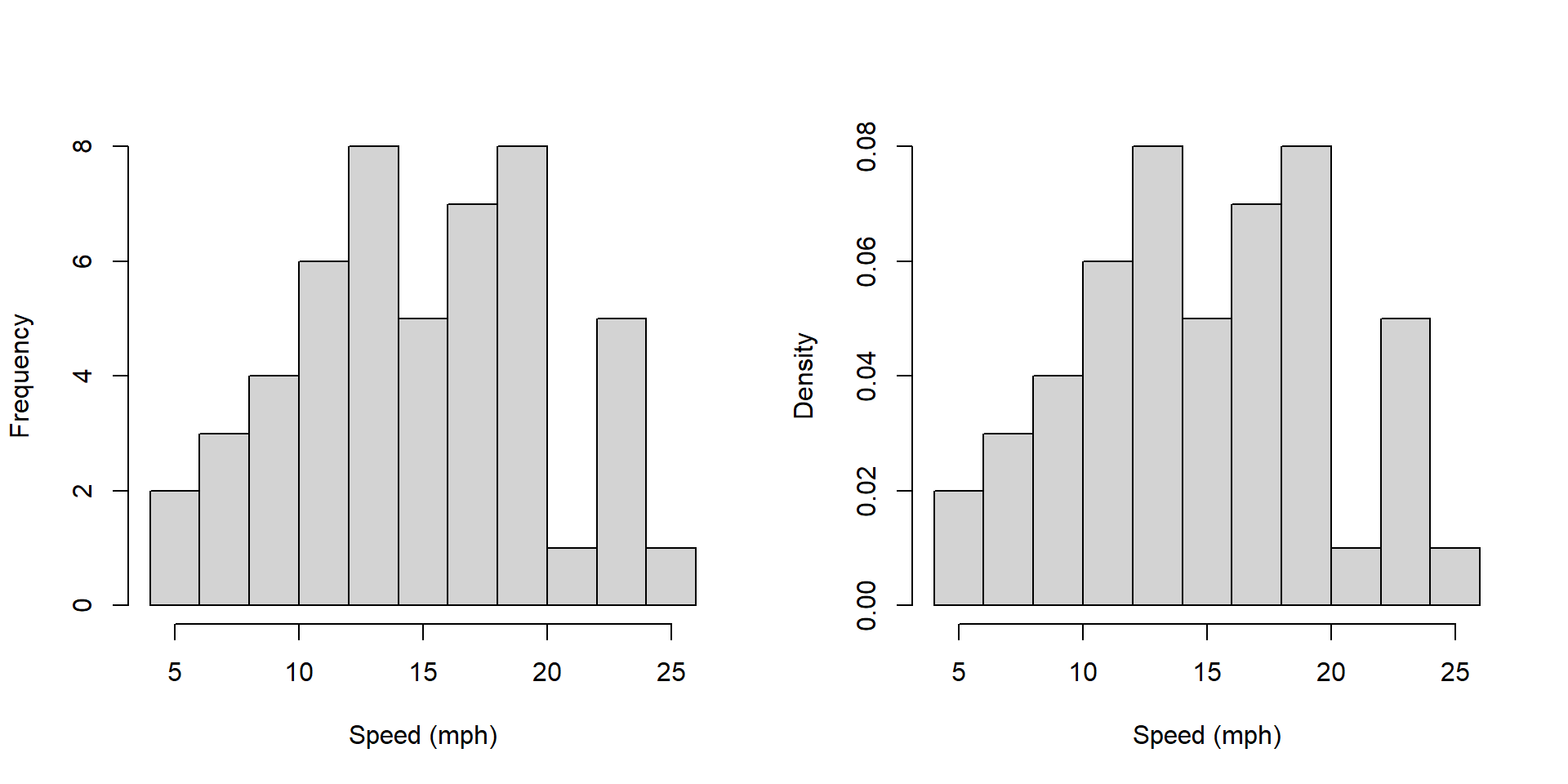
Answers here should include: * the y axis label is different. What does each represent? Why would you want one vs. the other?
Note that sum of the heights of the bars on the left hand plot is 272 and the sum of the heights of the bars on the right hand plot is 1.
How does the plot on the right relate to a probability distribution?
3.6.4 A few technical notes about creating histograms
- The bin size is adjustable via the
breaks=parameter. - Use the raw data, NOT the output of a table() function. The histogram function first bins the data, then plots it. The table similarly counts the data (bin size of 1).
3.6.5 Additional thoughts on Data Visualization
Data visualization is a key part of our EDA process. An important skill is to be able to recognize patterns and trends that occur in plots. We will return to this in more detail when discussing linear regression
When creating plots of data, at least initially, its more important to think about the story one is trying to tell, than to try to make the plot look perfect.
One key takeaway is that there isn’t necessarily 1 perfect graph for a given data set. And usually we plot data first, to figure out what’s going on, before delving deeply into the statistical analysis.
3.6.6 Guided Practice
Using the built in cars data set:
- create a well labeled box plot of the speed column
- in interpreting the scatter plot of the
carsdata, does the variance seem constant as a function of speed?
Using the built in trees data,
* create a scatter plot of diameter (on x axis) against tree volume (on y axis)
* how would you describe the relationship?
3.7 Building and Using Simple Test Conditions
Often, we want to select a subset of a data frame for analysis. This may be part of a column, or a set of rows. We may also use data from one column to select data from a second column.
In this section we will describe how to use simple test conditions to help select subsets of data.
This is an extension of the work we did in the previous chapter related to finding those values above or below a certain threshold, such as by using the which() function.
This section provides only a summary of these methods. More details can be found in Appendix B. Additionally, this section assumes the ability to load data into R from an external *.csv file, the details of which are included in Appendix D.
3.7.1 Loading and Inspecting our Data
For this section we will use some data on a selection of Pacific Northwest colleges and universities. (Note: this information may not be entirely correct! Please consult with your college counselor for more up to date information!)
We will load our external data as:
and inspect the first few rows of the data:
##               School Tuition Enrollment State Engr_degree Median_SAT
## 1    Whitman College   55698       1579    WA           N       1345
## 2 Gonzaga University   46920       5238    WA           Y       1280
## 3                 UW   12092      32046    WA           Y       1345
## 4   Univ of Portland   49864       3796    OR           Y       1250
## 5       Reed College   60620       1457    OR           N       1425
## 6      Lewis & Clark   55266       1965    OR           N       1310
##   percent_admit
## 1          0.56
## 2          0.62
## 3          0.52
## 4          0.61
## 5          0.39
## 6          0.72
Use names(colleges) to find the column names and you’ll see this data frame contains information on school, tuition, undergraduate enrollment, state, whether it offers engineering degrees, median SAT score of admitted, and percent of those who apply that are admitted.
3.7.2 Deconstructing Simple Numeric Test Conditions
Here we will attempt to answer the following types of questions:
- How many schools had an undergraduate enrollment greater than 5000 students?
- What is the 95% likely range of tuition for WA state schools?
- What was the average percent admission for all PNW schools?
- Which OR schools offer an Engineering degree?
- What was the average percent admission for all PNW schools that don’t offer Engineering degrees?
- Is there a relationship between median SAT scores and percent admittance?
- Does tuition vary by state?
In some cases we need data from only one column to solve this, in other cases we need data from multiple columns to do so.
Also, for many of these questions we’ll need to use a test condition to select (and extract) a subset of the data.
Inspect the following code:
## [1] 9There are three parts to this:
- the test condition
colleges$Enrollment>5000,
- the column or vector we’re selecting the data from
colleges$School[], and
- the function we’re applying to the subset of the data,
length().
and note that these steps are nested within one another.
If I execute just the test condition, it returns a list of boolean (TRUE/FALSE) results corresponding to whether each element in our column is true or false.
##  [1] FALSE  TRUE  TRUE FALSE FALSE FALSE FALSE FALSE FALSE  TRUE FALSE FALSE
## [13] FALSE FALSE  TRUE  TRUE FALSE  TRUE  TRUE  TRUE FALSE  TRUE FALSE
So, the first school in our list does NOT have enrollment greater than 5000, the second and third do, etc. etc.
Next, if I use that test condition to select data from the $School column, I’m asking for a list of only those schools where the enrollment is greater than 5000. Note the use of the square brackets here.
## [1] "Gonzaga University"        "UW"
## [3] "UofO"                      "WWU"
## [5] "WSU"                       "Central Washington"
## [7] "University of Idaho"       "Boise State University"
## [9] "Portland State Univeristy"
Finally, if I want to know the number of schools with enrollment of greater than 5000, I simply need to take the length of that subset, or:
## [1] 93.7.3 Types of Test Conditions
In general, test conditions can be anything that returns a list of boolean results. We’ll typically use \(<, \le, ==, \ge, >\) for numeric tests, where the double equals sign is used to test for equality.
We can also test text (characters or strings) and in that case we also use a double equals sign, and we must put the value we’re looking for within quotes (see the example below).
3.7.4 Simple Character Test Conditions
Above we asked: “What is the 95% likely range of tuition for WA state schools?”
Inspect the following code, which has the same structure described above:
##    2.5%   97.5%
##  7790.9 55128.6
which I’d read as the quantile of the tuition where the state is WA. Note that the c(0.025, 0.975) parameter tells the quantile() function to find the middle 95% interval.
Working through the same process as above we notice:
- Our test condition selects just those colleges in WA state,
colleges$State=="WA".
- We then use that to select data from the
colleges$Tuitionvector.
- Finally, we use the
quantile()function on the resulting subset of data.
3.7.5 Notes on using simple test conditions
Looking at the full R code for an example using test conditions can be overwhelming, and so I’d encourage you to build them up as I’ve done, step by step:
- First create, run and verify the test condition clause itself. Are you getting TRUE and FALSE values as expected?
- Then, use that to select a subset of data from your chosen column. Again here, run and verify your code before continuing.
- Finally, apply your function of choice.
Also, I’m calling these “simple” test conditions because there are methods to construct more complex test condition clauses using boolean logic that incorporate multiple conditions within the square brackets. We’ll see those later.
3.7.6 Guided Practice
Using the colleges data:
- What was the average percent admission for all PNW schools?
- Which OR schools offer an Engineering degree?
- Is there a relationship between median SAT scores and percent admittance? You might create a scatter plot to evaluate this.
- Does tuition vary by state? You might create a box plot separated by state.
.
.
.
.
.
3.7.7 Summary of Using Test Conditions
In this section we’ve described a three step process to create and use a variety of simple test conditions, that includes:
- writing a test condition that returns a boolean result
- using that boolean result to select a subset of a vector (which may or may not be the same)
- applying a function to our subset to possibly calculate a result
3.8 How Much Data Between Two Values?
At this point it is worth circling back to a topic we discussed in the previous chapter, namely how might we characterize the spread of our data. THe approach we’ll take here is to quantify the range where the bulk of the data lie, such as where does the middle 95% of the data lie, similar to our quantile() approach. And we will discuss some “rules of thumb” that many data show.
Specifically, in this section, we’ll discuss a few concepts including:
- Determining the percent of a data set between two values?
- Using
&(AND) and|(OR) to create more complex test conditions - Calculating the mean +/- 2 standard deviation interval
- Evaluating the observed data within our “rule of thumb” 95% interval
To start, let’s suppose we have some generic data, \(x\) which has the following distribution:
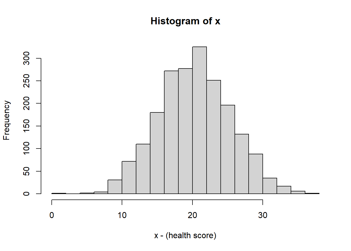
(This call, which we’ll introduce later this Trimester, generates 2000 random values from a Normal distribution with mean 10 and standard deviation 5.)
It doesn’t particularly matter what \(x\) represents here, but if its useful, consider it some measure of health score in the population, such as a blood measure or exercise metric.
As we see, the above histogram which shows the bell curve and symmetric shape.
##     2.5%    97.5%
## 10.44284 30.27035
3.8.1 Test conditions to evaluate proportions of data
Let’s ask some questions about the distribution of this data:
- How much (what %) of the data is above 15? How would we figure that out?
You might be tempted to use which(), and although that would work, there’s a slightly easier way. First, we could use which() as:
## [1] 0.8515This first creates a vector of those indices of those values that are greater than 15. It then calculates the length of that vector and finally, divides that by the length of x.
An slightly easier way:
## [1] 0.8515This is a slightly different formulation than we used before. Here, we first create a new vector x[x>15] which selects only those values of x that are greater than 15. (note that x>15 is a boolean vector.) Then we take it’s length and divide it by the total number.
Here’s a slightly more complicated question to ask about our data:
- What percent is between 5 and 15?
## [1] 0.147What we’re doing here is using a more complex test condition to extract and analyze certain portions of the data. Let’s look at the inner most clause:
This is a Boolean statement that only selects those values which are both greater than 5 AND less than 15.
- What percent is below 15 or above 25?
## [1] 0.325Here we use a test condition to select those values that are either less than 15 or more than 25.
In summary we can use & as a logical AND, and we can use | as a logical OR.
3.8.2 Evaluating our Rules of Thumb around Distributions
In the previous chapter we introduced some rules of thumb about the distribution of data:
| interval | percent of data |
|---|---|
| \(\mu \pm 1*\sigma\) | 68% |
| \(\mu \pm 2*\sigma\) | 95% |
| \(\mu \pm 3*\sigma\) | 99% |
Let’s used what we’ve learned to calculate and plot the mean +/- 2 standard deviations and compare this to the above table. For this data, we find the mean is \(\bar x=\) 20.3 and the standard deviation is \(s=\) 5.12. Hence, we find the interval of the mean +/-2 standard deviations as:
## [1] 10.05689## [1] 30.55168These are the lower and upper bounds of this interval, that based on our rules of thumb should contain about 95% of the data.
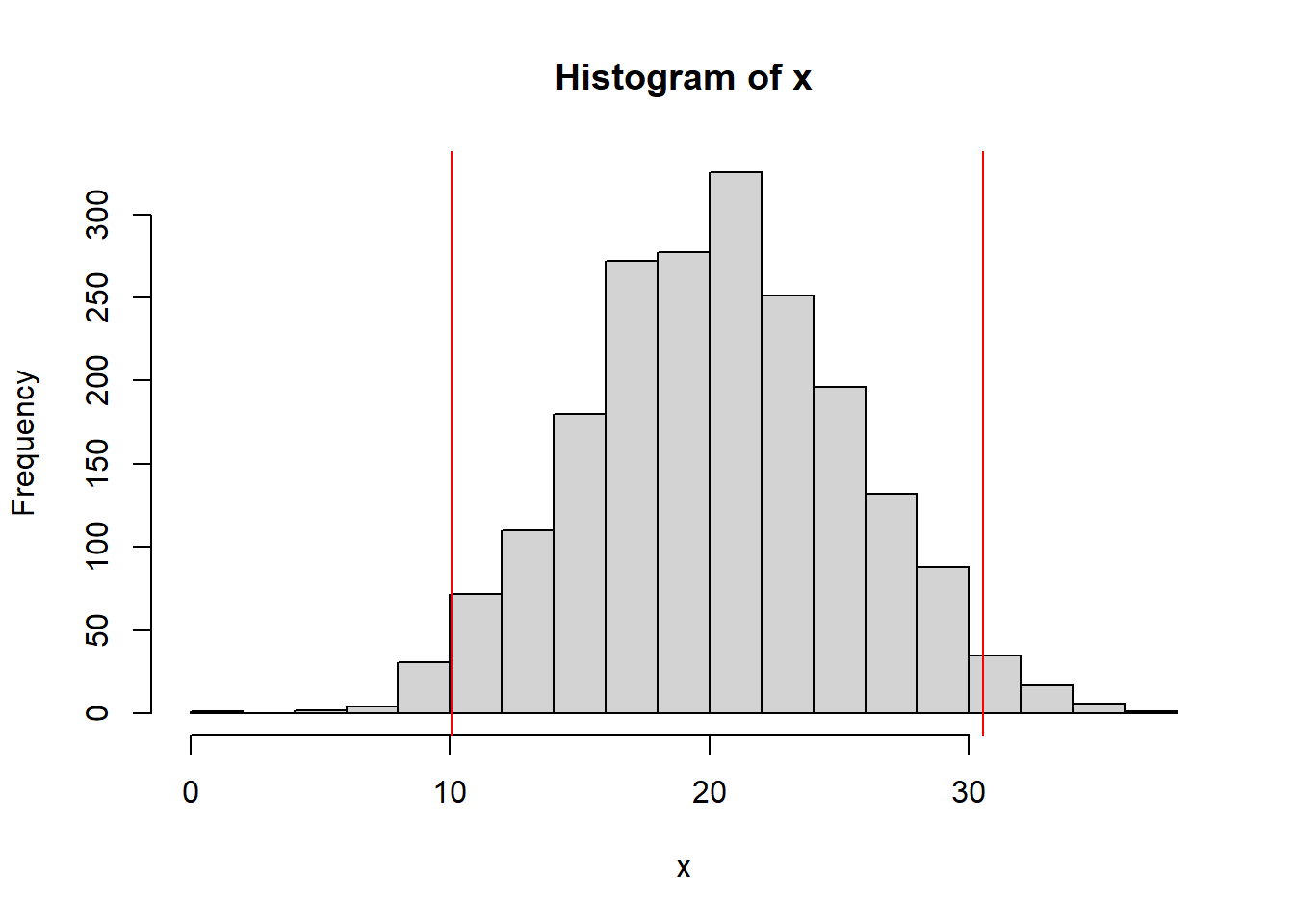
We could, then, using the approach described above calculate the actual results between or below/outside these limits.
## [1] 0.9405Which is quite close (if not exactly equal) to 95%.
Finally, let’s compare this interval to the empirical (based on the data) middle 95% interval. That would imply that we want 2.5% below and above. So we’ll use:
##     2.5%
## 10.39588## 97.5%
## 30.267863.8.3 Guided Practice
- Check the mean +/- 1 standard deviation range for
x. How well do our rules of thumb work? - Check the mean +/- 3 standard deviation range for
x. How well do our rules of thumb work? - You can generate 2000 points using a Uniform distribution with the following:
x <- runif(2000). How well do our rules of thumb work for this distribution?
- What is the difference between using
quantile()to evaluate the spread of the data compared with using the test condition approach shown above?
3.8.4 Review
In review, in this section we’ve looked at:
- Determining the percent of a data set between two values
- Using
&(AND) and|(OR) to create more complex test conditions - Calculating the mean +/- 2 standard deviation interval
- Evaluating the observed data within our “rule of thumb” 95% interval
3.9 The Relationship Between Variables
Much of EDA is focused on attempting to uncover if a relationship exists between variables.
Earlier in this chapter we created scatter plots showing the relationship between Ozone and Temperature. We then did an exercise to explore the relationship between different variables within the airquality data set, although we didn’t explicitly quantify any of these relationships.
In this section we will introduce ideas around how we might quantify a relationship between two variables and what might “a relationship” mean in this context. This is an important tool in our EDA toolbox. We will dive deeper into these concepts later when discussion linear regression.
3.9.1 Is There a Relationship Between…
Brainstorm with your table - Is there a relationship between:
- the amount of mountain snowpack and the intensity of the subsequent fire season
- midterm grades and final grades
- height and weight of adult males
- atmospheric CO\(_2\) and plant growth
- smoking and cancer
In each case be prepared to discuss why or why not.
Importantly, just because there’s a relationship between variables doesn’t mean that its perfectly linear or that there aren’t other important co-variates or that there isn’t a lot of noise (variability) in the relationship.
The goal of this section is to introduce correlation, which is a method to quantify the linear relationship between variables.
3.9.2 What Does a Relationship Mean?
Here is the plot of Temperature vs. Ozone for the airquality data:
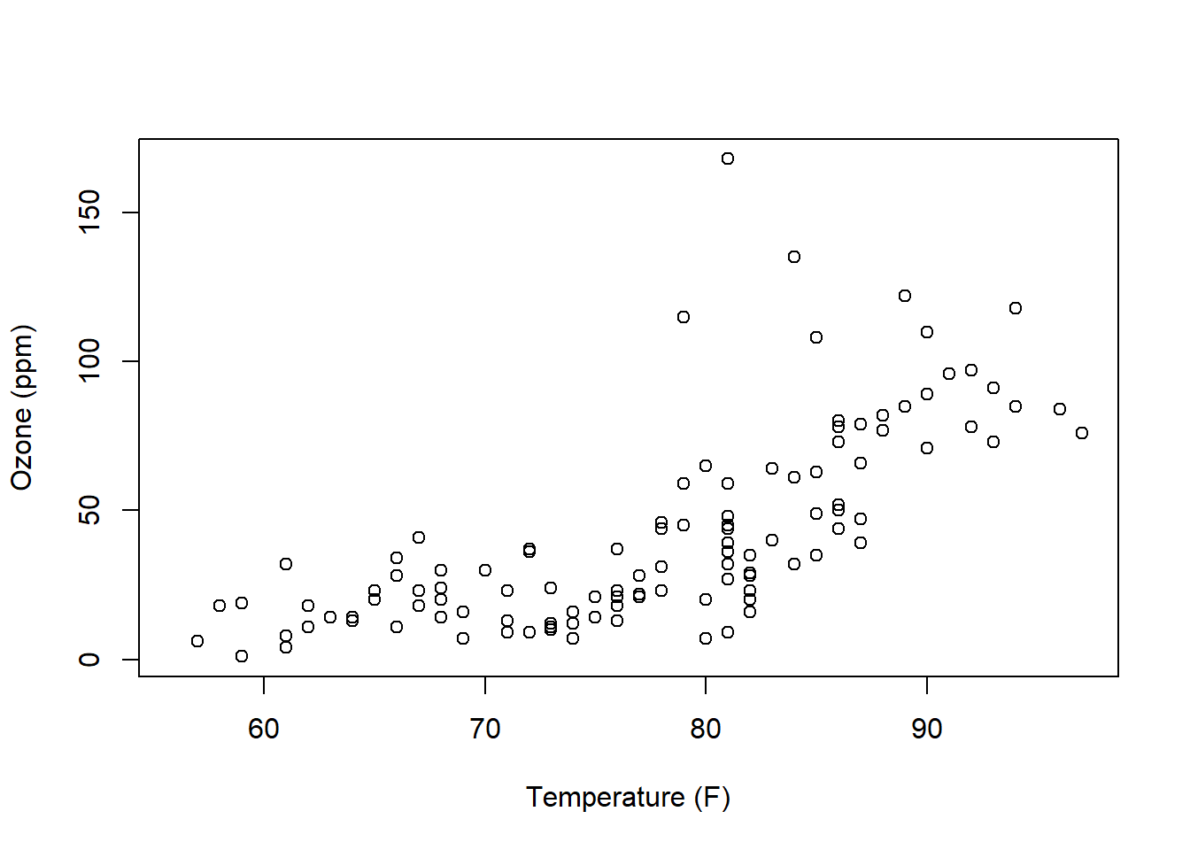
How would we describe this relationship? This is a critical skill that we need to learn. Questions you should attempt to answer while looking at this graph include:
- Does the relationship between x and y appear positive or negative (think about the slope)? Or does “no relationship” between the variables appear to exist (would the “best slope” be zero)?
- Is any observed relationship strong or weak? Here, think about if the points would fall right along a line or if they form a wider cloud around it.
- Does the relationship appear linear? Or is it exponential in shape or possibly some type of other curve?
- Does it appear that the variance (spread of the response data) is roughly the same as \(x\) increases?
3.9.3 Correlation
Visualizing the relationship between two variables is very useful to gain understanding and insight, and sometimes, we’d also like to quantify that relationship. One way we do that is through the correlation.
The correlation \(r\) is calculated as:
\[r = \frac{1}{n-1}\sum_{i=1}^n\frac{x_i-\bar x}{s_x}\frac{y_i-\bar y}{s_y}\]
where
- \(x_i\) is the \(i^{th}\) observation of the \(x\) variable
- \(\bar x\) is the mean of the \(x\) variable
- \(s_x\) is the standard deviation of the \(x\) variable
- \(y_i\) is the \(i^{th}\) observation of the \(y\) variable
- \(\bar y\) is the mean of the \(y\) variable
- \(s_y\) is the standard deviation of the \(y\) variable
- \(n\) is the number of joint (shared) observations in \(x\) and \(y\)
Without going into too much technical detail, for each observation, it looks at whether certain points vary from the means in both \(x\) and \(y\) simultaneously. As \(x\) varies from the mean, does \(y\) simultaneously vary in the same direction? If so, there’s probably some relationship between the variables, and \(r\) is bigger if that’s true. Alternatively, if there’s no pattern (read no relationship) between \(x\) and \(y\), then they won’t co-vary, and after the summation, \(R\) will be close to 0.
3.9.4 Correlation in airquality
Let’s review the the relationship between ozone and temperature in the airquality data. Remember we had observations on 153 days and on most days both ozone and temperature were recorded. So, here, \(n=153\) and \(i\) will range from 1 to 153.
To start, let’s calculate the mean of each. (Note that we use the na.rm=T parameter to filter out the ‘NA’ observations.)
## [1] 42.12931## [1] 77.88235Now let’s create a scatter plot of the data and add a point (in red) that shows the mean of both.
plot(airquality$Temp, airquality$Ozone, xlab="Temperature (F)", ylab= "Ozone (ppb)")
points(mean(airquality$Temp), mean(airquality$Ozone, na.rm=T), col="red", pch=19)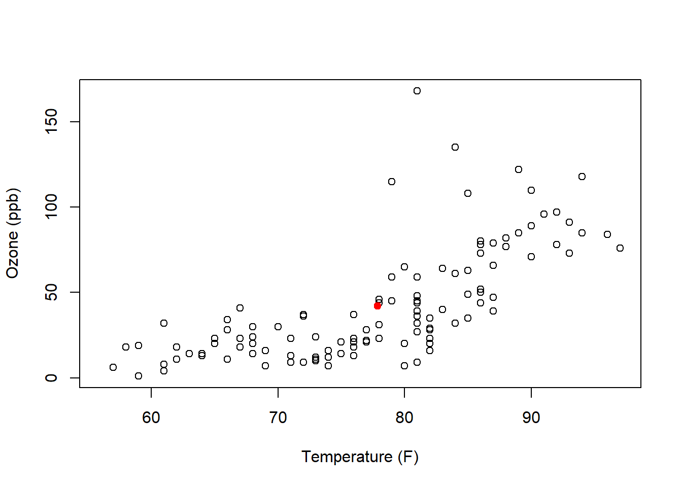
Looking back to our correlation equation, each point contributes a little bit depending on it’s relation to the mean.
Based on this plot, the majority of points will add a positive contribution to our correlation, although the points above mean temperature but below mean ozone will add a negative contribution.
3.9.5 Examples of Correlation
Correlation can range between -1 and 1. This happens because we are scaling each value by its standard deviation.
Moreover, correlation is measuring the strength of the linear relationship between the two variables. The following image shows correlation values for different scatter plots.

Figure 3.2: Plots and calculated values of different correlations from Math is Fun
3.9.6 Calculating Correlation in R
In R, we won’t do the calculation by hand, and instead we will use the cor() function as:
## [1] 0.6983603Here the use="complete.obs" parameter is used to filter out the NA values.
An important note here is that correlation is looking at a linear relationship between the variables. However, it can still give a high value if the relationship is not exactly linear. We see that with the above airquality scatter plot. Therefore in addition to calculating correlation, your analysis should always be accompanied by the plot itself, and include a discussion of what the scatter plot shows.
We’ll spend more time with correlation when we discuss linear regression.
3.9.7 Does Correlation Imply Causation?
No, and there are a lot of possible reasons for this. In particular, it may be there are other underlying (not measured) variables that are impacting both the variables we are considering.
We’ll discuss this in more detail when we get into linear regression.
3.9.8 Guided Practice
- Based on the equation for correlation, explain why a data with a decreasing (negative) trend results in a negative value for its correlation.
- Using the built-in
carsdata set, calculate the correlation between speed and braking distance. Comment on whether this value makes sense based on the scatter plot.
3.10 Old Faithful!
3.10.1 Waiting…
https://www.nps.gov/yell/learn/photosmultimedia/webcams.htm
But what is a good measure of how long we have to wait?
Here’s our plan:
Part I:
- in small groups, you will use EDA techniques to interrogate the
faithfuldata. You will attempt to both (i) understand what the data represents, and (ii) come up with your own interesting questions. - we will get back together as a whole class and discuss what you found, including allowing groups to present anything interesting you saw
Part II:
- now assume you work for the NPS (National Park Service) and have been tasked to create a statistically informed brochure about the Old Faithful geyser.
- you can use your own question, or you can investigate, what’s the best measure of “how long will you wait?” If you answer this question make sure to explore the advantages and disadvantages of various measures.
- you will present your results next class.
3.10.2 Beginning EDA
Step 1: “Play” with the data. What do you Know-Notice-Wonder? Use R: create plots, and do calculations of “middle” and “spread”. Ask interesting question and then attempt to find the answers.
Remember our “process” from above.
(Note to self: Last year the focus was more on different measures of central tendency, whereas here I want to have the focus more on the whole EDA process. But we won’t yet have looked at test conditions.)
3.10.3 Our Data
Let’s start by looking the faithful data in R. This is a built-in data set, meaning you don’t need to read the file or explicitly load the data. It’s already part of your R installation and readily accessible.
As a first step, inspect the data. Put it into a code block (Ctrl+Alt+I) and similar to how we’d type the name in the console, then press the green arrow:
##   eruptions waiting
## 1     3.600      79
## 2     1.800      54
## 3     3.333      74
## 4     2.283      62
## 5     4.533      85
## 6     2.883      55
This shows us the whole data set, and as a reminder if you only want the beginning of the data, use the head() function.
Also, in this case, since faithful is a built-in dataset, we can use R’s help to learn more about the data frame, using:
and again, this last step only works if it is a built-in data frame.
3.10.4 Some Hints if you’re Stuck
3.10.5 Group Brainstorm on Initial Results
So, what did you find?
3.10.6 Sell Me…
Imagine I work for the Park Service and am putting together the brochure for people visiting Old Faithful. What should I say? You and your groups are consultants I’ve hired.
You might consider answering the question of “which measure is best”. Or get creative and answer a different question. Whatever you choose, it should be statistically informed.
3.11 Review of Learning Objectives
By the end of this chapter you should be able to:
- Explain the purpose and iterative nature of Exploratory Data Analysis (EDA)
- Query a data set, ask and then answer interesting questions
- Describe what vectors and data frames in R are and use simple test conditions to extract data from a data frame
- Recognize that columns are vectors and can be manipulated in R as such. Extract columns from data frames using either the
$or[]operators - Perform calculations using vector math
- Load external data from your computer into a data frame in R (including setting the correct working directory), and understand the format of CSV files
- Create and interpret scatter plots, line graphs, histograms, and boxplots, and select the appropriate plot for the analysis at hand
- Customize plots in R, including adding appropriate title, axis labels, plot character and plot color
- Determine the percent or proportion of a dataset that lies between two specified values
- Understand how to write simple test conditions using <, <=, ==, >=, >
- Extract a subset of a vector or data frame using
[]and a Boolean test condition - Use data from one vector along with a test condition to select data from a second vector
- Describe the relationship that exists between two variables as displayed in a scatter plot
- Calculate and interpret the correlation between two variables
3.12 Summary of R functions in this Chapter
| function | description |
|---|---|
data() |
used to load a built in data set |
plot() |
generic function used for scatter plots and more |
points() |
function used to add new points to an existing plot |
dim() |
to return the dimensions of a data frame |
names() |
to return the column names of a data frame |
head() |
to return the first few rows of a data frame |
getwd() |
to return the current working directory |
setwd() |
to set the current working directory |
read.csv() |
to load a CSV file from your computer into R |
cor() |
to calculate the correlation between two variables |
3.13 Exercises
Note: These are not required and will occasionally be used during class as warm-up exercises or no-stakes quizzes.
Exercise 3.1 Using the built in airquality data set:
- What were the minimum and maximum wind speed recorded? what were the mean and standard deviation of the wind speed?
- What percent of the measurements have a wind speed below 5 mph?
- Create a box plot that looks at the variability in temperature as a function of month.
- Create a scatter plot that shows the relationship between ozone and wind. What trends do you see in this plot? Does this pattern make sense to you? Why or why not?
Exercise 3.2 Using the built in women data set:
- Determine the dimensions of the data frame (hint: you may need to load using
data()). - Determine the names of the 2 columns.
- Create a scatter plot of the 2 columns of the
womendata with appropriate axis labels, including units. (hint: type?womenat the console.) - In a few sentences, describe the relationship you see in the plot.
- Calculate the median and range of each column.
Exercise 3.3 For this problem we will use the built-in cars data set to practice customizing plots in R.
- Type
?carsin the console to learn more about the data set. What year were the data recorded? - Plot a histogram of the speed data, using the
hist(cars$speed, col="gray")function. How many bins are there by default? Note the use of the$here to access that specific column of data. What happens if you change the word “gray” to “red” in the above function call (and keep it in quotes)? - Change the number of bins by adding the
breaks=10parameter within the hist() function. The actual order doesn’t matter, but make sure to also add a comma, separating it from the previous parameter. Which plot (the original or the new one) do you think provides a more informative view of the data?
- Calculate the mean of the speed data. Add it to the plot by typing
abline(v=xxx, col="red")at the command prompt, wherexxxis your result.
- Change the x-axis label by adding the
xlab="Car Speed (mph)"parameter to thehist()function call. Also, change the title of the plot by adding themain=("My Awesome Title")parameter. - The default of the histogram function is to display ‘Frequency’ on the y-axis. You can change this by setting the parameter
freq=F. Try this. What does it now show and what is the difference?
Exercise 3.4 The co2 data (also a built in data set) contains monthly observations of CO2 levels from Mauna Loa between 1959 and 1997. Note, this is a time series object, not a data frame, so the $ character is not needed.
- How many observations are there in the
co2data?
- Plot the
co2data usingplot(co2, type="p")where the “p” indicates points. What is the result? Does this seem useful? Now plot using, plot(co2, type=“l”) where the l indicates to use a line. Is a line plot or a scatter plot better for this data and why?
- What does the plot seem to indicate? Describe in words what you see, including what type of trend and/or variation do you see?
- Add an appropriate title to your plot using the `main=“some title” parameter.
- How many of the observations are above 350 ppm? Hint: use the
which()command.
Exercise 3.5 Using the airquality data set, calculate the correlation between ozone and each of temp, wind and solar radiation (so three values in total). Which pair has the highest correlation? Does that make sense based on their respective scatter plots?